
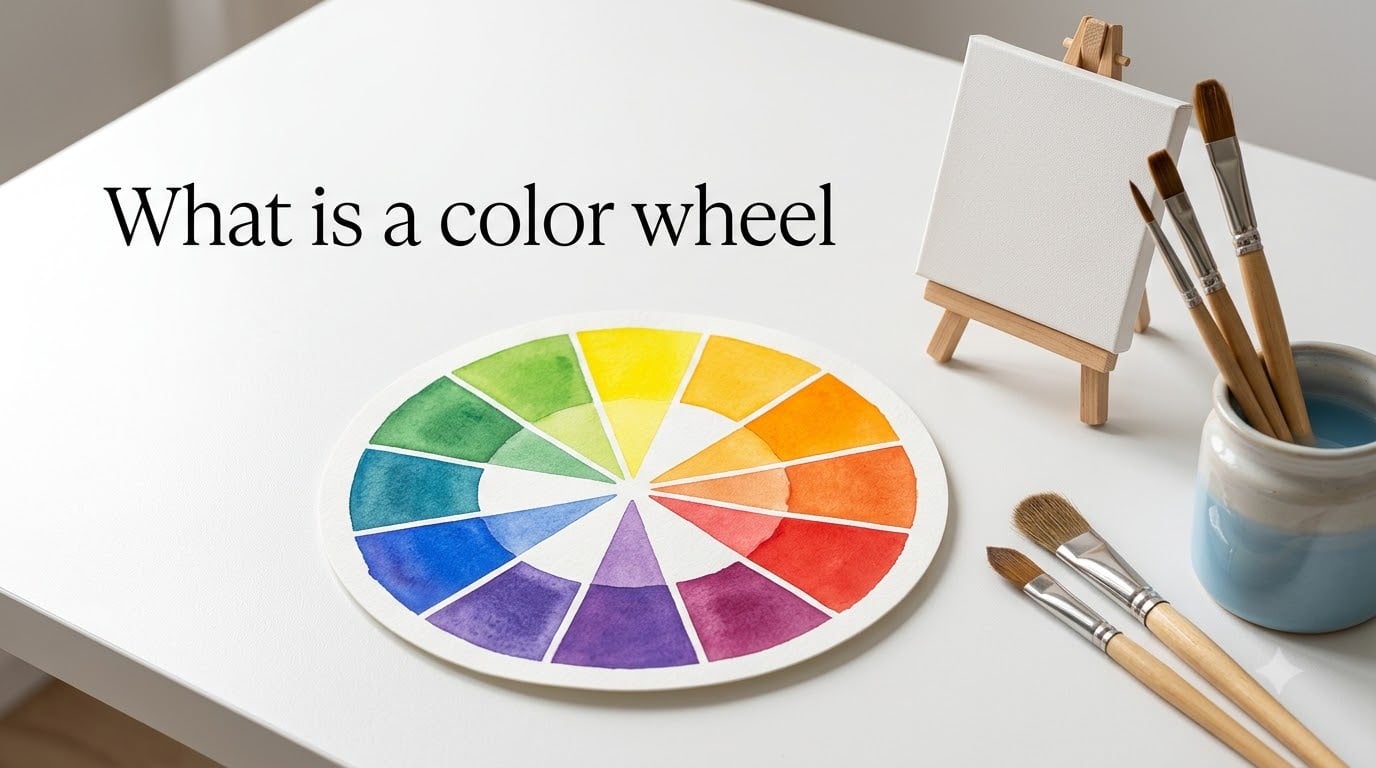
A color wheel is a circular diagram that organizes colors of the visible spectrum and shows how they relate to each other. Sir Isaac Newton invented the first version in 1666 by mapping the colors he saw through a prism onto a circle. Today, artists, designers, and students use it to pick colors that look good together, mix paints with confidence, and build balanced palettes for everything from paintings to websites.
If you have ever felt overwhelmed by color theory terminology or wondered why some color combinations just work while others clash, the color wheel is your answer. It is a simple visual tool, but the logic behind it shapes every creative field from fine art to interior design.
In this guide, our team breaks down exactly what a color wheel is, how it works, and how you can start using it today. No art degree required.
Table of Contents
- What is a Color Wheel? A Clear Definition
- The History of the Color Wheel
- Primary Colors: The Foundation
- Secondary Colors: The First Mix
- Tertiary Colors: Filling the Gaps
- Warm Colors vs Cool Colors
- Color Relationships and Harmonies
- RYB vs RGB Color Wheels: What is the Difference?
- How to Use a Color Wheel for Beginners
- FAQs
- Conclusion
What is a Color Wheel? A Clear Definition
A color wheel (sometimes called a color circle) is an abstract, circular arrangement of color hues that shows the relationships between primary, secondary, and tertiary colors. Think of it as a map for colors. Each color sits at a specific position based on how it is mixed, and the distance between colors tells you how they will interact.
The wheel typically organizes 12 colors into a seamless circle. Here is the basic breakdown:
Primary colors: Red, yellow, and blue sit at equal points around the wheel.
Secondary colors: Orange, green, and purple fill the gaps between each pair of primaries.
Tertiary colors: Six additional colors like red-orange and yellow-green sit between each primary and its neighboring secondary.
That structure is what gives the wheel its predictive power. By reading the positions, you can tell which colors complement each other, which ones clash, and how to mix a specific shade.
The History of the Color Wheel
The story of the color wheel begins with Sir Isaac Newton in 1666. Newton was not thinking about art at the time. He was running experiments with a prism and a beam of sunlight, discovering that white light could be split into a band of distinct colors.
Newton noticed that the colors blended into each other seamlessly, forming what we now call the visible spectrum: red, orange, yellow, green, blue, indigo, and violet. He arranged those seven colors into a circle to show how the last color (violet) wrapped back around to the first (red), creating a continuous loop.
Later artists and scientists refined the idea. In the 1700s and 1800s, theorists like Johann Wolfgang von Goethe and Michel Eugene Chevreul developed versions that focused more on paint mixing and visual perception. The 12-color RYB wheel that most art classes use today grew out of those refinements.
Primary Colors: The Foundation
Primary colors are the three colors that cannot be created by mixing other colors together. On the traditional RYB color wheel, they are:
Red
Yellow
Blue
These three form the structural backbone of the entire wheel. Every other color on the diagram is built from some combination of them. They are spaced equally around the circle at 120-degree intervals, which gives the wheel its visual balance.
That even spacing matters. It means the primaries anchor the wheel and create predictable positions for every mixed color that follows. Without that mathematical relationship, the tool would not work.
Secondary Colors: The First Mix
Secondary colors are created by mixing two primary colors in equal amounts. There are exactly three of them, and each one sits halfway between the two primaries that make it:
Orange = Red + Yellow
Green = Yellow + Blue
Purple (Violet) = Blue + Red
On the wheel, secondary colors fill the three gaps between the primaries. If you imagine the circle as a clock face with red at 12, then orange sits at roughly 2, yellow at 4, green at 6, blue at 8, and purple at 10.
This is where the wheel starts to become a practical mixing guide. You can look at any two adjacent colors and predict what their blend will produce.
Tertiary Colors: Filling the Gaps
Tertiary colors are the six colors that sit between each primary color and its neighboring secondary color. They are created by mixing a primary with the secondary right next to it. The naming convention always lists the primary color first.
Here are all six tertiary colors and how they are made:
Red-Orange = Red + Orange
Yellow-Orange = Yellow + Orange
Yellow-Green = Yellow + Green
Blue-Green = Blue + Green
Blue-Purple = Blue + Purple
Red-Purple = Red + Purple
With these six added, the wheel is complete at 12 colors. This is the version most art teachers, design programs, and color theory books refer to when they talk about the standard color wheel.
Many beginners gloss over tertiary colors, but they are where the real nuance lives. The difference between a painting that feels flat and one that feels rich often comes down to understanding and using these in-between shades.
Warm Colors vs Cool Colors
The color wheel can be split down the middle into two halves: warm colors and cool colors. This split is one of the most practical concepts in all of color theory.
Warm colors include reds, oranges, and yellows. They are associated with fire, sunlight, and energy. In paintings and designs, warm colors tend to advance toward the viewer, making objects feel closer and more active. They are a natural choice for creating focal points or conveying excitement.
Cool colors include blues, greens, and purples. They evoke water, sky, and calm. Cool colors tend to recede visually, making objects feel farther away. Designers use them to create a sense of space, tranquility, or professionalism.
Understanding this warm-cool divide gives you an immediate advantage. If your design feels too aggressive, you can cool it down. If it feels flat and cold, you can add warmth. The color wheel tells you exactly where to look.
Color Relationships and Harmonies
One of the most powerful uses of the color wheel is identifying color harmonies. These are proven combinations that look visually pleasing together. Here are the four most common schemes.
Complementary Colors
Complementary colors sit directly opposite each other on the wheel. The classic pairs include red and green, blue and orange, and yellow and purple. Because they are maximum opposites, they create the strongest possible contrast when placed side by side.
That contrast is attention-grabbing, which is why complementary pairs show up everywhere from sports team logos to holiday decorations. The catch is that they can feel jarring in large doses. Most designers use one color as the dominant shade and its complement as an accent.
Analogous Colors
Analogous colors sit next to each other on the wheel, usually three in a row. A common example is blue, blue-green, and green. Because they are neighbors, they blend naturally and create a calm, cohesive feel.
This scheme is perfect when you want harmony without excitement. Nature uses analogous colors constantly, think of a sunset moving from yellow through orange to red, or a forest shifting from yellow-green to deep green to blue-green.
Triadic Color Scheme
A triadic scheme uses three colors that are evenly spaced around the wheel, forming an equilateral triangle. The primary set (red, yellow, blue) is itself a triadic scheme. Other examples include orange, green, and purple.
Triadic combinations offer strong visual contrast while maintaining balance. They are vibrant and energetic, and they work well when you want a playful or bold palette. The key is letting one color dominate and using the other two as supports.
Split-Complementary Colors
The split-complementary scheme takes a base color and pairs it with the two colors adjacent to its complement. For example, if your base color is blue, its complement is orange, so your split complements would be red-orange and yellow-orange.
This gives you the contrast of a complementary scheme but with less tension. It is one of the easiest harmonies for beginners to work with because it is forgiving and hard to get wrong.
RYB vs RGB Color Wheels: What is the Difference?
One of the most common questions in art forums is which color wheel is the “correct” one. The answer is that it depends on your medium. There are actually two main color wheel systems, and they serve completely different purposes.
The RYB wheel (Red, Yellow, Blue) is the traditional artist’s wheel. It is based on subtractive color mixing, which is how paints, inks, and dyes work. When you mix paint colors together, they absorb more light and eventually produce a dark brownish-black. This is the wheel used in art classrooms, painting studios, and most physical media. The three primary colors are red, yellow, and blue.
The RGB wheel (Red, Green, Blue) is the digital wheel. It is based on additive color mixing, which is how light works on screens. When you combine all three RGB primaries at full intensity, you get white light, not black. This is the system your computer monitor, phone screen, and television use. The primary colors here are red, green, and blue, and the secondary colors are cyan, magenta, and yellow.
There is also CMYK (Cyan, Magenta, Yellow, Key/Black), which is the color model used for printing. It is another subtractive system, but it starts from a different set of primaries than RYB to achieve a wider printable color range.
The confusion arises because the RYB and RGB wheels have different primary, secondary, and complementary colors. Red and green are complementary on the RYB wheel, but on the RGB wheel, red and cyan are the true opposites. Neither is wrong. You just need to match the wheel to your medium.
How to Use a Color Wheel for Beginners
The color wheel only helps if you know how to read it. Here is a simple step-by-step process that anyone can follow, whether you are painting a canvas or designing a living room.
Step 1: Pick your base color. This is the dominant color of your project. It might be a wall color, a brand color, or the main subject of your painting. Start by choosing one color that feels right for the mood you want.
Step 2: Decide on a harmony scheme. Choose one of the four schemes described above. Complementary for high contrast, analogous for calm cohesion, triadic for bold energy, or split-complementary for a balanced middle ground.
Step 3: Find your partner colors on the wheel. Use the geometric rules of your chosen scheme to locate the other colors. Opposite for complementary, neighbors for analogous, even spacing for triadic.
Step 4: Test the combination. Lay your colors out side by side before committing. If something feels off, adjust by shifting one color warmer or cooler, or by changing the proportion so one color dominates.
Step 5: Add neutrals. White, black, gray, and brown are not on the color wheel, but they are essential for balancing any palette. Use them as backgrounds and buffers so your wheel colors do not overwhelm the viewer.
Beginners often skip straight to choosing colors by gut feel. That works sometimes, but the wheel gives you a repeatable system. Once you internalize the basics, you will make faster and more confident color decisions every time.
FAQs
How to explain color wheel to kids?
Tell kids the color wheel is like a rainbow bent into a circle. Start with three colors that are the bosses: red, yellow, and blue. Mix two bosses together and you get new colors like orange, green, and purple. The circle shows how all the colors are connected, like neighbors on a street.
What is this color wheel?
A color wheel is a circular diagram that arranges colors by their relationships. It was invented by Sir Isaac Newton in 1666 to organize the visible spectrum. The wheel shows primary, secondary, and tertiary colors and helps artists and designers choose colors that work well together.
What are the 7 colors of the color wheel?
The original seven colors Newton identified were red, orange, yellow, green, blue, indigo, and violet (ROYGBIV). However, the standard modern color wheel used in art and design has 12 colors: 3 primary, 3 secondary, and 6 tertiary colors.
How to use a color wheel for beginners?
Start by picking one base color. Then choose a harmony scheme: complementary (opposite colors for contrast), analogous (neighboring colors for calm), or triadic (evenly spaced for energy). Find your partner colors using the wheel, test them side by side, and add neutral colors like white or gray to balance the palette.
Conclusion
So what is a color wheel? At its core, it is a circular map of how colors relate to each other, built on the primary colors of red, yellow, and blue, and expanded through secondary and tertiary colors into a full 12-color spectrum. Sir Isaac Newton gave us the first version, and artists and scientists have been refining it ever since.
The real value of the color wheel is practical. It turns the guesswork out of choosing colors into a repeatable system. Whether you are mixing paint, designing a website, decorating a room, or just trying to understand why certain colors look good together, the wheel gives you a reliable starting point.
Start with the basics: memorize the three primaries, learn how secondaries are mixed, and pick one harmony scheme to practice. Once those fundamentals click, everything else on the wheel falls into place naturally.