
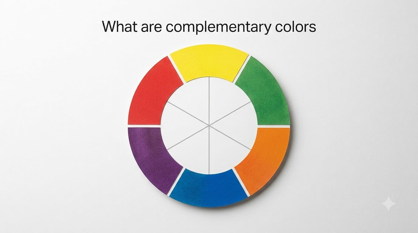
Complementary colors are pairs of colors that sit directly opposite each other on the color wheel, creating the strongest possible visual contrast when placed side by side. The three main complementary pairs in traditional color theory are red and green, blue and orange, and yellow and purple.
When I first started studying color theory, this concept clicked for me faster than almost anything else. That is because complementary colors show up everywhere, from sunset skies to sports team uniforms to the flowers in your garden.
Understanding how these opposite colors work gives you an enormous advantage whether you paint, design websites, decorate a room, or just want to dress with more intention. I will walk you through the definition, the science, the color models, and practical ways to use complementary colors in your own projects.
Table of Contents
- What Are Complementary Colors?
- The Three Main Complementary Color Pairs
- How Complementary Colors Work on the Color Wheel
- RYB vs RGB Complementary Color Models
- Why Complementary Colors Create Such Strong Contrast
- What Happens When You Mix Complementary Colors
- Split Complementary Colors Explained
- How to Use Complementary Colors in Design and Art
- Complementary Colors in Nature and Everyday Life
- FAQs
- Wrapping Up: The Power of Complementary Colors
What Are Complementary Colors?
Complementary colors are defined by their position on the color wheel. If you draw a straight line from any color through the center of the wheel, the color it lands on is its complement.
This relationship matters because opposite colors have nothing in common pigment-wise. Red contains no blue or yellow that would tie it to green. Blue shares no pigment with orange. That total lack of overlap is exactly what makes the pairing so visually electric.
Think of it this way. Every complementary pair consists of one primary color and one secondary color that is built from the other two primaries. Green is made from blue and yellow, so it is the natural opposite of red. Orange comes from red and yellow, making it the opposite of blue. Purple is a mix of red and blue, placing it across from yellow.
When you place complements side by side, each color makes the other look more intense and vibrant than it would on its own. This effect is called simultaneous contrast, and artists have been using it for centuries to make their work pop.
The Three Main Complementary Color Pairs
The traditional color wheel gives us three primary complementary pairs. Each one has distinct characteristics and shows up in famous art, branding, and nature.
Red and Green
Red and green are probably the most recognizable complementary pair, thanks in large part to Christmas decorations. But this combination goes far beyond the holidays. Think of a ripe red strawberry against its green leaves, or a vibrant cardinal perched in an evergreen tree.
This pairing creates intense visual energy. Because both colors are so saturated, using them at full strength can feel overwhelming. Many designers dial back one color to a muted shade while letting the other stay bold, which creates balance without losing the contrast.
Blue and Orange
Blue and orange might be the most widely used complementary pair in modern visual media. Movie posters, sports uniforms, and brand identities lean on this combination constantly. The reason is simple: warm orange against cool blue creates a temperature contrast that feels dynamic and alive.
I have noticed that this pair is especially effective in photography and film. A blue-toned shadow against an orange-lit subject instantly creates depth and draws the eye.
Yellow and Purple
Yellow and purple sit at opposite ends of the value spectrum as well as the color wheel. Yellow is naturally the lightest color, while purple tends to be darker. This means the pair delivers contrast in both hue and brightness.
You see this combination in everything from royal regalia to spring flowers like crocuses and irises. The warmth of yellow against the cool depth of purple creates a sophisticated, almost regal feeling.
How Complementary Colors Work on the Color Wheel
The color wheel is a circular arrangement of hues that shows how colors relate to each other. Developed in the 18th century and refined over time, it remains the foundation of color theory.
Here is how to find any color’s complement in three quick steps. First, locate your starting color on the wheel. Second, imagine a straight line passing from that color through the exact center point. Third, follow that line to the color on the opposite side. That is your complement.
The wheel organizes colors into three tiers. Primary colors (red, yellow, blue) form the base. Secondary colors (green, orange, purple) are created by mixing two primaries. Tertiary colors fall between a primary and its adjacent secondary, with names like red-orange or blue-green.
Every color on the wheel has a complement. Tertiary colors pair with other tertiary colors. Red-orange complements blue-green, yellow-orange complements blue-purple, and so on. The opposite-color rule applies at every level.
RYB vs RGB Complementary Color Models
Here is where a lot of people get tripped up, and I have seen this confusion discussed constantly on art forums. The complementary pairs you learned in school are not the only ones that exist. Different color models produce different pairs.
The traditional RYB model is used for paint, pigment, and most art education. Red, yellow, and blue are the primaries. The complementary pairs are red-green, blue-orange, and yellow-purple. This model works well for mixing physical materials like acrylics, oils, and watercolors.
The RGB model governs light, which means it applies to screens, digital displays, and photography. The primaries are red, green, and blue. In this system, the complementary pairs shift. Red complements cyan, green complements magenta, and blue complements yellow.
A third model called CMY (cyan, magenta, yellow) is used in printing. It is a subtractive model like RYB but with different primaries, so its complementary pairs differ as well.
The key takeaway is this: your complementary pairs depend on your medium. If you are painting on canvas, use RYB. If you are designing for a screen, use RGB. Mixing up the models is one of the most common mistakes beginners make.
Why Complementary Colors Create Such Strong Contrast
The intensity of complementary color pairings is not just an aesthetic opinion. It is rooted in how the human eye and brain process visual information.
Your retina contains photoreceptor cells that respond to different wavelengths of light. When you look at a red surface, the red-sensitive receptors become fatigued. If you then look at a white surface, your eye temporarily sees an afterimage in green, the complementary color.
This afterimage effect, known as successive contrast, demonstrates that complements are neurologically linked. Your brain literally generates one color in response to overstimulation from its opposite.
Simultaneous contrast works on the same principle but happens when two complementary colors are viewed at the same time. Each color stimulates its receptors while the surrounding complementary color stimulates the opposing ones. The result is that both colors appear more vivid than they would in isolation.
This is why a small red dot on a green background seems to vibrate or glow. Your visual system is amplifying the difference between the two.
What Happens When You Mix Complementary Colors
Placing complementary colors next to each other makes them pop, but mixing them together does the exact opposite. When you combine two complementary colors in equal amounts, they neutralize each other.
The result is a muted gray, brown, or neutral tone. This happens because each color contains none of the pigments found in its complement. Red mixed with green does not lean red or green. Instead, the two cancel each other’s chroma, producing a desaturated color.
Artists use this neutralizing effect deliberately. If a red feels too intense, adding a touch of green will tone it down without making it look like a different color. This technique is far more effective for creating natural shadows than simply adding black, which can muddy the paint.
Many watercolorists and oil painters create rich, complex neutrals by mixing complements rather than reaching for a tube of gray or brown. The resulting colors have more depth and feel more organic than pre-mixed neutrals.
I have seen beginners get frustrated when their carefully mixed colors turn muddy brown. That muddiness is the neutralizing effect in action. Once you understand it, that same effect becomes a powerful tool rather than an accident.
Split Complementary Colors Explained
If working with direct complementary colors feels too intense, split complementary schemes offer a gentler alternative. Many experienced artists recommend this approach for beginners.
A split complementary scheme starts with one base color, then uses the two colors adjacent to its complement instead of the complement itself. For example, if your base color is blue, its complement is orange. Instead of using orange, you would use red-orange and yellow-orange.
This gives you the high contrast of complementary colors but with more variety and less tension. The result feels more balanced and is easier to work with across larger areas like a painting or a room design.
The split complementary approach also solves a common problem. Direct complements at full saturation can be visually jarring when used in equal proportions. By splitting the complement into two related colors, you get richness without the vibration that some people find uncomfortable.
To build a split complementary palette, pick your main color and find its complement on the wheel. Then move one step to the left and one step to the right of that complement. Those two colors plus your base form a versatile, harmonious trio.
How to Use Complementary Colors in Design and Art
Knowing the theory is only half the battle. Here is how to actually apply complementary colors in practical work across different fields.
In painting, use complementary colors to create depth and shadows. Instead of darkening a red area with black, mix in a small amount of green. The shadow will feel more alive and realistic. For focal points, place a small area of one color within a field of its complement to draw the eye instantly.
In graphic and web design, complementary colors are ideal for calls to action. An orange button on a blue background is a classic conversion-boosting combination because the contrast naturally attracts attention. Just be careful not to overuse it. Reserve the strongest complementary pair for the single most important element on the page.
For interior design, the 60-30-10 rule works beautifully with complementary palettes. Use one color as your dominant 60 percent, its complement as the 30 percent secondary, and a neutral or accent as the final 10 percent. This prevents the room from feeling like a clash of competing colors.
Here are some common mistakes to avoid. First, never use complementary colors at full saturation in equal amounts. That creates visual tension with no resting place for the eye. Second, avoid placing detailed text on a complementary-colored background, as the vibration makes reading difficult. Third, remember that complementary pairs shift depending on whether you are working in RYB or RGB.
Photography and film use complementary color grading extensively. The teal-and-orange look that dominates Hollywood blockbusters is simply a blue-orange complementary scheme applied to shadows and highlights. You can replicate this effect in any photo editor by warming the highlights and cooling the shadows.
Complementary Colors in Nature and Everyday Life
Nature is arguably the original master of complementary color schemes. Once you start looking for these pairs, you will see them everywhere.
Sunsets are the classic example. The warm oranges and yellows of a setting sun against the deep blue of the fading sky create one of the most photographed complementary scenes on earth. This combination is so visually pleasing that it has become a default palette for everything from travel posters to website backgrounds.
Tropical fish, birds, and flowers frequently display complementary coloring. A red betta fish against green aquatic plants, a purple coneflower with a yellow center, an orange monarch butterfly against a blue sky. Evolution did not arrange these colors for art theory, but the same visual principles that make complements appealing to humans make them effective for attracting mates and pollinators.
Even traffic signals rely on complementary relationships. The red and green of stop and go lights are instantly distinguishable partly because they are opposites on the color wheel. The high contrast makes them readable even at great distances and in poor weather conditions.
FAQs
What are examples of complementary colors?
The three main complementary color pairs are red and green, blue and orange, and yellow and purple. In the RGB color model used for screens, the pairs shift to red-cyan, green-magenta, and blue-yellow. You can find any color’s complement by locating its opposite on the color wheel.
How do I know if a color is complementary?
Find your starting color on the color wheel and draw an imaginary straight line through the center to the opposite side. The color the line reaches is the complement. For example, a line from red passes through the center to green, making those two colors complements.
What two colors should not be seen together?
Red and green at full saturation are notoriously difficult to use together because they vibrate intensely and can strain the eyes. This does not mean you cannot use them, but you should vary the proportions, mute one of the colors, or use a neutral buffer between them to reduce the harsh effect.
How do you explain complementary colors to kids?
Tell kids that complementary colors are best friends who live across from each other on a color circle. Red’s best friend is green, blue’s best friend is orange, and yellow’s best friend is purple. When they stand next to each other they make each other look extra bright and colorful. Use crayons or paint to show them how mixing the pair turns into a muddy brown.
What happens when you mix complementary colors together?
Mixing two complementary colors in equal amounts neutralizes them, producing a muted gray, brown, or other desaturated tone. This happens because opposite colors share no pigments, so they cancel each other’s intensity. Artists use this effect to create natural-looking shadows and rich neutrals.
Wrapping Up: The Power of Complementary Colors
Complementary colors are one of the most practical concepts in all of color theory. By understanding that opposite colors on the wheel create maximum contrast, you gain a reliable tool for making your work more visually striking.
Remember the key points. The three traditional pairs are red-green, blue-orange, and yellow-purple. Placing them side by side intensifies both colors, while mixing them together neutralizes into gray or brown. Your medium matters too, since RYB pairs apply to paint and RGB pairs apply to screens.
Start by experimenting with one complementary pair in your next project. Try the split complementary approach if a direct pairing feels too intense. Once you internalize these relationships, every color decision you make becomes more confident and intentional.