
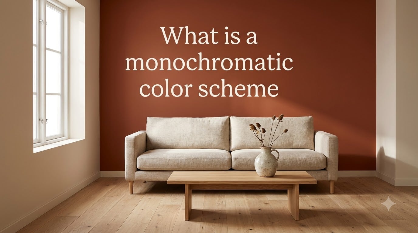
A monochromatic color scheme is a color palette built from one base hue and its variations in lightness, darkness, and saturation. We use it whenever we want a calm, unified look without the visual noise of competing colors, and it remains one of the most reliable tools in any designer’s kit going into 2026.
I’ve leaned on monochromatic palettes for years across branding, interior, and web projects, and the reason is simple: they make decisions easier while still leaving room for depth and contrast. In this guide, I’ll walk you through exactly what a monochromatic color scheme is, how to build one, and where it works best.
Table of Contents
- What Is a Monochromatic Color Scheme
- Understanding Hue, Tint, Shade, and Tone
- Why Designers Use Monochromatic Schemes
- How to Create a Monochromatic Color Scheme
- Where Monochromatic Schemes Work Best
- Common Mistakes to Avoid
- Monochromatic vs. Other Color Schemes
- Frequently Asked Questions About Monochromatic Color Schemes
- Final Thoughts on Monochromatic Color Schemes
What Is a Monochromatic Color Scheme
A monochromatic color scheme uses one single hue as a foundation and explores it through different tints, shades, and tones. The word “monochromatic” comes from the Greek words “mono” (one) and “chroma” (color), which literally means “one color.”
The key components of any monochromatic color scheme are:
- Hue: The pure base color on the color wheel (like pure blue, red, or yellow)
- Tint: The hue mixed with white, creating lighter, pastel versions
- Shade: The hue mixed with black, producing deeper, darker versions
- Tone: The hue mixed with gray, giving softer, more muted versions
Because the hue stays constant, every element in the palette shares the same underlying color identity. The variation comes from manipulating value (lightness) and saturation (intensity), which is what gives a monochromatic scheme its range despite using only one color family.
Understanding Hue, Tint, Shade, and Tone
Before you build a monochromatic palette, you need a clear grip on these four color theory terms. I’ve seen too many amateur designers confuse tints with shades, so let’s lock it down.
Hue: The Starting Point
A hue is the pure, undiluted color you see on the color wheel. Think of the 12 main hues: red, orange, yellow, green, blue, purple, and their in-between shades. When you pick a hue for a monochromatic scheme, you’re picking the family that everything else will descend from.
Tint: Adding White
A tint is created when you add white to a hue. This makes the color lighter and softer, often producing pastel-like results. A light baby blue is a tint of the blue hue, and a blush pink is a tint of red.
Shade: Adding Black
A shade is what you get when you add black to a hue. This darkens the color and creates depth. Navy is a shade of blue, and burgundy is a shade of red.
Tone: Adding Gray
A tone is created when you add gray (a mix of black and white) to a hue. Tones feel more sophisticated and less intense than the original hue, which is why professional designers often prefer them for background colors.
One insight I picked up from working on dozens of brand projects: push value and saturation in opposite directions. When you make a color lighter, lower its saturation slightly. When you make it darker, raise it. This is what separates a flat monochrome from one that feels alive.
Why Designers Use Monochromatic Schemes
Monochromatic palettes aren’t just a stylistic choice. They solve real design problems, and the benefits show up in everything from conversions to interior mood.
Visual Harmony and Cohesion
Because every color shares the same hue, monochromatic schemes naturally feel unified. There’s no risk of clashing colors, which is one of the most common mistakes beginners make when mixing multiple hues.
Simplicity and Timelessness
Monochromatic palettes age well. They’ve been trending in interior design for years and continue to dominate minimalist aesthetics. A monochromatic space or interface rarely looks dated, even five years later.
Built-in Focus
With color variation removed, the eye naturally lands on content, layout, and typography. In web design, this means your call-to-action button stands out more when the rest of the page sits in one color family.
Easier Decision-Making
Choosing a single hue and its variations is far faster than trying to balance two or three conflicting colors. I can build a usable monochromatic palette in about 10 minutes, while a complementary scheme takes twice as long.
How to Create a Monochromatic Color Scheme
Here’s the step-by-step process I use whenever I start a new project that calls for a unified look.
Step 1: Pick Your Base Hue
Start by choosing one hue that fits the mood or brand. For calm and trust, blue is a safe bet. For energy and warmth, try orange or red. For luxury and elegance, deep purples and blacks work beautifully.
Step 2: Generate Four to Six Variations
From your base hue, create at least four variations: a very light tint, a medium tint, the base color itself, a darker shade, and a deep shade. This gives you enough range to build visual hierarchy.
Step 3: Apply the 60-30-10 Rule
Use your lightest variation for about 60% of the design (backgrounds), your mid-tone for about 30% (secondary surfaces), and your deepest shade as a 10% accent (buttons, headlines, key elements). This rule keeps monochromatic designs from feeling flat.
Step 4: Test Contrast and Accessibility
Check that your text colors pass WCAG contrast standards against your background colors. This is the step most people skip, and it’s the reason many monochromatic interfaces end up unreadable on small screens.
Step 5: Add Texture and Materials
To keep things visually interesting, layer in different textures, materials, or patterns within the same color family. In interiors, this might mean linen, velvet, and wood in various shades of beige. In web design, it could be subtle gradients, shadows, and noise textures.
Where Monochromatic Schemes Work Best
Monochromatic palettes show up across nearly every creative discipline. Here are the most common applications I’ve used and seen.
Interior Design
Monochromatic rooms feel spacious and intentional. Designers often layer a single hue across walls, furniture, and accessories to create a sense of flow. Soft beige rooms, all-white kitchens, and moody dark-green libraries are all classic monochromatic spaces.
Web and UI Design
Many of the cleanest websites you have visited use a monochromatic palette. It guides the user toward actions without distracting them. Spotify, Apple, and countless SaaS dashboards rely on monochromatic color systems for exactly this reason.
Branding and Logos
Single-hue brand systems are bold and memorable. Think of Tiffany Blue, Coca-Cola Red, or Cadbury Purple. The commitment to one color becomes the identity itself.
Fashion
Monochromatic outfits, head-to-toe dressing in one color family, are a recurring trend. They look polished, elongate the silhouette, and remove the stress of mixing colors.
Film and Cinematography
Directors use monochromatic color grading to set mood. Films like The Matrix lean heavily on green, Schindler’s List uses selective color against black and white, and many thrillers use desaturated blues to create tension.
Fine Art and Illustration
Many famous painters built entire bodies of work around monochromatic palettes. Mark Rothko’s color field paintings and Picasso’s blue period works are two powerful examples.
Common Mistakes to Avoid
Even experienced designers slip up with monochromatic palettes. Here are the traps I see most often, and how to dodge them.
Making It Too Monotone
The most common complaint forum users share is that monochromatic designs feel “missing a spark.” The fix is layering enough value difference between your lightest and darkest tones. If everything sits in the middle range, it will look flat.
Ignoring Contrast
Poor contrast is the number one reason monochromatic interfaces fail accessibility checks. Always test your text-to-background ratios, and never use a medium tint for body text against a slightly lighter background.
Forgetting Texture
When color variation is limited, texture becomes critical. Without it, the design feels empty. A monochromatic living room without texture is just a colored box. Add wood, fabric, glass, or metal to create interest.
Choosing the Wrong Hue
Not every hue works well in a monochromatic system. Pure yellows and bright oranges can feel overwhelming when used across a whole room or interface. Pick hues with enough depth to sustain variations.
Overdoing the 60-30-10 Rule
The 60-30-10 ratio is a starting point, not a law. For some palettes, you might need 50-30-20 to get the accent to feel right. Trust your eye and adjust.
Monochromatic vs. Other Color Schemes
How does monochromatic compare to the other color schemes on the wheel?
- Analogous: Uses three neighboring hues on the color wheel. More variation than monochromatic, but still harmonious. Risk of looking too uniform if the hues are too close.
- Complementary: Pairs opposite hues, like blue and orange. High contrast and energy, but harder to balance.
- Triadic: Uses three evenly spaced hues. Bold and playful, but the most complex to manage.
Pick monochromatic when you want calm, focus, and simplicity. Pick something else when you need energy, contrast, or visual surprise.
Frequently Asked Questions About Monochromatic Color Schemes
What is a monochromatic color scheme in simple terms?
A monochromatic color scheme uses one base hue combined with its tints (hue + white), shades (hue + black), and tones (hue + gray) to create a unified palette. Every color in the design shares the same underlying hue family, which produces a calm, harmonious look.
What are the 7 types of color schemes?
The seven common types of color schemes are monochromatic, analogous, complementary, split-complementary, triadic, tetradic, and square. Each one organizes hues on the color wheel in a different way to produce different moods and visual effects.
How do I create a monochromatic color scheme?
Start by choosing one base hue, then generate four to six variations by adding white (tints), black (shades), and gray (tones). Apply the 60-30-10 rule: 60% lightest tint for backgrounds, 30% mid-tone for secondary surfaces, and 10% deepest shade for accents. Always test contrast for accessibility.
What are the disadvantages of a monochromatic color scheme?
The main disadvantages are risk of feeling flat or monotonous, limited visual variation, and difficulty creating strong contrast. To avoid these, layer different textures, push the value range between your lightest and darkest tones, and use enough saturation difference to add depth.
What colors are best for monochromatic art?
Deep blues, earthy greens, warm terracottas, and rich purples work especially well for monochromatic art because they have enough depth to sustain multiple tints and shades. Avoid pure yellows and bright oranges as they can feel overwhelming across a whole piece.
Final Thoughts on Monochromatic Color Schemes
A monochromatic color scheme is one of the simplest and most powerful tools in the entire color theory toolbox. By sticking to one hue and exploring its tints, shades, and tones, you get a calm, cohesive look that works across interior design, web design, branding, fashion, and film.
Start small: pick one hue, build five variations, and apply the 60-30-10 rule. Then push the value range, layer in texture, and test your contrast. Within an hour, you’ll have a palette that feels professional and timeless. As you head into 2026, monochromatic design remains one of the safest bets for any project that calls for elegance and clarity.