
If you have ever opened an email where the header banner looks stretched, blurry, or cut off on one side, you already know why getting image dimensions right matters. The header is the first thing subscribers see, and a poorly sized image can make an otherwise polished campaign look amateur. Whether you are building a newsletter in Mailchimp, a product launch in HubSpot, or a custom-coded HTML email, the dimensions you choose directly affect load speed, rendering across clients, and click-through rates.
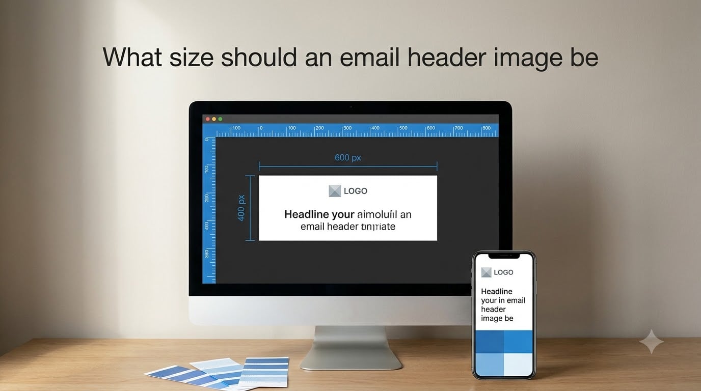
So what size should an email header image be? The short answer: aim for 600 pixels wide and 200 to 300 pixels tall for a standard email header banner. This matches the industry-standard email template width of 600px and keeps the header compact enough to stay above the fold on most devices. For full-width hero headers, you can go up to 800 to 900 pixels wide, and for retina-quality sharpness, export at double resolution (1200px wide for a 600px display slot).
In this guide, our team breaks down every dimension you need — headers, banners, logos, icons, column images, and content blocks — along with file format advice, compression targets, mobile responsiveness techniques, dark mode tips, and email-client-specific quirks. We have spent years designing and testing email templates, and everything here comes from real rendering tests across Gmail, Outlook, Apple Mail, and the major mobile clients.
Table of Contents
- Quick Answer: Email Header Image Dimensions at a Glance
- What Size Should an Email Header Image Be: Standard Dimensions Explained
- Email Header Image Size for Different Email Clients
- Mobile Email Header Dimensions and Responsive Design
- Retina and High-DPI Display: Designing Sharp Email Headers
- File Formats for Email Header Images: PNG, JPEG, GIF
- File Size Optimization for Email Headers
- Other Email Image Sizes: Logos, Icons, Column Images, Content Blocks
- Dark Mode Compatibility for Email Header Images
- Common Email Header Image Mistakes and How to Fix Them
- Email Image Accessibility Best Practices
- FAQs
- What is the ideal size for email images?
- What size should icons be in emails?
- How should images be adjusted for responsive email design?
- Why is dark mode compatibility important for email images?
- What file formats are best for email images?
- What is the standard width for email headers?
- What is the ideal height for an email header?
- What size should an email header image be for mobile?
- How do I make email header images responsive?
- What is the maximum file size for email images?
- Conclusion
Quick Answer: Email Header Image Dimensions at a Glance
Here is a quick-reference breakdown of the most common email image dimensions. Bookmark this table — it covers the numbers most people look up first.
Email header banner: 600px wide x 200–300px tall (standard), up to 900px wide for hero headers
Full-width hero image: 600–900px wide x 300–500px tall
Email logo: 200–300px wide x 100–150px tall (export at 2x for retina)
Icon images: 32–48px wide x 32–48px tall (export at 2x = 64–96px)
Two-column images: 270–290px wide each (within a 600px template)
Three-column images: 170–185px wide each
Content block image: 560–600px wide x 200–400px tall
Retina header (2x): 1200px wide x 400–600px tall for a 600px display slot
The golden rule: always design within a 600px-wide template. This is the width that renders consistently across Gmail, Outlook, Apple Mail, Yahoo, and most mobile clients. Wider templates risk horizontal scrolling or clipping, especially on older Outlook versions.
What Size Should an Email Header Image Be: Standard Dimensions Explained
The standard email header image is 600 pixels wide. This width has been the de facto industry standard for over a decade because it fits comfortably inside the preview pane of virtually every desktop and webmail client. When people ask what size an email header image should be, 600px wide is the answer that works everywhere.
Height is more flexible. Most header banners fall between 200 and 300 pixels tall, which gives you enough vertical space for a logo, headline text, or a branded background without pushing your main message below the fold. Taller headers (400–500px) work for hero-style emails where the image is the entire above-the-fold experience, but they risk hiding your call-to-action on smaller screens.
Aspect ratio matters too. A header that is 600 x 200px has a 3:1 aspect ratio — wide and short, which is ideal for logo bars and thin banner strips. A 600 x 300px header gives you a 2:1 ratio that accommodates more visual content. Stick to ratios between 2:1 and 3:1 for headers that feel balanced and professional.
The 600px Standard and Why It Exists
Email clients render HTML inside fixed-width containers. Gmail’s reading pane, Outlook’s preview window, and most webmail interfaces cap content width between 600 and 650 pixels. Designing at exactly 600px ensures your header image fills the content area edge to edge without overflowing or leaving awkward gaps.
Some modern email clients can handle wider templates — up to 700 or 750px — but supporting those widths means accepting inconsistent rendering. The safest choice remains 600px, and every major email framework (Foundation for Emails, MJML, Cerberus) defaults to this width.
Safe Zone for Header Content
Email clients add padding, sidebars, and interface elements that eat into your visible space. Keep critical content — logos, text, faces — within the center 400 to 450 pixels of your header. The outer 75–100px on each side is a “safe zone” that may get clipped on narrower screens or in clients with thicker interface chrome.
This is especially important for text inside your header image. If your headline is baked into the banner graphic, position it at least 50px from every edge. Text that sits too close to the border will get cropped on mobile devices or in smaller preview windows.
Hero Headers vs. Logo Bars
Not all headers serve the same purpose. A logo bar — a thin strip with just your logo and maybe a navigation link — typically measures 600 x 100 to 600 x 150px. A hero header with a full promotional image, headline, and CTA button often runs 600 x 400 to 600 x 500px. Choose your header height based on what it needs to accomplish, not on a one-size-fits-all number.
Email Header Image Size for Different Email Clients
Email clients do not all render images the same way. A header that looks perfect in Gmail might break in Outlook. Here is what you need to know about the major clients.
Gmail (Web, iOS, Android)
Gmail handles images well and supports responsive CSS, fluid images, and modern HTML. A 600px-wide header will display cleanly across Gmail web, iOS, and Android. Gmail automatically scales images to fit the viewing window, so your proportions stay intact. One quirk: Gmail clips messages longer than 102KB of HTML, so keep your total email size lean.
Gmail also supports WebP images as of 2026, which can reduce file size significantly compared to PNG or JPEG. If your audience is predominantly Gmail users, WebP is worth testing for header banners.
Outlook (Desktop and Web)
Outlook is the trickiest major client. The desktop versions (Outlook 2016, 2019, 2021, and Microsoft 365) use Microsoft Word’s HTML rendering engine, which ignores many CSS properties and does not support background images without VML fallback code.
For Outlook, keep header images to 600px wide maximum and avoid relying on CSS background images. Use standard <img> tags instead. Outlook also does not support rounded corners on images or CSS-based image scaling, so design with hard rectangular crops. If you need background images in Outlook, use VML (Vector Markup Language) code as a fallback.
Apple Mail (macOS and iOS)
Apple Mail has excellent CSS support and renders images beautifully, including retina-quality displays. Apple Mail supports high-DPI images natively, so serving 2x resolution headers will look crisp on MacBook Pro, iPhone, and iPad screens. Apple Mail also handles dark mode well, automatically inverting colors in some cases — so test your headers in both light and dark modes.
Yahoo Mail and Samsung Mail
Yahoo Mail and Samsung Mail render HTML email reasonably well but have some quirks with fluid images. Stick to fixed-width headers (600px) with responsive scaling via CSS, and test thoroughly. Both clients support standard <img> tags but may not handle advanced CSS backgrounds.
Mobile Email Header Dimensions and Responsive Design
Over 60% of emails are opened on mobile devices as of 2026. Your header image must look good on a 375-pixel-wide iPhone screen and a 360-pixel-wide Android screen, not just on desktop. This is where responsive design becomes essential.
For mobile, your header image needs to scale down proportionally. The most reliable technique is to set the image to a fixed width (600px) in the HTML, then use CSS to make it fluid on smaller screens:
img { max-width: 100%; height: auto; }
This tells the browser to never exceed the container width while maintaining the aspect ratio. On a 375px phone, your 600px header shrinks to 375px wide, and the height adjusts automatically.
What Size Should an Email Header Image Be for Mobile?
On mobile, your header will typically render at 320 to 414 pixels wide, depending on the device. You do not need a separate mobile-sized image — the same 600px-wide header scales down. However, you should design the header so that text and important details remain readable at 320px wide. A headline that looks fine at 600px might become illegible when shrunk by half.
A good practice: test your header at 50% scale in your image editor. If the text is still readable, it will work on mobile.
Using Media Queries for Mobile Headers
For more control, use CSS media queries to adjust the header layout on mobile. You can hide certain decorative elements, change the header height, or even swap in a mobile-optimized version of the image:
@media only screen and (max-width: 480px) { .header-img { width: 100% !important; height: auto !important; } }
Some teams create two versions of their header — a 600 x 300px desktop version and a 480 x 200px mobile version — and swap them with media queries. This ensures optimal cropping and text legibility on each device class.
The Fluid Hybrid Approach
If you want maximum compatibility without relying on media queries (which Outlook does not support), use the fluid hybrid technique. This method uses percentage-based widths and ghost tables to create layouts that adapt naturally. For header images, this means setting the image width to 100% of its container and letting the container resize based on the screen width.
Frameworks like MJML and Cerberus handle this automatically. If you are hand-coding, look into the fluid hybrid pattern for robust mobile support.
Retina and High-DPI Display: Designing Sharp Email Headers
Retina displays (Apple’s term for high-DPI screens) pack twice as many pixels into the same physical space. A header that looks sharp on a standard monitor can look fuzzy and pixelated on a MacBook Pro, iPhone, or iPad. To keep your email headers crisp, you need to design for 2x resolution.
The rule is simple: export your header image at double the display dimensions. If your header displays at 600 x 300px, create the image file at 1200 x 600px. Then set the HTML width attribute to 600px so the browser knows how much screen space to allocate. The extra pixels are used to render the image sharply on high-DPI screens, while standard screens simply downsample.
File size is the tradeoff. A 1200 x 600px PNG can be 500KB or more, which slows load times. Balance retina quality with compression — use JPEG for photographic headers at 2x, and PNG only when you need transparency or sharp text. Tools like TinyPNG, ImageOptim, and Squoosh can compress 2x images dramatically without visible quality loss.
For an extra-sharp option on the newest devices, some teams export at 3x resolution (1800 x 900px for a 600 x 300px display). This covers phones like the iPhone 15 Pro and Samsung Galaxy S24. However, 3x images are heavy — only use them when file size permits after compression.
File Formats for Email Header Images: PNG, JPEG, GIF
Choosing the right file format affects quality, file size, and compatibility. Here is how the three main formats compare for email headers.
PNG (Best for Text, Logos, and Graphics)
PNG is the go-to format for email headers that contain text, logos, or flat graphic elements. It supports transparency, which is essential for logos that sit on colored backgrounds. PNG preserves sharp edges and crisp text, making it ideal for header bars with embedded headlines.
The downside is file size. PNGs with complex imagery can balloon to 1MB or more. Use PNG-8 for simple graphics with few colors, and PNG-24 only when you need full color depth or partial transparency. Always run PNGs through a compressor before uploading.
JPEG (Best for Photos and Complex Images)
JPEG is the format of choice for photographic email headers — product shots, lifestyle images, and complex gradients. JPEG compression can reduce file sizes to a fraction of the equivalent PNG, especially for images with many colors and soft transitions.
JPEG does not support transparency, so it works best for full-bleed headers that fill the entire content area. Use a quality setting of 70–80% for a good balance of file size and visual quality. Avoid re-saving JPEGs multiple times, as each save degrades quality.
GIF (Best for Simple Animations)
GIF is the only broadly supported animated image format in email. If your header includes a simple animation — a flashing promo code, a rotating logo, or a short looping sequence — GIF is the way to go. Keep animations short (2–3 seconds) and file sizes under 1MB.
GIF supports transparency (1-bit only, so no smooth alpha edges) and a limited 256-color palette. It is not suitable for photographic content. For simple animated headers, GIF works; for anything complex, consider whether the animation is worth the file size cost.
WebP and AVIF (Emerging Formats)
WebP is now supported by Gmail, Apple Mail, and most modern clients as of 2026. It offers JPEG-like quality at 25–35% smaller file sizes. However, Outlook desktop does not support WebP, so include a JPEG fallback if you use it. AVIF offers even better compression but has limited email client support and is not yet recommended for production email.
Recommendation: Use PNG for headers with text or transparency, JPEG for photographic headers, and GIF only for simple animations. Test WebP with a JPEG fallback if file size is a priority and your audience skews toward Gmail and Apple Mail.
File Size Optimization for Email Headers
Image file size directly affects email load time, and slow-loading emails hurt engagement. Studies show that emails taking more than 2 seconds to load see significantly lower click-through rates. Here is how to keep your header images lean.
What Is the Maximum File Size for Email Images?
The recommended maximum for any single email image is 1MB, and ideally under 200KB. For a header banner, aim for 70–150KB. Total email weight (HTML plus all images) should stay under 102KB to avoid Gmail’s clipping behavior, though in practice most well-designed emails run 200–500KB total.
If your header image exceeds 200KB, compress it further or simplify the design. Photographic headers in JPEG at 70% quality will typically land in the 80–120KB range at 600 x 300px.
Compression Tools and Techniques
Several tools make compression straightforward:
TinyPNG / TinyJPG: Browser-based, excellent for PNG and JPEG. Reduces file size 50–80% with minimal quality loss.
Squoosh: Google’s free tool. Offers fine-grained control over quality, format, and resize settings.
ImageOptim: macOS app that strips metadata and applies lossless compression.
ShortPixel or EWWW Image Optimizer: WordPress plugins that compress images automatically during upload.
The general workflow: export at 2x resolution for retina, then compress until visible quality starts to degrade. Back off slightly from that point. This gives you the smallest file that still looks professional.
Why File Size Matters for Deliverability
Large images do not just slow load times — they can affect deliverability. Some spam filters flag emails with oversized images as suspicious. Heavy emails may also trigger Gmail’s clipping (the “message clipped” notice), which hides your content and tracking pixel. Keeping images under 1MB each and the total email under 500KB helps ensure your messages reach the inbox and display fully.
Other Email Image Sizes: Logos, Icons, Column Images, Content Blocks
Headers are just one part of your email. Here are the recommended dimensions for every other common email image type.
Email Logo Size
Your logo typically sits in the header area and should be 200–300px wide and 100–150px tall. Export at 2x (400–600px wide) for retina sharpness. Keep the logo file under 50KB — it is usually a simple graphic, so aggressive compression should not hurt quality. PNG is the best format for logos because it preserves sharp edges and supports transparency.
Icon Size in Emails
Icons (social media icons, bullet-point icons, feature icons) should be 32–48px in display size. Export at 2x (64–96px) for retina. Keep icons consistent in size throughout your email — mixing 32px and 48px icons in the same row looks unprofessional. Use PNG for crisp edges, and keep each icon file under 10KB.
Column Images (Two-Column and Three-Column Layouts)
For a two-column layout within a 600px template, each image should be 270–290px wide. This leaves room for padding and gutters between columns. For a three-column layout, aim for 170–185px wide per image. Match the height across all columns for a clean, aligned look.
On mobile, columns stack vertically. Each column image then displays at the full 600px container width (scaling down to 320–414px on phone screens). Make sure your images look good both in their desktop column size and when stretched to full width on mobile.
Content Block Images
Content blocks — the main image areas between your header and footer — typically span the full template width. Recommended dimensions: 560–600px wide and 200–400px tall. For product spotlights or feature highlights, a 600 x 400px image gives you enough space to show a product in context. Keep text overlays within the safe zone (center 400–450px).
Footer Images and Social Icons
Footer social icons follow the same 32–48px rule as other icons. If your footer includes a banner image (such as a trust badge row or an award strip), size it to 400–600px wide and 50–100px tall. Keep footer images subtle and lightweight — they are the last thing subscribers see, not the focal point.
Dark Mode Compatibility for Email Header Images
Dark mode is now used by a significant portion of email subscribers. Apple Mail, Outlook, and Gmail all offer dark mode options that can change how your header images appear — sometimes dramatically.
The biggest issue is logos and graphics designed for light backgrounds. A logo with white text on a transparent PNG background will become invisible when dark mode inverts the background to black. To handle this, create two versions of your logo: one for light mode and one for dark mode. Use CSS media queries to swap between them based on the user’s color scheme preference.
For header banners with photographic backgrounds, dark mode typically does not cause problems because the image itself provides the background. However, test your headers in both modes to be sure. Avoid relying on CSS background colors behind transparent PNGs, as some dark mode implementations will invert those colors unexpectedly.
Best practice: add a subtle outline or shadow to logos and text-only graphics so they remain visible on both light and dark backgrounds. This simple step prevents the “invisible logo” problem without requiring complex CSS swaps.
Common Email Header Image Mistakes and How to Fix Them
Even experienced designers run into email image issues. Here are the most common problems and their solutions.
Mistake 1: Header Image Is Blurry or Pixelated
This almost always means the image resolution is too low for the display size or the user’s screen. Fix it by exporting at 2x resolution (1200px wide for a 600px display slot) and compressing the larger file. The result will be crisp on both standard and retina screens.
Mistake 2: Header Image Is Stretched or Distorted
Stretching happens when the HTML width and height attributes do not match the image’s natural aspect ratio. Always set width and height attributes that match the image’s proportions, or use height: auto with a fixed width. Never force an image into dimensions that distort it.
Mistake 3: Header Is Cropped on One Side
This occurs when the image is wider than the email template or when Outlook’s rendering engine clips content. Keep headers to 600px maximum width and place critical content within the center 400–450px safe zone. Test in Outlook specifically, as it is the most likely to crop.
Mistake 4: Background Image Does Not Show in Outlook
Outlook desktop does not support CSS background images. If your header design relies on a background image, add VML (Vector Markup Language) code as a fallback. Alternatively, use a standard <img> tag inside a table cell instead of a CSS background.
Mistake 5: Image File Is Too Large and Email Loads Slowly
Run every header image through a compressor before uploading. Aim for under 150KB per header. If your image is still large after compression, reduce the dimensions or simplify the design (fewer colors, less photographic detail).
Mistake 6: Broken Image Icons Appearing
Broken images usually mean the image URL is incorrect, the hosting server is down, or the image format is not supported by the client. Always use absolute URLs (starting with https://), host images on a reliable CDN, and stick to universally supported formats (PNG, JPEG, GIF).
Email Image Accessibility Best Practices
Accessibility in email is often overlooked, but it matters for both inclusivity and deliverability. Screen readers used by visually impaired subscribers rely on alt text to describe images. Without it, your header image is invisible to them.
Every header image should have descriptive alt text that conveys the image’s purpose. For a promotional header, the alt text might read “Summer Sale — 40% off all outdoor gear.” For a logo, use your brand name. Avoid generic alt text like “header image” or “banner” — describe what the image actually communicates.
Color contrast matters too. If your header includes text baked into the image, ensure the text-to-background contrast ratio meets WCAG AA standards (at least 4.5:1 for normal text). Low-contrast text is hard to read for users with visual impairments and looks unprofessional on dim screens.
Finally, avoid using images as the sole method of conveying important information. If your header contains a critical announcement or CTA, include that information as live HTML text elsewhere in the email. Some subscribers disable images by default, and they should still understand your message.
FAQs
What is the ideal size for email images?
The ideal size for most email images is 600 pixels wide, matching the standard email template width. Header banners should be 600px wide and 200–300px tall, while content images range from 200–400px tall depending on layout. Always export at 2x resolution for retina displays and compress to under 150KB per image.
What size should icons be in emails?
Email icons should be 32–48 pixels in display size. Export them at 2x resolution (64–96px) for crisp rendering on retina and high-DPI screens. Keep all icons in the same row at a consistent size for a clean, professional appearance.
How should images be adjusted for responsive email design?
Use CSS to set images to max-width: 100% with height: auto so they scale proportionally within their container. For more control, use media queries that adjust image dimensions and layout at breakpoints like 480px. The fluid hybrid approach works well for clients that do not support media queries.
Why is dark mode compatibility important for email images?
Dark mode can invert background colors, making logos and graphics designed for light backgrounds invisible. Create separate light and dark versions of logos, add subtle outlines to text-based graphics, and test all header images in both modes to ensure they remain visible and legible.
What file formats are best for email images?
PNG is best for text, logos, and graphics with transparency. JPEG is ideal for photographic images and complex gradients due to its efficient compression. GIF works for simple animations but has a limited color palette. WebP is supported by Gmail and Apple Mail but needs a JPEG fallback for Outlook.
What is the standard width for email headers?
The standard width for email headers is 600 pixels. This width renders consistently across Gmail, Outlook, Apple Mail, Yahoo, and mobile clients. Designing at 600px ensures your header fills the content area without overflowing or causing horizontal scrolling.
What is the ideal height for an email header?
The ideal height for a standard email header is 200–300 pixels, giving you space for a logo and headline without pushing content below the fold. Hero-style headers can be 400–500px tall. Keep the aspect ratio between 2:1 and 3:1 for a balanced look.
What size should an email header image be for mobile?
You do not need a separate mobile image — your 600px header scales down automatically with responsive CSS. On mobile it will render at 320–414px wide. Design the header so text and details remain readable at half scale, and use media queries to adjust layout if needed.
How do I make email header images responsive?
Set the image to max-width: 100% and height: auto in your CSS so it scales with the container. Use media queries to adjust sizing at mobile breakpoints. For best results, use a framework like MJML or Cerberus that handles responsive image sizing automatically across all email clients.
What is the maximum file size for email images?
Keep individual images under 1MB and ideally under 200KB. Header banners should target 70–150KB. Total email weight should stay under 102KB to avoid Gmail clipping, though most emails run 200–500KB total. Compress images using tools like TinyPNG, Squoosh, or ImageOptim before uploading.
Conclusion
Getting email header image sizing right comes down to a few core principles. Design within the 600-pixel standard template width. Keep header heights between 200 and 300 pixels for standard banners, or up to 500px for hero-style headers. Export at 2x resolution for retina sharpness, compress aggressively to stay under 150KB, and test across Gmail, Outlook, and Apple Mail before sending.
Understanding what size an email header image should be is the foundation of professional email design. From there, responsive scaling handles mobile, proper file formats ensure quality, and accessibility practices make your emails work for every subscriber. Use the dimension reference in this guide as your starting point, and always test your final email in real clients before hitting send.
Start with a 600 x 300px header at 2x resolution, compress it to under 100KB, and you will be ahead of most email campaigns out there. The rest is iteration — test, measure, and refine based on how your subscribers actually open and read your messages.