
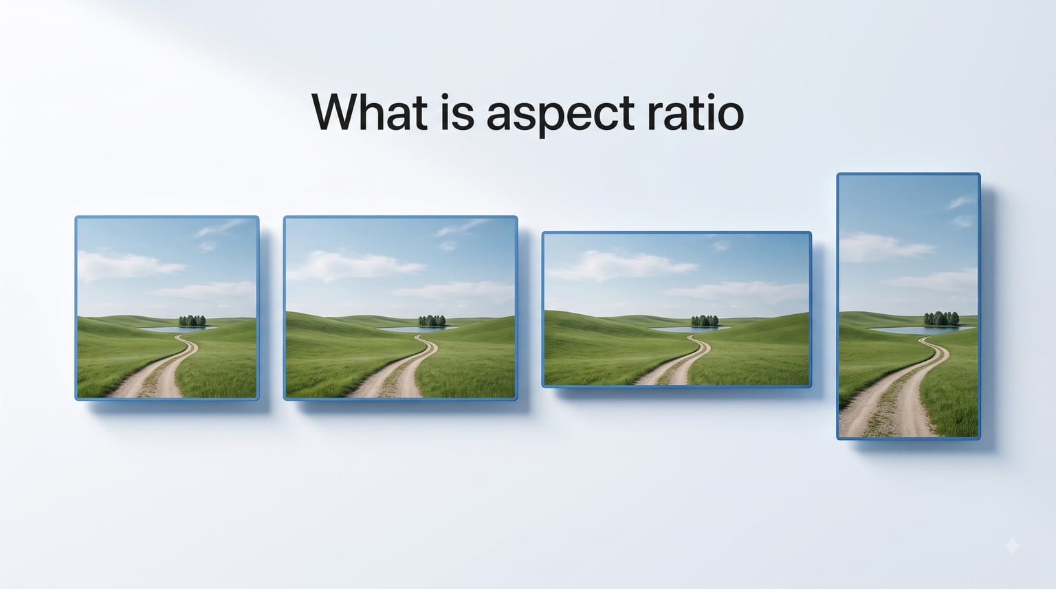
Aspect ratio is the proportional relationship between an width and height of an image, video, or screen, expressed as two numbers separated by a colon, such as 16:9. When you ask what is aspect ratio, the answer comes down to one thing: it describes shape, not size. A 16:9 rectangle and a 4:3 rectangle can both be large or small, but they look different because their proportions differ.
Our team put this guide together because the concept trips up a lot of people. Photographers, video editors, web designers, and social media creators all run into aspect ratio questions daily. Getting it wrong means stretched images, awkward crops, or those annoying black bars on your videos.
In this article, we will break down what aspect ratio means in plain English, walk through every common ratio with real examples, and explain exactly how to pick the right one for your next project.
Table of Contents
- What Is Aspect Ratio? A Simple Definition
- How to Read Aspect Ratio Numbers
- Common Aspect Ratios Explained
- Aspect Ratio vs Resolution: What Is the Difference
- Aspect Ratios for Photography, Video, and Social Media
- Aspect Ratio for Website Headers and Banners
- Why You See Black Bars (Letterboxing and Pillarboxing)
- How to Choose the Right Aspect Ratio
- FAQs
- Conclusion
What Is Aspect Ratio? A Simple Definition
Aspect ratio is the ratio of an image’s width to its height. That is the whole definition. If you think of a rectangle, the aspect ratio tells you how wide it is compared to how tall it is. Nothing more, nothing less.
Here is a simple analogy. Imagine a picture frame. If the frame is 16 inches wide and 9 inches tall, its aspect ratio is 16:9. If you shrink that frame down to 16 centimeters wide and 9 centimeters tall, the aspect ratio stays 16:9. The ratio does not care about actual measurements. It only cares about the relationship between width and height.
The format is always written as width:height. The first number is always the width. The second number is always the height. So 16:9 means 16 units of width for every 9 units of height. Those units can be pixels, inches, centimeters, or anything else. The ratio remains the same regardless.
This is why aspect ratio is sometimes called image proportions or the width height ratio. All three terms describe the same concept. And understanding this single idea unlocks better photography, cleaner web design, and frustration-free video.
How to Read Aspect Ratio Numbers
Reading aspect ratio numbers is straightforward once you know the pattern. The notation uses two numbers with a colon in between. The first number represents width, and the second represents height.
Take 3:2 as an example. This means the image is 3 units wide for every 2 units of height. If you double the size to 6 units wide and 4 units tall, the ratio is still 3:2. You can multiply both numbers by any factor, and the shape does not change.
You will also see aspect ratios written in decimal form, especially in cinema. Instead of 16:9, a filmmaker might say 1.78:1, meaning the width is 1.78 times the height. This is the same ratio expressed differently. IMAX uses 1.43:1, standard widescreen cinema uses 2.39:1, and standard TV uses 1.78:1 (which is 16:9 simplified).
Some ratios get reduced to their simplest form. For example, 1920:1080 reduces to 16:9 because 1920 divided by 120 equals 16 and 1080 divided by 120 equals 9. The ratio is what matters, not the raw numbers.
Common Aspect Ratios Explained
Six aspect ratios cover almost everything you will encounter in photography, video, web design, and social media. Here is each one explained with where you will see it used.
1:1 (Square): The width equals the height. This ratio is the classic Instagram square format. It works well for profile pictures, product shots, and any composition where symmetry matters. A typical 1:1 image is 1080×1080 pixels.
4:3 (Standard): This was the television standard for decades before widescreen took over. It is slightly wider than square. You will still find it on older monitors, in classic video games, and on some digital cameras. A common 4:3 resolution is 1024×768 pixels.
3:2 (Photography Standard): Most DSLR and mirrorless cameras shoot in this ratio by default. It is based on the traditional 35mm film frame. A full-resolution 3:2 photo might be 6000×4000 pixels. This ratio gives photographers a nice balance between width and height for prints and editing flexibility.
16:9 (Widescreen): This is the dominant aspect ratio for modern TVs, computer monitors, YouTube videos, and laptop screens. It is wider than it is tall, making it ideal for horizontal video content. The most common 16:9 resolution is 1920×1080 (Full HD).
21:9 (Ultrawide): This is the cinematic widescreen format. You will see it on ultrawide gaming monitors and in theaters. It creates an immersive viewing experience with a much wider field of view. A typical ultrawide resolution is 2560×1080 or 3440×1440 pixels.
9:16 (Vertical): This is 16:9 flipped on its side. It is the ratio for vertical video on TikTok, Instagram Reels, YouTube Shorts, and Snapchat. A standard 9:16 video is 1080×1920 pixels. Vertical video has become massive as mobile-first content dominates social platforms.
Here is a quick comparison table showing the most common ratios side by side:
| Aspect Ratio | Shape | Common Resolution | Primary Use |
|---|---|---|---|
| 1:1 | Square | 1080×1080 | Instagram posts, profile images |
| 4:3 | Standard | 1024×768 | Classic TV, retro gaming |
| 3:2 | Photography | 6000×4000 | DSLR photos, 35mm film |
| 16:9 | Widescreen | 1920×1080 | YouTube, TV, laptops |
| 21:9 | Ultrawide | 3440×1440 | Cinema, gaming monitors |
| 9:16 | Vertical | 1080×1920 | TikTok, Reels, Shorts |
Aspect Ratio vs Resolution: What Is the Difference
This is one of the most common sources of confusion. Aspect ratio and resolution are related but they are not the same thing. Aspect ratio describes shape. Resolution describes size in pixels.
Think of it this way. Aspect ratio is the recipe, and resolution is the serving size. Two images can have the same aspect ratio but completely different resolutions. A 16:9 image could be 1920×1080 pixels (Full HD), 1280×720 pixels (HD), or 3840×2160 pixels (4K). All three share the 16:9 shape but contain different amounts of detail.
Many people ask what the aspect ratio of 1920×1080 is. The answer is 16:9. You can calculate it by dividing 1920 by 1080, which gives 1.78. That decimal matches the 16:9 ratio (16 divided by 9 equals 1.78). The same calculation works for any resolution. Divide width by height, and you get the aspect ratio in decimal form.
The key takeaway: resolution determines how sharp and detailed an image is, while aspect ratio determines what shape it is. You can change resolution without changing aspect ratio, and you can change aspect ratio by cropping without necessarily changing the pixel count.
Aspect Ratios for Photography, Video, and Social Media
Different platforms and media types have specific aspect ratio requirements. Using the wrong one leads to automatic cropping, stretched images, or letterboxing. Here is a breakdown of what to use where.
Photography Aspect Ratios
Most digital cameras default to 3:2, inherited from 35mm film. This ratio works well for prints and gives you room to crop later. Some cameras, particularly Micro Four Thirds models, shoot in 4:3 natively. Smartphone cameras typically capture in 4:3 as well.
When printing, standard photo sizes follow specific ratios. A 4×6 print is 3:2. A 5×7 print is roughly 7:5. An 8×10 print is 5:4. Knowing these helps you compose shots that will not need heavy cropping at print time.
Video and Cinema Aspect Ratios
Standard video for YouTube, television, and streaming is 16:9. This has been the broadcast standard since the transition from analog to digital TV. Most cameras and smartphones shoot video in this ratio by default.
Cinema uses wider ratios for a more immersive feel. Theatrical releases often use 2.39:1 (also called Cinemascope or anamorphic widescreen). IMAX films use 1.43:1 or 1.90:1, which is taller and fills more of your vertical vision. Filmmakers like Christopher Nolan and Denis Villeneuve are known for switching between these ratios within a single film to create different emotional effects.
Social Media Aspect Ratios
Each social platform has its own preferred ratios. Here is a quick reference:
Instagram Feed: 1:1 (square) or 4:5 (portrait)
Instagram Stories and Reels: 9:16 (vertical)
YouTube Videos: 16:9 (widescreen)
YouTube Shorts: 9:16 (vertical)
TikTok: 9:16 (vertical)
Facebook Feed: 1:1 or 4:5
LinkedIn: 1.91:1 for link previews, 1:1 for posts
Twitter/X: 16:9 for images, 1:1 for profile photos
Posting a horizontal 16:9 video to TikTok or Reels means it will appear small with large black bars above and below. The platform wants 9:16 vertical content to fill the phone screen. Always check the current platform specs before exporting your content.
Aspect Ratio for Website Headers and Banners
Website headers and banners have their own aspect ratio considerations. Since our focus at Free Web Headers is helping you build better websites, this section deserves special attention.
Most full-width website headers use a wide aspect ratio. The most common header dimensions fall between 16:4 and 16:5, which is significantly wider than standard 16:9. A typical banner header might be 1920×500 pixels or 1920×600 pixels. This creates a slim, cinematic strip across the top of a page.
For hero images and landing page banners, 16:9 or 3:1 work well depending on your design. A 3:1 banner (like 1500×500 pixels) is popular for Twitter headers and slim website banners. Wider ratios like 21:9 can create dramatic full-bleed hero sections on modern websites.
The challenge with web headers is responsive design. A header that looks perfect on a desktop monitor may need to crop dramatically on a mobile phone. Many sites solve this by using two different header images: a wide version for desktop and a taller version for mobile. This ensures your header always looks intentional rather than awkwardly cropped.
When designing web headers, keep key content like text and logos centered. If the header gets cropped on different screen sizes, important elements stay visible. Avoid placing critical information near the edges where it might get cut off on narrower screens.
Why You See Black Bars (Letterboxing and Pillarboxing)
Those black bars on your screen are a direct result of mismatched aspect ratios. When the content ratio does not match the display ratio, something has to give.
Letterboxing is when you see horizontal black bars above and below the image. This happens when you play a wider video (like a 2.39:1 movie) on a narrower screen (like a 16:9 TV). The video keeps its original shape, and the empty space above and below fills with black bars.
Pillarboxing is the opposite. You see vertical black bars on the left and right sides. This happens when you play older 4:3 content on a modern 16:9 screen. The image is narrower than the display, so the sides stay empty.
The alternative to black bars is cropping or stretching. Cropping removes part of the image to fill the screen, which can cut off important content. Stretching distorts the image, making people look too wide or too tall. Neither option looks good, which is why most platforms default to showing black bars instead.
How to Choose the Right Aspect Ratio
Choosing the right aspect ratio comes down to three questions. Where will this content be displayed? What is the purpose? Who is the audience?
For social media, match the platform. Instagram Reels need 9:16. YouTube needs 16:9. Square posts work for Instagram feeds. When in doubt, check the platform’s current specifications, as they update frequently.
For web design, think about your layout. Full-width headers need wide ratios. Sidebar banners need narrow ones. Hero sections often work best in 16:9 or wider. Always consider how the image will look on both desktop and mobile.
For photography, start with your camera’s native ratio and crop if needed. Most DSLR cameras shoot in 3:2, which gives flexibility. If you know the final destination (like a specific print size or social platform), compose your shot with that ratio in mind from the start.
For video, consider where people will watch. Horizontal video (16:9) suits YouTube and television. Vertical video (9:16) suits mobile-first platforms like TikTok and Instagram Reels. If you need both, shoot in a way that works for both orientations, keeping important subjects centered.
When converting between ratios, use cropping rather than stretching. Cropping preserves the quality and proportions of your content. Stretching always looks unnatural. Most photo and video editors make cropping to specific ratios straightforward with preset options.
FAQs
What is the aspect ratio of 1920×1080?
The aspect ratio of 1920×1080 is 16:9. You can calculate this by dividing the width by the height (1920 divided by 1080 equals 1.78), which matches the 16:9 ratio. This is the standard widescreen format used for Full HD TVs, YouTube videos, and most computer monitors.
What is the difference between 4:3 and 16:9 aspect ratio?
The 4:3 aspect ratio is nearly square, with 4 units of width for every 3 units of height. The 16:9 aspect ratio is significantly wider, with 16 units of width for every 9 units of height. 4:3 was the standard for older televisions and monitors, while 16:9 is the current standard for modern TVs, laptops, and online video.
What aspect ratio is best?
There is no single best aspect ratio. The right choice depends on where your content will be displayed. For YouTube and TV, 16:9 is standard. For Instagram feed posts, 1:1 or 4:5 works best. For TikTok and Reels, use 9:16. For photography, 3:2 gives the most flexibility. Always match the ratio to the platform.
What is aspect ratio on TV?
Aspect ratio on TV refers to the proportional shape of the picture displayed on your screen. Modern TVs use a 16:9 widescreen ratio, meaning the screen is 16 units wide for every 9 units tall. Older TVs used 4:3. When you watch content filmed in a different ratio, you may see black bars as the TV adjusts to show the full picture without distortion.
How do I calculate aspect ratio?
To calculate aspect ratio, divide the width by the height. For example, 1920 divided by 1080 equals 1.78, which corresponds to 16:9. To express it as a ratio, find the simplest whole numbers that match. You can also use the formula Aspect Ratio equals Width divided by Height. Online aspect ratio calculators can do this automatically if you enter your dimensions.
Conclusion
Understanding what is aspect ratio comes down to one simple idea: it is the proportional relationship between width and height, written as two numbers separated by a colon. Whether you are shooting photos, editing videos, designing website headers, or posting on social media, the right aspect ratio makes your content look polished and professional.
Remember the key points. Aspect ratio describes shape, not size. Resolution describes pixel count. The six most common ratios (1:1, 4:3, 3:2, 16:9, 21:9, and 9:16) cover almost every use case you will encounter. Always match your ratio to the platform where your content will live, and crop rather than stretch when you need to convert between formats.
Now that you know how aspect ratio works, take a look at your next project with fresh eyes. Check your platform specs before you export, compose your shots with the final ratio in mind, and say goodbye to stretched images and surprise black bars for good.