
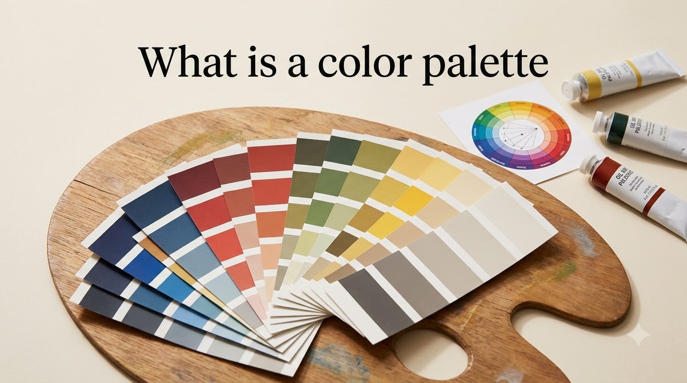
A color palette is a curated set of colors selected to be used together in design, art, fashion, or digital media to create visual harmony and convey a specific mood, message, or brand identity. In plain terms, it is your go-to list of colors that work well as a team, so your website, logo, painting, or outfit looks intentional instead of accidental.
I have spent years building palettes for client brands, and I still get a small thrill every time a group of colors clicks into place. In this guide, I will walk you through what a color palette really is, where the idea came from, the six main palette types, and how to build your own from scratch. By the end, you will know exactly how to choose colors that look professional and feel right for your project.
Table of Contents
- What Is a Color Palette? A Clear Definition
- The History of Color Palettes: From Wood Panels to Pixels
- Color Theory Basics Every Designer Should Know
- Six Types of Color Palettes (With Examples)
- How to Create a Color Palette in 5 Steps
- The 60-30-10 Rule: A Practical Formula for Balance
- Color Psychology: What Colors Communicate
- Accessibility and Color Contrast: Designing for Everyone
- Best Tools for Building and Exploring Color Palettes
- Color Palette Examples Across Industries
- Frequently Asked Questions
- Final Thoughts on Building a Color Palette That Works
What Is a Color Palette? A Clear Definition
A color palette is a defined set of colors selected to be used together in a design system, brand identity, or product. Designers, artists, and developers use a palette to keep every visual element consistent, from background fills and text to illustrations and icons.
The term covers three slightly different meanings depending on the context. In art, it refers to the range of colors a painter uses in a single piece or across their body of work. In design and branding, it is the official set of colors a company uses across logos, websites, packaging, and ads. In computing, it is the range of colors a system or image can display, often expressed in hex codes or RGB values.
You will sometimes see the words “color palette” and “color scheme” used interchangeably, but they are not identical. A color palette is the full set of colors available to you. A color scheme is the specific selection you actually apply within that palette. Think of the palette as your toolbox and the scheme as the tools you grab for today’s job.
The History of Color Palettes: From Wood Panels to Pixels
The word “palette” originally described a physical wooden board or tablet an artist held in one hand while painting. Classical painters like Rembrandt and Vermeer mixed their paints on these oval or rectangular boards, and the limited surface forced them to work with small, intentional color choices.
By the 19th century, the Impressionists and the Pre-Raphaelites pushed the idea further. Painters such as Monet and Van Gogh became known for signature color palettes that made their work instantly recognizable, even from across a gallery. Van Gogh’s swirling blues and yellows, for example, are a kind of palette you can identify without seeing his signature.
The industrial age brought the Pantone Matching System in 1963, which gave the world a shared language for color reproduction. Print designers, manufacturers, and advertisers could finally agree that “PMS 185” was the same exact red everywhere. This was the first time a color palette became a global standard rather than a personal choice.
The digital revolution in the 1990s introduced RGB values, hex codes, and software palettes inside tools like Photoshop. Today, a color palette is as likely to live in a Figma file or CSS variable as on a wooden board, but the core idea is the same: a curated group of colors that work together with purpose.
Color Theory Basics Every Designer Should Know
Before you can pick a great palette, you need to understand the building blocks of color. Three terms come up constantly: hue, saturation, and brightness.
Hue is the basic color family, red, blue, green, yellow, purple, and so on. It is what most people mean when they say “color.” Saturation (also called chroma) is the intensity or purity of that hue. A highly saturated red is vivid and bold, while a desaturated red looks dusty and muted. Brightness (or value) is how light or dark the color appears.
From these three properties, designers create three useful variations. A tint is a hue mixed with white, which lightens it. A shade is a hue mixed with black, which darkens it. A tone is a hue mixed with gray, which mutes it. Knowing the difference between tints, shades, and tones is what lets you build a palette with depth instead of one flat color repeated everywhere.
The color wheel ties this all together. It arranges hues in a circle so you can see relationships at a glance. Warm colors (reds, oranges, yellows) sit on one side, cool colors (blues, greens, purples) sit on the other. The wheel is the map you will use to navigate the six main palette types in the next section.
Six Types of Color Palettes (With Examples)
Most palettes fall into one of six categories based on how colors relate to each other on the color wheel. Each type produces a different mood, and each works better in some contexts than others.
Monochromatic Color Palette
A monochromatic palette uses one hue in multiple tints, shades, and tones. Imagine a deep navy (#1B2A4E), a mid blue (#3D5A80), and a soft sky (#E0FBFC). The result feels calm, elegant, and unified, which is why luxury brands and minimalist websites love it. The downside is that it can feel flat if you do not lean hard on contrast.
Analogous Color Palette
An analogous palette picks three to five colors that sit next to each other on the color wheel, like teal (#008080), green (#00A86B), and yellow-green (#BFD641). Because the hues share undertones, the result feels harmonious and natural, perfect for nature-inspired brands, wellness products, and editorial layouts.
Complementary Color Palette
A complementary palette uses two colors directly opposite each other on the wheel, such as blue (#2E86AB) and orange (#F18F01). The high contrast creates energy and draws the eye, which is why you see it on call-to-action buttons and sports branding. The trick is to let one color dominate and use the other as a sharp accent.
Split-Complementary Color Palette
A split-complementary palette takes a base color and pairs it with the two colors that sit next to its opposite. If you start with violet (#6A0572), your pairings might be yellow-green (#9DCD5A) and yellow-orange (#F7B538). You get the contrast of complementary schemes without the harshness, which gives you more room to breathe.
Triadic Color Palette
A triadic palette uses three colors evenly spaced around the wheel, like red (#E63946), blue (#1D3557), and yellow (#F1FAEE). Triads feel playful and balanced, and they show up a lot in children’s products, educational platforms, and bold editorial design. Pick one color as your lead and use the other two as accents.
Square and Tetradic Color Palette
A square palette uses four colors spaced evenly around the wheel, while a tetradic palette uses two complementary pairs. Think purple (#845EC2), green (#00C9A7), orange (#FF6F91), and yellow (#FFC75F). These rich combinations offer more variety than a triad, but they are harder to balance, so reserve them for projects where you want a vibrant, complex feel.
How to Create a Color Palette in 5 Steps
Building a palette does not require a design degree. I use the same five-step process whether I am branding a startup or refreshing my own blog, and you can borrow it too.
Step 1: Define Your Mood and Goal
Before you pick a single color, write down how you want your audience to feel. Calm and trustworthy? Bold and exciting? Playful and creative? Two or three emotion words will guide every choice that follows. If you skip this step, you will end up choosing colors that look pretty but do not fit your message.
Step 2: Pick a Base Color
Choose one anchor color that captures your mood. This will be your dominant brand color, the one that shows up on your logo and primary buttons. Pull it from your mood words, an existing brand asset, or a single inspiration image.
Step 3: Build With the Color Wheel
Open a color wheel tool and test relationships around your base color. Try a complementary, analogous, or triadic setup and see what feels right. Aim for three to five working colors total, plus a neutral like white, black, or gray.
Step 4: Apply the 60-30-10 Rule
Split your usage so 60 percent of the design uses your dominant color, 30 percent uses a secondary color, and 10 percent uses a sharp accent. This ratio gives your design balance without feeling busy, and it works whether you are dressing a website, a room, or an outfit.
Step 5: Test Across Mediums
Look at your palette on a phone screen, a laptop, in print, and against a photo background. Colors shift depending on the medium, and what looks balanced on your monitor may feel harsh in print. Testing early saves you from redesigning later. If you are working on a social media header, our guide to LinkedIn banner safe zones shows how creating a cohesive color palette matters for cross-platform consistency.
The 60-30-10 Rule: A Practical Formula for Balance
The 60-30-10 rule is a decoration classic that designers borrowed from interior design. It is a ratio, not a rule carved in stone, and it works because it matches how the human eye likes to take in a scene.
Your dominant color covers about 60 percent of the space, usually backgrounds and large surfaces. Your secondary color fills about 30 percent, often subheadings, sidebars, and supporting graphics. Your accent color takes the final 10 percent and sits on call-to-action buttons, links, and small highlights. That accent is what pulls a viewer’s eye exactly where you want it.
When you ignore the ratio, designs feel off in ways people cannot always name. Too many accent colors fight for attention. Too much of one flat shade feels sterile. Stick to the ratio and your work will instantly feel more polished.
Color Psychology: What Colors Communicate
Colors carry meaning, and your audience will react to those meanings whether you planned for it or not. This is color psychology, and it is why a finance brand rarely chooses bright pink and a children’s bakery rarely picks corporate gray.
In Western design, red signals energy, urgency, and passion, which is why it dominates fast food and clearance sales. Blue communicates trust, calm, and stability, which is why banks and tech companies lean on it. Green ties to nature, growth, and health. Yellow feels optimistic and attention-grabbing. Purple suggests luxury, creativity, and wisdom. Black reads as sophisticated and powerful. White feels clean, simple, and modern.
These meanings are not universal. In China, red signals luck and celebration. In parts of the Middle East, white is tied to mourning. In South Africa, red can mean grief. If your audience is global, treat these meanings as starting points, not defaults, and research the cultures you serve before locking in a palette.
The safest move is to match your color psychology to your message. If you sell eco-friendly products, lean into greens and earth tones. If you offer luxury services, deep purples and blacks will reinforce what you are already saying with your words.
Accessibility and Color Contrast: Designing for Everyone
A color palette is not finished until you have checked it for accessibility. Roughly one in twelve men and one in two hundred women has some form of color vision deficiency, and low-contrast designs lock them out of your content.
The standard measurement is the contrast ratio, a number from 1 to 21 that compares the relative luminance of two colors. The Web Content Accessibility Guidelines (WCAG) require at least a 4.5:1 ratio for normal body text and 3:1 for large text to meet AA standards. AAA, the stricter tier, asks for 7:1 for body text.
You do not have to memorize these numbers. Free tools like the WebAIM Contrast Checker let you paste two hex codes and instantly see if your pair passes. Always run your main text and background combinations through a checker before you ship a design, and never rely on color alone to convey meaning. Add icons, underlines, or labels so users who cannot distinguish your hues still get the message.
Best Tools for Building and Exploring Color Palettes
The good news is you do not need to build a palette from scratch. A small set of free tools will do the heavy lifting and let you focus on choice rather than math.
Coolors.co is the fastest palette generator I have used. Press the spacebar and it cycles through random combinations until you find one that clicks. Adobe Color lets you build palettes from the color wheel and extract palettes from uploaded photos. Colormind.io generates palettes based on existing photography, which is great for moody, editorial looks.
For developers, Figmatic Tokens, Style Dictionary, and the built-in CSS variables in your design system turn your palette into reusable code. For designers, Figma and Sketch both support shared color libraries so every teammate pulls from the same source. Pick one tool, save your final hex codes there, and use it as the single source of truth.
Color Palette Examples Across Industries
Seeing real palettes in context makes the theory stick. Here are three quick examples with hex codes you can borrow or adapt.
A web design palette for a fintech app might use a trustworthy navy (#0A2540) as the dominant shade, a softer slate (#3A4F66) for cards and secondary surfaces, and a bright cyan (#00D4FF) reserved for action buttons. The result reads professional, but the cyan adds a spark of personality.
A branding palette for a wellness brand could lean fully analogous: sage green (#9CAF88), cream (#F5EFE6), and warm terracotta (#C97B63). Together they feel grounded, natural, and inviting, which is exactly what the brand wants to communicate.
An art and illustration palette for a children’s book might go triadic with cherry red (#E63946), sunny yellow (#F1C40F), and ocean blue (#3498DB). High contrast keeps the illustrations readable from a parent’s arms, and the trio feels joyful without being chaotic.
Frequently Asked Questions
What is the meaning of color palette?
A color palette is a curated set of colors chosen to work together in a design, brand, artwork, or digital product. It defines which colors you are allowed to use so every visual element feels consistent and intentional.
What is an example of a color palette?
A simple example is a brand palette with three colors: a deep navy (#1B2A4E), a soft sky blue (#E0FBFC), and a warm coral accent (#F18F01). Together they cover backgrounds, text, and highlights for a website or logo system.
What are the four types of color palettes?
The four most common palette types are monochromatic (one hue in many shades), analogous (neighboring hues on the wheel), complementary (opposite hues), and triadic (three evenly spaced hues). Designers also use split-complementary and tetradic schemes as variations.
What is the meaning of hue in a color palette?
Hue is the base color family, like red, blue, or green. It is the part of color that changes when you move around the color wheel. Saturation and brightness then adjust how vivid, muted, light, or dark that hue appears in your final palette.
Final Thoughts on Building a Color Palette That Works
A color palette is more than a list of pretty swatches. It is a decision-making tool that keeps your work consistent, helps your audience feel the right emotions, and saves you hours of guessing on every new design. Start with your mood, pick a base hue, build out a balanced set of three to five colors, and test the result for accessibility.
Once you have your palette, save it somewhere central, document the hex codes, and reuse it everywhere. The whole point of a color palette is that it does the hard work for you so you can focus on the rest of your creative decisions.