
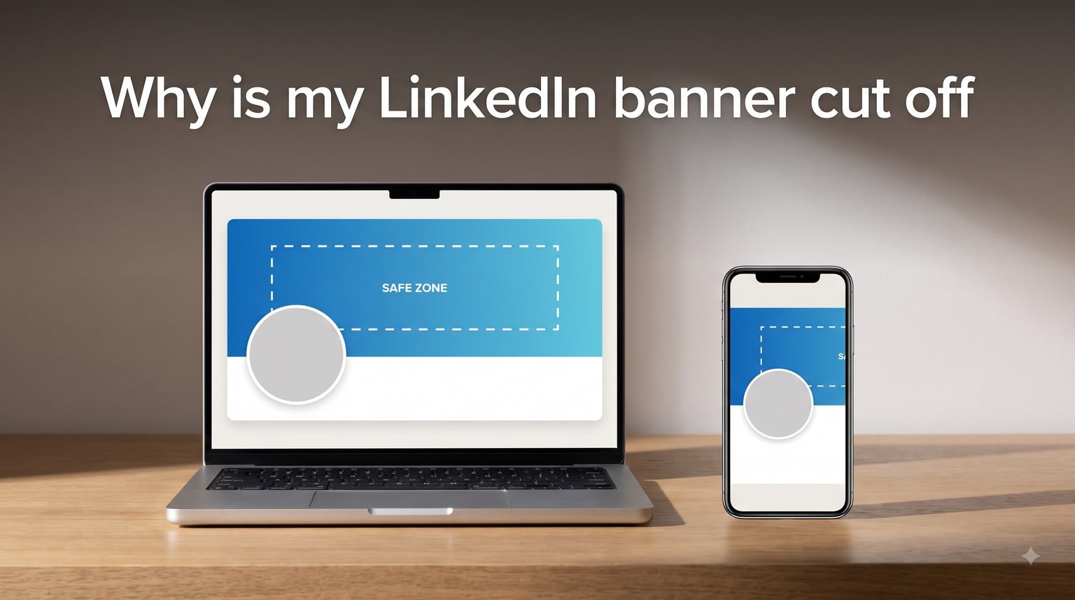
Your LinkedIn banner is cut off because LinkedIn crops the image to fit different screen widths and overlays your circular profile photo on top of it. On desktop the profile photo sits in the bottom-left corner; on mobile it slides to bottom-center. The left and right edges also get trimmed on phones, which hides anything you placed near the outer thirds of the banner.
If you uploaded a banner that looked perfect in your design tool but arrived clipped, you are not alone. Our team has tested dozens of banner layouts across desktop, mobile, personal profiles, and company pages, and the same three trouble zones cause almost every cut-off complaint we see on Reddit and in LinkedIn help forums.
The good news is that once you understand LinkedIn’s safe zone, fixing a cropped banner takes about five minutes. This guide breaks down the exact cause, the precise dimensions for every banner type in 2026, a plain-English safe-zone map, and a step-by-step fix you can follow even if you have never opened a design tool before.
Table of Contents
- Why Is My LinkedIn Banner Cut Off (The Short Answer)
- LinkedIn Banner Dimensions 2026: Exact Size for Every Banner Type
- The Safe Zone: Where Your Content Survives the Crop
- Profile Photo Overlap: Desktop vs Mobile
- Mobile vs Desktop Crop: Why Your Banner Looks Different
- How to Fix a Cut-Off LinkedIn Banner (Step by Step)
- Common LinkedIn Banner Mistakes and How to Avoid Them
- LinkedIn Banner Design Tips That Survive the Crop
- FAQs
- Conclusion
Why Is My LinkedIn Banner Cut Off (The Short Answer)
Your LinkedIn banner is cut off for three reasons, and almost every crop complaint traces back to at least one of them.
1. Mobile edge cropping. LinkedIn displays the full 1584 x 396 pixel image on wide desktop monitors, but on a phone the same banner is rendered inside a narrower window. To fill that window without letterboxing, LinkedIn trims the left and right edges. Anything sitting in the outer 20 to 30 percent of the banner on either side simply disappears on mobile.
2. Profile photo overlap. Your circular headshot floats over the banner. On desktop it anchors to the bottom-left; on mobile it drifts toward bottom-center. Any text, logo, or graphic hiding behind that circle gets covered. A Reddit user in r/graphic_design put it bluntly: “The banner gets covered up by the profile pic, so at minimum you have the right two-thirds to play with.”
3. Wrong starting dimensions. If your file is taller or shorter than the 4:1 ratio LinkedIn expects, the platform forces a crop to fit. Upload a square, a 16:9 photo, or an outdated 1128 x 191 image and LinkedIn will slice it to match its container, often removing the part you cared about most.
LinkedIn Banner Dimensions 2026: Exact Size for Every Banner Type
LinkedIn uses different banner dimensions depending on whether you are updating a personal profile, a company page, a showcase page, or a Life tab. Using the right pixel dimensions from the start is the single biggest thing you can do to prevent a cut-off banner.
Here is the current dimensions reference our team uses for every banner type in 2026.
| Banner Type | Recommended Size | Minimum Size | Aspect Ratio |
|---|---|---|---|
| Personal profile | 1584 x 396 px | 1128 x 191 px | 4:1 |
| Company page | 4200 x 700 px (some accounts now accept 1128 x 191) | 1128 x 191 px | 6:1 |
| Showcase page | 4200 x 700 px | 1128 x 191 px | 6:1 |
| Life tab cover | 1128 x 376 px | 1128 x 376 px | 3:1 |
A few specifications apply across all banner types. The maximum file size is 8 MB. Accepted formats are PNG, JPG, and GIF. PNG is the better choice when your banner contains text or a logo because it preserves sharp edges, while JPG works fine for photographs. Set the resolution to 72 DPI, which matches what screens display, so you do not waste file size on invisible detail.
One common point of confusion is the 1128 x 191 figure you still see in older guides. That number is the minimum, not the recommended size. LinkedIn’s recommended 1584 x 396 is double the minimum in each dimension so the image stays crisp on high-density Retina displays. Always design at 1584 x 396 and let the browser scale it down.
The Safe Zone: Where Your Content Survives the Crop
The safe zone is the part of your banner that LinkedIn will never crop, trim, or cover with another element. If you keep your logo, headline text, and any critical imagery inside this zone, your banner looks correct on every device. Anything outside the safe zone is risky and may vanish on at least one screen size.
Think of the 1584 x 396 banner as a wide horizontal strip with three unreliable zones to avoid.
Unreliable Zone 1: Bottom-left (desktop). On a laptop or desktop browser, your circular profile photo anchors in the bottom-left corner and covers a roughly 200 x 200 pixel patch of banner. Any text or logo sitting under that circle is hidden on desktop. Move that content up or to the right.
Unreliable Zone 2: Bottom-center (mobile). On a phone the same profile photo slides toward the horizontal center of the banner. The circle still overlaps the banner, but now it sits closer to the middle of the bottom edge. Content that survived the desktop overlap can get swallowed on mobile.
Unreliable Zone 3: Left and right edges (mobile). Mobile screens are narrow, so LinkedIn trims the outer left and right portions of the banner to fit the viewport. Roughly the outer 20 to 30 percent on each side is at risk. Anything in those outer strips, including a logo parked in the far-right corner, is likely to disappear when viewed on a phone.
That leaves a central safe zone occupying roughly the middle third of the banner width and the top two-thirds of the banner height. Picture an invisible rectangle about 1000 pixels wide and 250 pixels tall, centered horizontally and resting in the upper-middle of the banner. That rectangle is your reliable workspace. Put your most important content, your logo, your headline, and your call to action inside it.
Here is a simple text map to visualize the zones on a 1584 x 396 personal banner.
+--------------------------------------------------------+
|  ........ RISKY EDGE ........| SAFE TOP |.............. |
|  ............................|   ZONE   |.............. |
|  ............................| (logos,  |.............. |
|  ........ RISKY EDGE ........| headline)|.............. |
|  +-------+......... BOTTOM-CENTER (mobile) .....+-----+ |
|  |PROFILE|.........(photo overlaps here)........|RIGHT| |
|  |PHOTO  |......................................|EDGE | |
|  |(desk) |......................................|risk | |
|  +-------+......................................+-----+ |
+--------------------------------------------------------+
   ^-bottom-left risky        bottom-center risky ^  ^-far-right risky
The safest approach is the center-third rule. Concentrate everything that must be visible inside the central vertical third of the banner and keep it in the upper two-thirds of the height. Treat the bottom strip and both outer columns as decorative space only.
Profile Photo Overlap: Desktop vs Mobile
The profile photo overlap is the single most common cause of a “cut off” banner, and it trips up even experienced designers. The problem is that the overlap zone moves depending on the device, so content that clears the desktop circle can still get hidden on mobile.
On desktop, your profile photo appears as a circle roughly 200 pixels wide anchored to the bottom-left of the banner. The circle’s center sits near the left edge, so it covers a square patch in that corner. Any text or logo you place in the bottom-left 250 x 250 region is at risk on a laptop.
On mobile, the same circle stays the same approximate size but shifts horizontally toward the center of the banner. The bottom-center of the banner now becomes the danger zone. A logo placed at bottom-center to dodge the desktop circle gets covered on a phone instead.
The fix is to lift your important content above the bottom third of the banner entirely. Keep logos, names, headlines, and any text in the top half to two-thirds of the height. Use the bottom strip for background imagery, subtle patterns, or empty negative space that looks fine whether or not the circle covers it.
If you absolutely must place something near the bottom, put it in the right-center of the lower band. That region tends to survive both desktop and mobile overlap because it sits between the two profile-photo anchor points.
Mobile vs Desktop Crop: Why Your Banner Looks Different
LinkedIn uses responsive design, which means the same banner renders differently depending on screen width. On a wide desktop monitor you see the full 1584 x 396 image stretched edge to edge. On a phone, the browser has a much narrower window, so LinkedIn scales the banner down and then crops the overflow to fill the width without distortion.
The result is that mobile viewers see roughly the central 60 to 70 percent of your banner’s width. The left and right edges get trimmed to fit a portrait screen. This is why a logo placed in the far-right corner looks fine on your laptop but vanishes when a recruiter checks your profile on their phone.
This also explains the most frequent complaint in r/linkedin: “My banner looks great on desktop but terrible on mobile.” The two views are not showing the same crop. The mobile crop is tighter on both sides and shifts the profile photo toward center, so the visible content is genuinely different.
You cannot upload separate mobile and desktop banners. LinkedIn uses one image and crops it automatically. The only way to control both views is to design inside the safe zone so that whatever survives the crop is still your most important content.
Here is how the same 1584 x 396 banner typically renders on each device class.
| Device | Visible Width | Profile Photo Position | At-Risk Zones |
|---|---|---|---|
| Desktop (wide monitor) | Full 1584 px | Bottom-left | Bottom-left corner only |
| Tablet | Most of banner, slight edge trim | Bottom-left to bottom-center | Bottom-left, minor edges |
| Mobile (phone) | Central 60-70% | Bottom-center | Both edges + bottom-center |
How to Fix a Cut-Off LinkedIn Banner (Step by Step)
If your banner is already uploaded and visibly cut off, follow this sequence to diagnose and repair it. Each step targets one of the three causes above.
Step 1: Confirm your file dimensions. Open your banner image and check its pixel size. For a personal profile it must be 1584 x 396, or at minimum 1128 x 191 in the correct 4:1 ratio. If the file is a different ratio, LinkedIn is forcing a crop. Re-export at the correct size before doing anything else.
Step 2: Map your important content. List every element that must stay visible: logo, name, headline, tagline, call to action, contact detail. Note where each one currently sits on the banner.
Step 3: Move all critical content into the safe zone. Relocate anything important into the central vertical third and the upper two-thirds of the height. Pull logos away from the far-right corner. Lift text out of the bottom strip entirely so neither the desktop nor mobile profile photo can cover it.
Step 4: Test on mobile before uploading. Crop your banner to its central 60 percent width in any image editor to simulate the mobile view. If anything important is missing, move it further toward the center. Free tools like Canva and Figma both have LinkedIn banner templates with built-in safe-zone guides you can toggle on.
Step 5: Re-export as PNG. If your banner has text or a logo, export as PNG to keep edges sharp. JPG compression introduces artifacts around lettering that read as blurriness after LinkedIn re-compresses the file. Keep the file under 8 MB.
Step 6: Upload and verify on two devices. Upload the new banner, then view your profile on both a laptop and a phone. If both views show your critical content inside the safe zone, you are done. If not, repeat from Step 3.
Step 7: For company pages, repeat with the 4200 x 700 spec. Company and showcase pages use a wider 6:1 ratio, so the safe zone is different. The same principles apply: keep the logo and any text in the central vertical band and the upper portion of the height, and avoid the bottom-left and far-right corners.
Common LinkedIn Banner Mistakes and How to Avoid Them
After reviewing hundreds of profiles, the same handful of mistakes account for nearly every cut-off banner. Here are the seven we see most often.
1. Using the wrong dimensions. Uploading a 16:9 photo, a square image, or the outdated 1128 x 191 minimum forces LinkedIn to crop. Always start from the 1584 x 396 template.
2. Placing text in the bottom-left. The desktop profile photo covers this corner. Any headline or contact detail parked there disappears on a laptop.
3. Parking a logo in the far-right corner. Mobile crops the right edge, so a right-corner logo vanishes on phones. Move it toward the center.
4. Ignoring mobile entirely. Roughly 60 percent of LinkedIn traffic is mobile. Designing only for desktop guarantees a broken banner for most viewers.
5. Using low-resolution source images. A 72 DPI photo scaled up to 1584 pixels wide looks soft. LinkedIn then compresses it again, magnifying the blur. Start from a high-resolution source.
6. Choosing JPG for text-heavy banners. JPG compression smears lettering. Use PNG whenever the banner contains text, a logo, or sharp geometric shapes.
7. Skipping a preview. LinkedIn offers no built-in preview before you commit to an upload. Always simulate the mobile crop in Canva, Figma, or a free banner checker tool before publishing.
LinkedIn Banner Design Tips That Survive the Crop
Designing a banner that looks right after LinkedIn’s cropping comes down to a few repeatable rules. Here is the workflow our team follows.
Use the center-third rule. Concentrate logos, headlines, and any text inside the central vertical third of the banner and the upper two-thirds of its height. Treat the outer columns and the bottom strip as background only.
Match your banner to your headshot. Pick banner colors that complement your profile photo so the overlap looks intentional rather than like an accident. A cohesive palette between headshot and banner reads as polished personal branding.
Keep text large and high-contrast. After LinkedIn scales the banner down for mobile, small text becomes unreadable. Use a font size that stays legible at roughly 40 percent of the original width, and ensure strong contrast against the background.
Export PNG for anything with type. PNG preserves the crisp edges of lettering and logos through LinkedIn’s compression step. Reserve JPG for pure photographs with no text overlay.
Design in a tool with a safe-zone guide. Canva and Figma both offer free LinkedIn banner templates with built-in safe-zone overlays. Toggle the guide on while you work and you will never accidentally place content in a crop zone again.
Preview the mobile crop before uploading. Crop your design to its central 60 percent in your editor and check that nothing important is missing. This 30-second step prevents almost every mobile crop surprise.
Tailor the banner to your goal. A job seeker might feature a clean headline and a subtle industry cue. An entrepreneur might place a product screenshot in the safe zone. An executive might use a brand-aligned color wash with a single tagline. The safe zone is the same; only the content changes.
FAQs
What is the LinkedIn banner size in 2026?
The recommended LinkedIn personal profile banner size is 1584 x 396 pixels with a 4:1 aspect ratio. The minimum accepted size is 1128 x 191 pixels. Company and showcase page banners use 4200 x 700 pixels at a 6:1 ratio. Maximum file size is 8 MB in PNG, JPG, or GIF format.
How do I fix my LinkedIn banner?
To fix a cut-off LinkedIn banner, first confirm your image is 1584 x 396 pixels in a 4:1 ratio. Then move all important content, including your logo and any text, into the central vertical third and the upper two-thirds of the banner height so neither the profile photo nor the mobile crop can hide it. Export as PNG, preview the central 60 percent to simulate mobile, and re-upload.
What is the aspect ratio for a LinkedIn banner?
The personal profile LinkedIn banner uses a 4:1 aspect ratio, which works out to 1584 x 396 pixels at the recommended size. Company pages and showcase pages use a wider 6:1 aspect ratio at 4200 x 700 pixels. The Life tab cover uses a 3:1 ratio at 1128 x 376 pixels.
How do I make my LinkedIn banner full width?
You cannot force a separate full-width banner on mobile. LinkedIn uses one image and automatically crops the left and right edges to fit narrower phone screens, showing roughly the central 60 to 70 percent of the banner width. To keep content visible full-width, place it inside the central safe zone and avoid the outer 20 to 30 percent on each side.
Why does my LinkedIn banner look blurry?
A blurry LinkedIn banner is usually caused by a low-resolution source image, JPG compression on text, or LinkedIn re-compressing an already small file. Fix it by starting from a high-resolution image, designing at the full 1584 x 396 recommended size rather than the 1128 x 191 minimum, and exporting as PNG when the banner contains text or a logo.
What are the best practices for a LinkedIn banner?
Use the exact recommended dimensions, keep all critical content inside the central safe zone, design for mobile first since most views happen on phones, export PNG for text, preview the mobile crop before uploading, and match the banner colors to your headshot for a cohesive look. Update the banner when your role, brand, or focus changes.
Conclusion
Your LinkedIn banner is cut off because LinkedIn crops the image for mobile screens and overlays your circular profile photo on top of it, hiding content in three unreliable zones: the bottom-left on desktop, the bottom-center on mobile, and both outer edges on phones.
The fix is straightforward. Design at the full 1584 x 396 recommended size for personal profiles, keep every important element inside the central safe zone, export as PNG for any text or logo, and preview the mobile crop before you upload. Follow the seven-step troubleshooting flow above and your banner will display correctly on every device a recruiter, client, or connection is likely to use.
Your banner is the single largest piece of visual real estate on your profile, so it is worth the five minutes it takes to get right. If you found this guide helpful, check back as we continue to track LinkedIn’s display changes through 2026.