
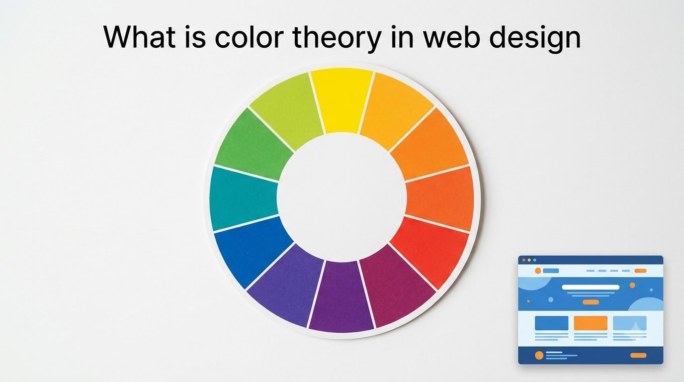
Color theory in web design is the practical guide to combining hues, tones, and saturation levels to create visually pleasing, accessible, and effective digital experiences. It draws on art, psychology, and science so designers can build sites that feel balanced, communicate brand personality, and guide user attention.
If you’ve ever stared at a color picker wondering why some combinations feel right while others feel jarring, this guide is for you. I break down the color wheel, the seven main color schemes, the basics of color psychology, and the rules (like 60-30-10) that professional designers use every day. By the end, you’ll know how to choose colors that work together, look professional, and meet accessibility standards in 2026 and beyond.
Let’s start with the foundation: what color theory actually is and why it matters for every website you build.
Table of Contents
- What is color theory in web design?
- The color wheel explained
- Primary, secondary, and tertiary colors
- Hue, saturation, and lightness: the three properties of color
- 7 color schemes every web designer should know
- How color psychology shapes user behavior
- RGB vs CMYK vs HEX: which color model should you use?
- The 60-30-10 rule for balanced web design
- Accessibility and contrast: WCAG guidelines for web colors
- Practical tips for choosing your website color palette
- Frequently asked questions
- Final thoughts on color theory in web design
What is color theory in web design?
Color theory in web design is a set of principles and practical guidelines that explain how colors interact, combine, and communicate with viewers. It covers everything from the physics of light wavelengths to the emotional responses that red, blue, or green can trigger.
At its core, color theory gives web designers three big advantages. First, it creates visual harmony so pages feel cohesive rather than chaotic. Second, it supports accessibility by ensuring text is readable for everyone, including people with visual impairments. Third, it shapes mood and behavior, helping brands signal trust, urgency, calm, or excitement with the colors they choose.
Think of color theory as the grammar behind good design. Once you understand it, you stop guessing and start making deliberate choices that improve user experience, strengthen brand identity, and increase conversions.
The color wheel explained
The color wheel is a circular diagram that maps out the relationships between colors. It was first developed by Sir Isaac Newton in 1666 and remains the single most useful tool for any designer learning color theory.
The wheel arranges colors by hue so you can see at a glance which colors sit next to each other (analogous), opposite each other (complementary), or form a balanced triangle (triadic). Most color wheels include 12 positions: three primary, three secondary, and six tertiary colors.
When I open a color wheel during a project, I’m usually looking for two things: a starting hue my client loves, and the color scheme (combination rule) that will produce a balanced palette. Tools like Adobe Color and Coolors let you spin the wheel digitally, lock in harmonies, and export HEX codes directly to your design software.
Primary, secondary, and tertiary colors
The 12 colors on the wheel fall into three groups, and understanding them is the first step toward building any color scheme.
The three primary colors are red, yellow, and blue. They cannot be created by mixing other colors, and they form the base of every other hue on the wheel. In traditional (subtractive) color mixing, primaries combine in pairs to make secondary colors.
The three secondary colors are orange (red + yellow), green (yellow + blue), and purple (red + blue). They sit between the primaries on the wheel and form the second ring.
The six tertiary colors fill the remaining positions and are made by mixing a primary with a neighboring secondary. They include red-orange, yellow-orange, yellow-green, blue-green, blue-purple, and red-purple. Tertiary colors are often the most pleasing to use in web design because they feel softer than pure primaries.
For digital screens, your computer uses a different set of primaries: red, green, and blue (RGB). More on that in the RGB vs CMYK section below.
Hue, saturation, and lightness: the three properties of color
Every color you pick in a design tool is defined by three measurable properties. Once you understand them, you can fine-tune palettes with precision instead of guesswork.
Hue is the actual color family: red, blue, green, orange, and so on. When people say “pick a hue,” they mean the pure color without any tints or shades added. Hues are measured in degrees around the color wheel, from 0° (red) to 360° (back to red).
Saturation refers to the intensity or purity of a color. A fully saturated hue is vivid and bold; a desaturated hue looks muted, grayish, or pastel. Designers lower saturation when they want a calm, professional feel, and raise it for energetic, attention-grabbing accents.
Lightness (sometimes called value) controls how light or dark a color appears. Adding white creates a tint; adding black creates a shade. Most modern design tools express colors in HSL format (hue, saturation, lightness), which makes these adjustments intuitive.
Together, these three properties form the foundation of nearly every modern color system. When you adjust a single value, you create an entire family of related shades you can use across a website.
7 color schemes every web designer should know
Color schemes are predefined rules for combining colors from the wheel. They take the guesswork out of building a palette and guarantee that your choices feel balanced. These are the seven most useful schemes for web design.
1. Monochromatic color scheme
A monochromatic palette uses one hue in multiple tints, shades, and saturations. It’s the simplest, safest choice and produces a clean, cohesive look. Think of a single blue base expanded into light blue, navy, sky blue, and slate.
This scheme works well for corporate websites, SaaS dashboards, and minimalist portfolios where you want the content, not the color, to lead.
2. Analogous color scheme
Analogous schemes use three colors that sit next to each other on the wheel, like blue, blue-green, and green. They create a serene, harmonious feel because the colors share underlying pigments.
Nature-themed sites, wellness brands, and travel blogs often use analogous palettes because they feel organic and unified.
3. Complementary color scheme
Complementary schemes pair colors directly opposite each other on the wheel, such as blue and orange or red and green. The high contrast makes both colors pop.
This is the go-to choice for call-to-action buttons. The button can be the complementary color while the rest of the page uses the primary hue, drawing the eye exactly where you want it.
4. Split-complementary color scheme
The split-complementary scheme starts with one base color and adds the two colors adjacent to its opposite. It gives you the contrast of a complementary scheme with less visual tension.
It’s a smart pick when you want bold accents but need a softer overall feel than direct complementaries provide.
5. Triadic color scheme
Triadic schemes use three colors evenly spaced around the wheel, forming an equilateral triangle. Classic examples include red, yellow, and blue, or purple, green, and orange.
Triadic palettes feel balanced and vibrant, making them popular for educational sites, children’s brands, and creative portfolios.
6. Tetradic (rectangle) color scheme
A tetradic scheme uses four colors arranged into two complementary pairs. It offers the richest variety but is also the hardest to balance. Most designers pick one color as the dominant and use the other three as accents.
Use this when you have a brand with multiple distinct product lines or visual themes to support.
7. Square color scheme
The square scheme is similar to tetradic but uses four colors evenly spaced around the wheel. It works best when one color dominates and the others share equal supporting roles.
This is more common in editorial and magazine-style layouts where multiple content zones need distinct color identities.
How color psychology shapes user behavior
Color psychology is the study of how colors influence emotion and decision-making. In web design, it’s the bridge between aesthetic choices and measurable user behavior. The same product page can convert better or worse depending on the colors you use.
Colors are generally grouped into two temperature categories. Warm colors include red, orange, and yellow. They feel energetic, urgent, and friendly, and they often raise heart rate. Cool colors include blue, green, and purple. They feel calm, trustworthy, and professional.
Beyond temperature, individual colors carry specific associations most viewers recognize. Red signals urgency, passion, and warning, which is why clearance sales and food brands rely on it. Blue conveys trust and stability, which is why banks and tech companies default to it. Green connects to nature, health, and money. Yellow attracts attention and optimism but can feel overwhelming in large doses. Purple suggests luxury and creativity. Black communicates sophistication and power, especially in luxury and fashion contexts. White signals simplicity and cleanliness, common in healthcare and minimalist tech brands.
Of course, these associations are not universal. Cultural context matters. White symbolizes purity in Western weddings but mourning in parts of East Asia. Red means good luck in China but danger in many Western contexts. If your audience is global, research local color meanings before locking in a palette.
In my own projects, I treat color psychology as a starting point, not a hard rule. I always test color choices against the specific audience, industry, and goal. A “playful yellow” CTA might work for a children’s toy brand but feel out of place on a legal services site.
RGB vs CMYK vs HEX: which color model should you use?
Digital and print use different color models, and using the wrong one can ruin your work. Here’s what each one does and when to use it.
RGB (Red, Green, Blue) is the additive color model used by screens. Every pixel on your monitor is made by combining different intensities of red, green, and blue light. RGB is the default for all digital design: websites, apps, video, and photography.
CMYK (Cyan, Magenta, Yellow, Black) is the subtractive color model used by printers. It works by absorbing light, so colors get darker as you add ink. CMYK only matters for web designers when you design assets that will be printed, like business cards or merchandise.
HEX codes are simply a shorthand way of expressing RGB values. A HEX code like #FF5733 breaks down into FF (255) for red, 57 (87) for green, and 33 (51) for blue. Designers use HEX codes because they’re compact and easy to copy into CSS.
For pure web work, stick with RGB or HEX. They cover the full spectrum of color your screen can display and convert cleanly to CSS, design tools, and code.
The 60-30-10 rule for balanced web design
The 60-30-10 rule is a classic interior design formula that translates perfectly to websites. It keeps your palette balanced and prevents any single color from overwhelming the page.
Sixty percent of your design should use the dominant color, usually a neutral background tone like white, off-white, light gray, or a soft brand color. This is the canvas. Thirty percent should use a secondary color, often a complementary or supporting brand hue used for subheadings, sidebars, or sections. Ten percent should be the accent color, the bold pop used for call-to-action buttons, links, and key highlights.
This rule works because it mirrors how the human eye processes visual information. Viewers need a calm base to scan content, a consistent secondary color for visual hierarchy, and one bright accent to guide their attention. Without that structure, even beautiful colors feel chaotic when layered together.
Try it on your next project: pick one dominant, one secondary, and one accent, then track the percentage of each color across your layout. You’ll quickly see where you’re overusing or underusing each.
Accessibility and contrast: WCAG guidelines for web colors
Color choice is not only an aesthetic decision. It’s an accessibility one. Poor contrast makes text unreadable for users with low vision, color blindness, or temporary impairments like glare.
The Web Content Accessibility Guidelines (WCAG) define minimum contrast ratios between text and background colors. For normal text, WCAG AA requires a contrast ratio of at least 4.5:1. For large text (18pt or 14pt bold), the minimum drops to 3:1. WCAG AAA, the strictest level, requires 7:1 for normal text.
You don’t need to memorize the math. Free tools like WebAIM’s Contrast Checker, Stark, and the built-in accessibility checkers in Figma and Sketch calculate contrast ratios for you as you design. I run every palette through at least one of these tools before sending a design to development.
Beyond contrast, avoid relying on color alone to convey meaning. If a form field turns red to signal an error, also include an icon or message. Around 8% of men and 0.5% of women have some form of color vision deficiency, and they need multiple cues to interpret your interface correctly.
Designing for accessibility doesn’t limit creativity. It actually forces you to make stronger contrast choices and clearer visual hierarchy, which usually improves the experience for everyone.
Practical tips for choosing your website color palette
Now that you understand the theory, here’s a practical workflow I use on every web design project. You can apply it whether you’re building a personal portfolio or a corporate site.
Step one: start with one anchor color. Pick the single hue that best represents your brand personality, whether that’s a calm blue, an energetic red, or a fresh green. This will become your dominant color.
Step two: choose a color scheme. Using the anchor, decide whether to go monochromatic, analogous, or complementary. For beginners, analogous is the safest; for conversion-focused pages, complementary works well for accent CTAs.
Step three: build out your 60-30-10. Assign your anchor to 60%, pick a secondary support color for 30%, and reserve an accent for the critical 10% of the page (buttons, links, highlights).
Step four: test for accessibility. Run every text-on-background pair through a contrast checker. Adjust lightness or saturation until you hit at least WCAG AA across the board.
Step five: preview in context. Drop your palette into a real layout, not just a swatch grid. Colors interact differently with images, type, and whitespace, so always check the full composition.
Step six: consider dark mode. Many sites now offer a dark mode toggle. Design a complementary dark palette using darker shades of your base colors rather than pure black. This keeps brand recognition while reducing eye strain.
Helpful tools for this process include Adobe Color (for exploring color schemes), Coolors (for fast palette generation), Figma or Sketch (for in-context design), and Stark or Contrast Checker (for accessibility validation). Each of these is widely used by professional designers and most have free tiers.
Frequently asked questions
What is color theory in simple words?
Color theory is the set of rules that explain how colors mix, match, and affect the people who see them. In web design, it helps you pick color combinations that look good together, communicate the right mood, and stay readable for every visitor.
What is the 3 color rule for websites?
The 3 color rule, often paired with the 60-30-10 ratio, says every website should use three core colors: a dominant color covering about 60% of the page, a secondary color used around 30%, and an accent color used for about 10%. The accent usually highlights buttons, links, and key information.
What are the 7 types of color theory?
The 7 main color schemes are monochromatic (one hue, many shades), analogous (neighboring colors), complementary (opposite colors), split-complementary (one base plus two adjacent complements), triadic (three evenly spaced hues), tetradic (two complementary pairs), and square (four evenly spaced hues).
What is an example of a color theory?
A common example is the complementary scheme used by many fast food brands. They pair red and yellow because those opposite colors create strong visual contrast, which speeds up decision-making and encourages quick turnover. Tech companies often use the analogous scheme, pairing blues and greens to feel calm and trustworthy.
Final thoughts on color theory in web design
Color theory in web design is one of those skills that pays off forever. Once you understand the color wheel, the seven main schemes, the 60-30-10 rule, and basic accessibility, every project you build will look more polished and perform better.
Start small. Pick one scheme to experiment with on your next project, run your colors through a contrast checker, and notice how intentional choices change the way your site feels. As your confidence grows, you’ll start seeing color decisions everywhere and building palettes that genuinely serve your users and your brand.