
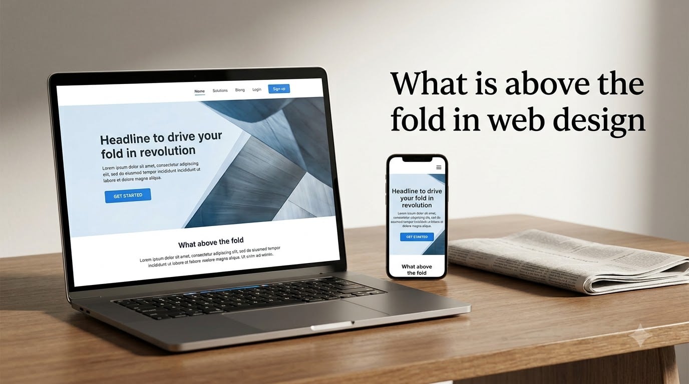
Above the fold in web design refers to the portion of a webpage that is visible to visitors without scrolling, immediately when the page loads. This area typically includes your website header, hero section, primary headline, and main call to action. Everything below that visible boundary requires the user to scroll down to see it, which is known as below the fold content.
If you are designing a website, building a landing page, or trying to improve your conversion rate, understanding above the fold web design is one of the most foundational skills you can learn. Our team has spent years studying how users interact with web pages, and the data is clear: what people see in the first second shapes everything that follows.
In this guide, we will break down exactly what above the fold means, where the term comes from, why it matters for user engagement and conversions, how it changes across different devices, and the best practices you should follow in 2026. We will also tackle the ongoing debate about whether the fold is still relevant in modern web design.
Table of Contents
- What Is Above the Fold in Web Design?
- Why Above the Fold Matters for Your Website
- What Should Be Above the Fold on a Website
- Above the Fold vs Below the Fold: Understanding the Difference
- How the Fold Changes Across Devices and Screen Sizes
- Best Practices for Above the Fold Web Design
- 1. Lead With a Clear Value Proposition
- 2. Place Your Primary CTA Above the Fold
- 3. Prioritize Page Load Speed
- 4. Keep Visual Hierarchy Strong
- 5. Use White Space Intentionally
- 6. Make Navigation Accessible but Unobtrusive
- 7. Test on Real Devices
- 8. Use Visual Cues to Encourage Scrolling
- 9. Optimize for Accessibility
- 10. A/B Test Your ATF Variations
- Common Above the Fold Mistakes to Avoid
- Is Above the Fold Still Relevant in 2026?
- FAQs
- Conclusion
What Is Above the Fold in Web Design?
Above the fold in web design is the visible area of a webpage that appears on screen before the user does any scrolling. It is the first thing every visitor sees when your page loads. This region sits above what designers call the fold line, which is simply the bottom edge of the browser viewport.
Think of it as the top section of your page that gets the most eyeballs. On a typical desktop monitor, this usually covers the first 600 to 700 pixels of vertical space. On a laptop, it might be closer to 500 pixels. On a smartphone, the fold is much higher because mobile screens are smaller and shaped differently.
Everything visible in this initial view is above the fold. Everything you need to scroll to reach is below the fold. The concept is simple, but the execution is where most websites succeed or fail.
Where the Term Comes From
The phrase above the fold originates from the newspaper industry. Traditional broadsheet newspapers were printed on large sheets of paper that were folded in half for display and sale at newsstands. When a newspaper sat on a rack, only the top half was visible to passersby. That top half had to grab attention with compelling headlines and striking images to convince someone to buy the paper.
Newspaper editors reserved this prime space for their most important stories and boldest headlines. The most valuable advertising slots were also placed above the physical fold. This publishing principle carried over directly to web design when the internet emerged as a publishing medium.
The fold in web design serves the same purpose as the fold in print. It represents the boundary between what is immediately visible and what requires effort to discover. The terminology stuck because the underlying psychology is identical.
Understanding the Viewport
In technical terms, the fold line is defined by the browser viewport. The viewport is the rectangular area of the screen where your web content is displayed. It is measured in pixels and changes based on screen resolution, browser chrome (toolbars, address bars, bookmarks), and device type.
For example, a monitor running at 1920×1080 resolution has more viewport space than one at 1366×768. A phone held in portrait mode has a tall, narrow viewport. A tablet in landscape mode offers a different fold position entirely. This variability is why there is no single universal fold line in modern responsive design.
Why Above the Fold Matters for Your Website
Above the fold content creates the first impression every visitor forms about your website. Research from the Missouri University of Science and Technology found that users form an opinion about your site within 0.2 to 0.5 seconds of landing on it. That fraction of a second happens entirely within the above the fold area.
If your ATF section loads slowly, looks cluttered, or fails to communicate what you offer, visitors will leave. Bounce rate climbs. Engagement drops. Conversions disappear. The stakes are high because this small strip of screen real estate does most of the heavy lifting for your entire page.
Google eye-tracking studies have shown that users spend roughly 80 percent of their first viewing time focused on content above the fold. Their attention gradually decreases as they scroll further down the page. This means the content you place in that initial viewport gets the strongest, most sustained attention from every visitor.
Impact on Conversion Rates
Conversion rate optimization depends heavily on above the fold design. When your primary call to action sits in the initial viewport, users see it without any effort. That visibility translates directly into higher click-through rates and more conversions, whether you are collecting email signups, selling products, or driving demo requests.
One commonly cited finding from digital marketing research is that content placed above the fold receives significantly more engagement than identical content placed below it. Ecommerce sites in particular benefit from showing product imagery, pricing, and add-to-cart buttons in the initial viewport.
Landing pages follow the same rule. A strong headline, clear value proposition, and visible CTA button above the fold can dramatically outperform pages that push these elements below the initial view. The ATF zone is your best opportunity to convert a visitor before they decide to leave.
What Should Be Above the Fold on a Website
The most effective above the fold sections share a common set of elements. Each piece serves a specific purpose in guiding the visitor toward your desired action. Here are the key elements every website should consider placing above the fold:
Logo and branding — Instantly identify your company or organization in the top-left corner.
Navigation menu — Let users find their way around without scrolling to locate the main menu.
Main headline — Communicate your core value proposition in one clear, compelling sentence.
Subheadline — Provide a brief supporting explanation of what you do or offer.
Hero image or video — Use a visually striking element that reinforces your message and brand.
Primary call to action button — Give visitors an obvious next step, whether that is signing up, buying, or learning more.
Trust signals — Include social proof like customer logos, star ratings, or a short testimonial near the CTA.
You do not need all of these elements crammed into the fold area at once. The goal is to include the ones that matter most for your specific audience and objective. A SaaS landing page might prioritize a headline and demo CTA. An ecommerce homepage might lead with a featured product image and shop button.
The one element you should never skip is the call to action. A CTA visible above the fold is consistently one of the highest-impact design choices you can make for conversions. Users should never have to scroll to figure out what you want them to do next.
Above the Fold vs Below the Fold: Understanding the Difference
Above the fold and below the fold represent two zones of your webpage divided by the fold line. Above the fold is everything immediately visible on page load. Below the fold is everything the user reaches by scrolling down. Both areas matter, but they serve different purposes.
Above the fold is your hook. It needs to answer three questions fast: Where am I? What is being offered? What should I do next? This zone prioritizes clarity, speed, and immediate impact. Every element must justify its presence in this premium space.
Below the fold is where you go deeper. This is where detailed product descriptions, customer testimonials, feature breakdowns, comparison tables, and FAQ sections belong. Users who scroll past the fold have already shown interest. They are giving you permission to provide more information.
Modern user behavior data shows that people scroll far more than they did in the early days of the web. Mouse-wheel scrolling, touchscreens, and mobile browsing have trained users to explore. However, the content they see first still shapes whether they bother scrolling at all. A weak ATF section means fewer people ever reach your below the fold content.
How the Fold Changes Across Devices and Screen Sizes
The fold is not a fixed line. It shifts dramatically depending on the device, screen resolution, browser, and even how many toolbars a user has open. This is one of the biggest challenges in modern web design, and it is why responsive design has become non-negotiable.
Desktop Fold Considerations
On desktop computers, the fold typically falls around 570 to 730 pixels from the top of the page. This range accounts for the most common monitor resolutions. A 1920×1080 display with a standard browser setup might show about 940 pixels of content height. A 1366×768 laptop screen might show closer to 620 pixels after accounting for the browser chrome.
Designers often use 600 pixels as a conservative baseline for the desktop fold. This ensures the most critical content appears in the initial viewport even on smaller laptop screens. However, treating 600 pixels as an absolute rule is a mistake. The fold varies, and your design should account for a range rather than a single pixel value.
Mobile Fold Considerations
Mobile devices completely reshape the fold. A typical smartphone in portrait mode offers a viewport height of roughly 640 to 900 pixels, but the width is much narrower than desktop. Content stacks vertically more aggressively on mobile, meaning the fold hits much sooner in the reading flow.
Mobile browsers also introduce a dynamic address bar. When users scroll, the address bar often shrinks or disappears, changing the viewport height on the fly. This means the fold literally moves as the user interacts with the page. Apple’s Safari and Google’s Chrome on mobile both behave this way.
For mobile design, prioritize the absolute essentials above the fold: a clear headline and one prominent CTA. Keep navigation simple, typically behind a hamburger menu. Avoid large hero images that consume the entire mobile viewport without leaving room for your message or button.
Tablet Fold Considerations
Tablets sit between desktop and mobile. In portrait orientation, a tablet behaves much like a large phone. In landscape mode, it approaches desktop viewport dimensions. Design your responsive breakpoints to handle both orientations gracefully, and test your ATF layout on real tablets whenever possible.
Working with Viewport Units in CSS
Modern CSS gives you tools to target the viewport directly. The vh unit represents a percentage of the viewport height. Setting a hero section to 100vh makes it fill the entire initial viewport on any device. This is useful for full-screen above the fold designs.
However, 100vh can cause issues on mobile browsers where the address bar changes the viewport height dynamically. CSS now offers dvh (dynamic viewport height) and svh (small viewport height) units that handle this more gracefully. Using 100svh ensures your ATF content fits within the smallest possible viewport, preventing elements from being cut off on mobile.
For content that should sit just above the fold, consider using 90svh or 85svh to leave a visual hint that more content exists below. This subtle peek of below-the-fold content encourages scrolling.
Best Practices for Above the Fold Web Design
Designing above the fold content that performs well requires intention and discipline. These best practices come from years of testing and analysis across landing pages, ecommerce sites, and content-heavy websites. Follow these principles to make your ATF section work harder for you.
1. Lead With a Clear Value Proposition
Your headline should tell visitors exactly what you offer and why they should care. Avoid vague or clever headlines that require context to understand. Be direct, specific, and benefit-oriented. A strong headline reads like an answer to the question, “What is in it for me?”
2. Place Your Primary CTA Above the Fold
Your main call to action button should be visible without scrolling on the most common screen sizes. Make it large enough to tap easily on mobile. Use a color that stands out from the surrounding design. The text on the button should describe the action clearly, such as “Start Free Trial” or “Get Your Quote.”
3. Prioritize Page Load Speed
Above the fold content that takes too long to load effectively has no fold. If your hero image or video delays the initial render, users see a blank or partially loaded page. Google considers page speed a ranking factor, and slow ATF content hurts both SEO and user experience. Optimize images, use lazy loading for below-the-fold assets, and minimize render-blocking scripts.
4. Keep Visual Hierarchy Strong
Use size, color, and spacing to guide the visitor’s eye through your ATF content in a logical order. The headline should be the largest text. The CTA should be the most visually distinct interactive element. Supporting text and images should complement, not compete with, these primary elements.
5. Use White Space Intentionally
Do not fill every pixel above the fold. White space gives your content room to breathe and helps important elements stand out. A clean, uncluttered ATF design communicates confidence and professionalism. Overcrowded above the fold sections overwhelm users and dilute your core message.
6. Make Navigation Accessible but Unobtrusive
Your navigation menu should be visible above the fold, but it should not dominate the space. On desktop, a horizontal menu bar works well. On mobile, use a hamburger menu to save screen space. The goal is to let users navigate without sacrificing room for your headline and CTA.
7. Test on Real Devices
Emulators and design tools give you an approximation of how your ATF looks across devices. Nothing replaces testing on actual hardware. Load your page on different phones, tablets, laptops, and desktop monitors. Check how the fold line shifts and whether your critical elements remain visible across all of them.
8. Use Visual Cues to Encourage Scrolling
Since modern users are willing to scroll, make sure they know there is more to see. A partially visible element at the bottom of the viewport, an animated scroll arrow, or a subtle gradient can signal that additional content waits below. Just do not rely on these cues alone; your ATF should deliver value on its own.
9. Optimize for Accessibility
Above the fold content must be accessible to all users, including those using screen readers. Use semantic HTML, descriptive alt text for images, sufficient color contrast, and keyboard-navigable interactive elements. Accessibility is not just a legal requirement; it expands your reach and improves SEO.
10. A/B Test Your ATF Variations
Never assume your first above the fold design is optimal. Test different headlines, CTA placements, hero images, and layouts. Small changes in ATF design can produce significant differences in conversion rates. Use analytics tools to track how scroll depth, bounce rate, and conversion metrics respond to each variation.
Common Above the Fold Mistakes to Avoid
Even experienced designers fall into common traps when working on above the fold sections. Recognizing these mistakes helps you avoid them and keep your ATF focused and effective.
Overcrowding the Fold Area
The most frequent mistake is trying to fit too much content into the initial viewport. Multiple headlines, several images, a video, three CTAs, and a paragraph of text all crammed above the fold creates chaos. Users cannot process that much information in the first second. Pick one primary message and one primary action, then build everything else around them.
Using Giant Hero Images With No Message
Full-screen hero images look beautiful, but if they push your headline and CTA below the fold, they work against you. A stunning photo that fills the entire viewport without telling users what you do or what to do next is wasted space. Overlay text on your hero image, or reduce its height to leave room for your message.
Slow-Loading ATF Content
Heavy hero videos, unoptimized images, and render-blocking JavaScript can delay above the fold rendering by several seconds. Every additional second of load time increases bounce rate. Compress your ATF assets, defer non-essential scripts, and use modern image formats like WebP to keep initial load times fast.
Ignoring the Mobile Experience
Designing for desktop first and then scaling down for mobile leads to broken ATF layouts on phones. Content that looks great above the fold on a 27-inch monitor might be entirely below the fold on a smartphone. Design mobile-first and then enhance for larger screens.
Hiding the CTA
Some designs bury the primary call to action below a long hero section or behind a scroll-triggered animation. If users cannot see or interact with your CTA within the first viewport, you are losing conversions. Make sure your CTA is visible and accessible without any user interaction.
Forgetting About Browser Chrome
Browser toolbars, bookmark bars, and address bars consume viewport space. A design that looks perfect in a clean browser window might have critical content cut off when the user has two rows of bookmarks. Account for roughly 100 to 150 pixels of browser chrome when calculating your effective fold line on desktop.
Is Above the Fold Still Relevant in 2026?
Every few years, a debate resurfaces in the web design community: is the fold dead? The argument goes that modern users scroll instinctively, so above the fold placement no longer matters. Reddit threads in r/web_design and r/UXDesign regularly revisit this question, with designers split down the middle.
Our take, backed by user behavior research, is that the fold has evolved but is far from irrelevant. Users do scroll more today than they did twenty years ago. Touchscreens, infinite scroll feeds, and mobile browsing have trained people to explore vertically. However, the content they see first still determines whether they scroll at all.
Above the fold in 2026 is less about cramming everything into one viewport and more about making a strong enough first impression to earn the scroll. If your ATF section communicates value clearly and quickly, users will scroll to learn more. If it fails, they leave before discovering anything below the fold.
The fold is also still relevant for specific use cases. Advertisers pay premium rates for above the fold ad placements because ATF ads have higher viewability rates. Google has penalized websites with too many ads above the fold since the 2012 Page Layout Algorithm update, proving the search engine itself still treats this area as special.
So no, the fold is not dead. It has simply changed. Treat above the fold as your storefront window rather than your entire sales pitch. Make it inviting, clear, and compelling enough to draw people inside.
FAQs
What is above the fold in web design?
Above the fold in web design is the portion of a webpage visible without scrolling when the page first loads. It typically includes the website header, hero section, headline, and primary call to action. Content below this visible area is called below the fold.
What should be above the fold on a website?
Your above the fold section should include your logo, navigation menu, a clear main headline stating your value proposition, a supporting subheadline, a hero image or video, and a prominent primary call to action button. Trust signals like ratings or customer logos can also boost conversions when placed in this area.
What is above the fold and below the fold?
Above the fold is the content immediately visible on a webpage before any scrolling. Below the fold is everything the user reaches by scrolling down. The dividing line between the two is called the fold line, which is determined by the height of the browser viewport on the user’s device.
Is above the fold still relevant?
Yes, above the fold is still relevant. While modern users scroll more than in the past, the content they see first determines whether they scroll at all. Research shows users form opinions within 0.5 seconds, making the initial viewport critical for engagement, bounce rate, and conversions.
How many pixels is above the fold?
There is no single fixed pixel value for above the fold because it depends on screen size and resolution. On desktop, the fold typically falls around 600 to 730 pixels from the top. On mobile devices, the fold is higher and varies further due to dynamic browser address bars.
Does above the fold affect SEO?
Above the fold content indirectly affects SEO through page load speed, bounce rate, and user engagement signals. Google has also penalized sites with excessive ads above the fold since 2012. Fast-loading, high-quality ATF content improves user experience, which supports better search rankings.
Conclusion
Above the fold web design remains one of the most important concepts for anyone building or optimizing a website. This initial visible area shapes every visitor’s first impression, drives engagement, and directly impacts your conversion rate. Getting it right means combining clear messaging, strong visual hierarchy, fast load times, and a prominent call to action.
Remember that the fold is not a single pixel measurement but a flexible boundary that shifts across devices. Design for the range of screens your visitors use, test on real hardware, and never stop iterating. The best above the fold sections are clean, focused, and purpose-built to earn the scroll.
Now that you understand what above the fold in web design means and how to use it, take a look at your own website’s initial viewport. Ask yourself: does it answer where am I, what is being offered, and what should I do next? If not, you know exactly where to start improving.