
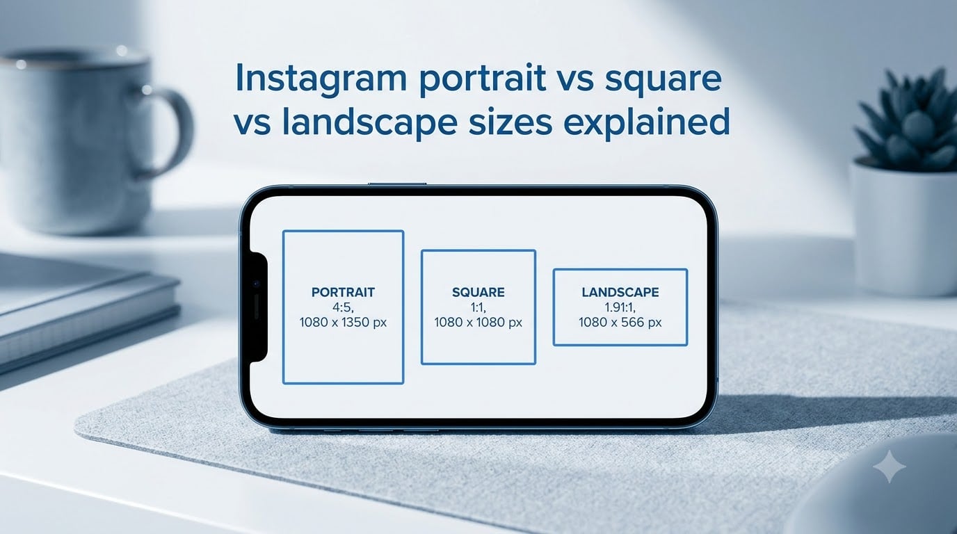
Instagram feed posts support three aspect ratios: 4:5 portrait at 1080×1350 pixels, 1:1 square at 1080×1080 pixels, and 1.91:1 landscape at 1080×566 pixels. Stories and Reels use a vertical 9:16 ratio at 1080×1920. Pick the right one and your photos fill more screen, get cropped less, and look sharper after Instagram’s compression.
I’ve been posting on Instagram for years, and I still get questions every week about which size to use. Photographers worry their landscapes look tiny. Small business owners can’t figure out why their product shots get cut off. Artists lose their canvases to mysterious black bars. The problem isn’t lack of information – it’s too much contradictory information. Different guides throw different numbers around, and the platform keeps changing.
So in this guide, I’m going to walk you through exactly what works in 2026. I’ll cover the three feed post sizes, the vertical 9:16 format, carousels, the 2026 profile grid change, and the export settings that prevent that dreaded blurry upload. By the end, you’ll know which size to use for any photo you want to post.
Table of Contents
- Quick Reference: Every Instagram Size at a Glance
- Aspect Ratio vs Pixel Dimensions: What You Actually Need to Know
- Instagram Feed Posts: Portrait vs Square vs Landscape Sizes Explained
- Stories and Reels: The 9:16 Vertical Standard
- Carousel Sizing: Why Every Slide Must Match
- The 2026 Profile Grid Shift: 3:4 Thumbnails Explained
- Export Settings That Stop Instagram From Blurring Your Photos
- How to Choose Between Portrait, Square, and Landscape
- Common Instagram Sizing Mistakes and How to Avoid Them
- FAQs
- What is the best aspect ratio for Instagram posts?
- What aspect ratio are Instagram Stories and Reels?
- What size should Instagram carousel images be?
- Does Instagram compress my photos?
- How do I stop Instagram from making my photos blurry?
- Why does my Instagram photo look cut off on my profile grid?
- What dimensions should I use for Instagram Reels?
- Does aspect ratio influence Instagram reach?
- Final Thoughts: Instagram Portrait vs Square vs Landscape Sizes Explained
Quick Reference: Every Instagram Size at a Glance
Here’s the table I wish I’d had on day one. Print it, bookmark it, or just scroll back to it whenever you’re exporting a photo.
| Format | Aspect Ratio | Pixel Size | Best For |
|---|---|---|---|
| Square post | 1:1 | 1080 x 1080 | Classic look, balanced grid |
| Portrait post | 4:5 | 1080 x 1350 | Maximum screen real estate, product shots |
| Landscape post | 1.91:1 | 1080 x 566 | Panoramic, editorial, scenic |
| Story / Reel | 9:16 | 1080 x 1920 | Vertical full-screen video |
| Reel cover | 9:16 | 1080 x 1920 | Thumbnail for Reels on grid |
| Profile picture | 1:1 (cropped) | 320 x 320 | Avatar, logo, headshot |
| Carousel slide | Match first slide | Match first slide | Multi-image posts |
If you remember nothing else, remember this: 1080 pixels wide is the magic number for almost every Instagram format. Stick to that width, pick the right height for your ratio, and you’ll rarely run into compression issues.
Aspect Ratio vs Pixel Dimensions: What You Actually Need to Know
Before we dive into each format, let’s clear up the two terms that confuse everyone.
Aspect ratio is the proportional relationship between width and height. A 1:1 ratio means equal width and height – a square. A 4:5 ratio means the image is taller than it is wide. A 1.91:1 ratio means wider than tall. Aspect ratios are unit-less – they describe the shape, not the size.
Pixel dimensions are the actual width and height in pixels. A 1080×1080 image has 1080 pixels across and 1080 pixels down. Pixel dimensions describe the resolution and detail level.
Why does this distinction matter? Because Instagram cares about both. The aspect ratio determines how your photo is shaped and displayed. The pixel dimensions determine how sharp it looks after compression. If you upload at the right ratio but the wrong size, your photo gets resized and may look blurry. If you upload at the right size but the wrong ratio, your photo gets cropped or letterboxed.
Think of aspect ratio as the picture frame and pixel dimensions as the picture quality. You need both to be correct for the best result.
Instagram Feed Posts: Portrait vs Square vs Landscape Sizes Explained
Feed posts are the bread and butter of Instagram. Every photo, video, and carousel you see in the main grid is a feed post. And you have exactly three shape choices.
Square (1:1, 1080×1080): The Classic Format
The square post is the original Instagram format – the one the platform was built around. At 1080×1080 pixels, a square post takes up about the same screen space as a portrait post on most phones, but it feels more balanced and symmetrical.
Squares work brilliantly for product shots, flat lays, quotes, and graphic designs where you want a clean centered composition. They also keep your profile grid looking uniform, since every tile is the same shape.
The downside? Squares occupy less vertical space than 4:5 portrait posts. On mobile, a portrait post fills roughly 78% of the screen height, while a square fills about 65%. That extra screen real estate often translates to higher engagement – more time spent looking at your post, which the algorithm rewards.
Portrait (4:5, 1080×1350): Maximum Screen Real Estate
Portrait is the format I recommend for most creators in 2026. At 1080×1350 pixels with a 4:5 aspect ratio, portrait posts fill more of the phone screen than any other feed format. That means more visual presence, more attention, and – according to countless creator reports – more engagement.
Portrait is perfect for full-body fashion shots, vertical product packaging, behind-the-scenes content, and any image where the subject is taller than it is wide. It’s also the go-to choice for carousels because users swipe through more content without scrolling.
The only real drawback: portrait images take up more vertical grid space, which can make your profile look uneven if you mix too many formats. A grid full of 4:5 portraits looks tight and full, while mixing in 1.91:1 landscapes creates awkward gaps.
Landscape (1.91:1, 1080×566): Panoramic and Editorial Use
Landscape is the least-used feed format, and that’s by design. At 1080×566 pixels with a 1.91:1 aspect ratio, landscape posts look small on the feed. They occupy about 65% of the screen width on mobile, making them feel almost thumbnail-sized.
But landscape has its place. Photographers love it for panoramic vistas and group shots. Editorial brands use it for magazine-style layouts. And if your composition is genuinely horizontal – think sweeping landscapes, architectural shots, or multi-person portraits – forcing it into a square or portrait will crop out important details.
My rule: only post in landscape if the wide composition is essential to the image. Otherwise, default to portrait.
Stories and Reels: The 9:16 Vertical Standard
Stories and Reels both use a 9:16 vertical aspect ratio at 1080×1920 pixels. That’s the full-screen phone shape – the format that fills your entire display when you turn your phone sideways.
This ratio is non-negotiable for Stories. Upload a square or landscape image and Instagram will letterbox it with black bars or zoom in and crop. Neither looks good.
Reels work the same way. If you want your Reel to display full-screen, shoot and export at 9:16. Anything else triggers cropping that can hide key content.
Stories and Reels Safe Zones
The 9:16 canvas isn’t all usable real estate. Instagram overlays UI elements – your profile name at the top, the caption and reply box at the bottom, reaction buttons on the side. If you place important content under those elements, viewers will miss it.
Here are the safe zone measurements I use:
Top: Avoid the top 250 pixels (profile name, follow button, timestamp)
Bottom: Avoid the bottom 250 pixels (caption input, reaction emojis)
Sides: Keep key content at least 150 pixels from each edge
That gives you a usable area of roughly 780×1420 pixels in the middle of the canvas. Design within that zone and your text, logos, and calls-to-action will stay visible.
Reel Cover Photos
Reels also display on your profile grid, and there they appear as 9:16 thumbnails (which get cropped to roughly 3:4 on the grid in 2026 – more on that next). When choosing a cover frame, pick a moment with strong visual contrast and avoid placing your subject in the bottom third, since the grid crop trims that area.
Carousel Sizing: Why Every Slide Must Match
Carousels let you post up to 20 images or videos in one swipeable post. But there’s one rule that trips up almost everyone: every slide must use the same aspect ratio.
If your first slide is a 4:5 portrait at 1080×1350, every other slide needs to be 4:5 as well. Mix in a 1:1 square and Instagram will either crop the square to fit the 4:5 frame (cutting off the sides) or display it awkwardly with black bars.
My recommendation for carousels: use 4:5 portrait. It gives you the most screen space, and it works well for storytelling sequences – product showcases, step-by-step tutorials, before-and-after comparisons.
If you want a square carousel for grid consistency, that works too. Just commit to square for every slide. The same applies to landscape carousels – rarely used, but valid if you have a reason.
The 2026 Profile Grid Shift: 3:4 Thumbnails Explained
Here’s something most guides still haven’t caught up to: in 2026, Instagram updated how posts appear on your profile grid. The grid now previews posts at a 3:4 ratio instead of the older 1:1 square preview.
That means a 1:1 square upload (1080×1080) no longer fills the entire grid tile. It gets cropped to roughly 1080×1440 pixels (a 3:4 frame), losing the top and bottom edges. A 4:5 portrait upload (1080×1350) almost fills the tile, with only minor cropping. A 1.91:1 landscape upload (1080×566) looks even smaller, occupying less than half the grid height.
This change caught many creators off guard. Existing grids that looked balanced suddenly appear uneven, with square posts looking cramped and landscape posts looking tiny.
How Each Format Looks on the 2026 Profile Grid
Here’s a quick breakdown of how each upload format displays in the new grid:
Square (1:1): Cropped to 3:4, loses top and bottom edges
Portrait (4:5): Fills nearly the full tile with minimal cropping
Landscape (1.91:1): Appears as a thin horizontal bar in the tile
If you’re starting a new account or planning a grid refresh, go with 4:5 portrait for everything. It gives you the cleanest, most consistent grid appearance under the 2026 preview rules.
Profile Picture Specifications
Your profile picture is the one place Instagram still uses a true 1:1 ratio, but it gets cropped into a circle. Upload at 320×320 pixels minimum, though 1080×1080 gives you better detail if Instagram ever supports higher resolution avatars.
Keep important content centered. The corners will be cropped off in the circular mask, and Instagram may reposition the circle slightly depending on the device.
Export Settings That Stop Instagram From Blurring Your Photos
Even with the perfect aspect ratio, a bad export can wreck your image. Here’s what I’ve learned about Instagram’s compression algorithm and how to work with it.
Upload at 1080 Pixels Wide
Instagram resizes anything wider than 1080 pixels down to 1080 pixels wide. That means if you upload a 4000-pixel-wide photo, Instagram downsamples it, which can introduce softness and artifacts. Uploading at exactly 1080 pixels wide skips the resize step and often results in a sharper final image.
For portrait, that’s 1080×1350. For square, 1080×1080. For landscape, 1080×566.
Use sRGB Color Profile
Instagram expects sRGB. If you export in Adobe RGB or ProPhoto RGB, the colors get converted during upload, often producing washed-out or oversaturated results. Most photo editors default to sRGB – just double-check before exporting.
Save as JPEG, Not PNG
Instagram converts most PNGs to JPEG anyway, which adds an extra compression step. Exporting directly as JPEG at 80-90% quality usually produces better results. Save PNG only for images with text or sharp edges where you need lossless quality.
Avoid Re-Exporting Multiple Times
Every time you save a JPEG, you lose a little quality. If you export from Lightroom, then resize in Photoshop, then re-export, you’ve compressed twice. Export once at the final size and quality.
Use the “Upload at Highest Quality” Setting
In Instagram’s settings, toggle on “Upload at highest quality” if your phone supports it. This setting tells the app to send the original file rather than a compressed version. You’ll use more data, but the image will look better.
How to Choose Between Portrait, Square, and Landscape
With three formats to pick from, the choice can feel overwhelming. Here’s the decision framework I use with my team and clients:
Default to 4:5 portrait. It fills the most screen space, fits the 2026 grid, and works for most subjects.
Use 1:1 square when you want a clean, balanced look or when matching an existing grid aesthetic.
Use 1.91:1 landscape only when the wide composition is essential – panoramas, group shots, architectural lines.
Use 9:16 for Stories and Reels. This is the only option for those formats.
Match every slide in a carousel to the first slide’s ratio.
Still unsure? Post the same image in all three formats and see which one gets the most engagement. The data from your own audience beats any generic advice.
Common Instagram Sizing Mistakes and How to Avoid Them
I’ve made most of these mistakes myself. Save yourself the frustration.
Mistake 1: Uploading at a non-1080 width. A 1200-pixel-wide image gets downsampled by Instagram and often looks softer than a properly sized 1080-pixel upload. Always match your width to 1080.
Mistake 2: Mixing ratios in a carousel. The first slide sets the canvas for the entire carousel. If you start with 4:5 and add a 1:1, Instagram crops the square awkwardly. Plan all slides before you upload.
Mistake 3: Ignoring the safe zone in Stories. Putting your call-to-action or logo in the bottom 250 pixels means half your viewers will never see it. Move important content to the middle 780×1420 pixel zone.
Mistake 4: Designing for the grid in 2026 without accounting for the 3:4 preview. Your gorgeous square posts now look cramped. Plan your grid with the 3:4 preview in mind, or switch to 4:5 portrait for a cleaner look.
Mistake 5: Using Adobe RGB. The colors look great on your calibrated monitor and terrible after Instagram’s sRGB conversion. Always export in sRGB.
Mistake 6: Posting landscape when portrait would work. Unless the wide composition is essential, landscape posts look tiny and get less engagement. Crop to portrait when possible.
FAQs
What is the best aspect ratio for Instagram posts?
The best aspect ratio for Instagram feed posts is 4:5 portrait (1080×1350 pixels). It fills more screen space on mobile than 1:1 square or 1.91:1 landscape, which tends to drive higher engagement. Use 1:1 square (1080×1080) for balanced, classic layouts. Use 1.91:1 landscape (1080×566) only for panoramic or wide compositions.
What aspect ratio are Instagram Stories and Reels?
Instagram Stories and Reels both use a 9:16 vertical aspect ratio at 1080×1920 pixels. This fills the entire phone screen in portrait orientation. Uploading any other ratio causes Instagram to crop or letterbox your content. Always export Stories and Reels at exactly 1080×1920.
What size should Instagram carousel images be?
Every slide in an Instagram carousel must use the same aspect ratio as the first slide. For 4:5 portrait carousels, export each slide at 1080×1350 pixels. For 1:1 square carousels, export at 1080×1080 pixels. Mixing ratios in a single carousel causes unwanted cropping or black bars on the inconsistent slides.
Does Instagram compress my photos?
Yes. Instagram compresses almost every uploaded image to reduce file size and speed up loading. The compression is most aggressive on images larger than 1080 pixels wide. Uploading at exactly 1080 pixels wide in JPEG format at 80-90% quality usually minimizes the visible compression artifacts.
How do I stop Instagram from making my photos blurry?
Export your photo at exactly 1080 pixels wide for the format you’re using, save it as a JPEG at 80-90% quality, use the sRGB color profile, and enable the Upload at Highest Quality setting in the Instagram app. Avoid re-exporting multiple times, since each save adds compression artifacts.
Why does my Instagram photo look cut off on my profile grid?
In 2026, Instagram updated profile grids to preview posts at a 3:4 aspect ratio. This means 1:1 square uploads (1080×1080) get cropped to roughly 3:4 on the grid, losing the top and bottom edges. To avoid unwanted cropping, post in 4:5 portrait (1080×1350), which fills almost the entire grid tile.
What dimensions should I use for Instagram Reels?
Export Instagram Reels at 1080×1920 pixels with a 9:16 vertical aspect ratio. For video, use the H.264 codec at 8-12 Mbps bitrate and a frame rate of 30 or 60 fps. Keep important content within the central 780×1420 pixel safe zone to avoid UI overlays at the top and bottom.
Does aspect ratio influence Instagram reach?
Aspect ratio does not directly affect your reach in Instagram’s algorithm, but it influences engagement signals like time spent on a post. 4:5 portrait posts fill more screen space than 1:1 square or 1.91:1 landscape, which often leads to longer view times and higher engagement, indirectly boosting reach.
Final Thoughts: Instagram Portrait vs Square vs Landscape Sizes Explained
Here’s the short version of everything we covered. Instagram portrait vs square vs landscape sizes explained boils down to three core feed ratios – 4:5 portrait (1080×1350), 1:1 square (1080×1080), and 1.91:1 landscape (1080×566) – plus the 9:16 vertical format (1080×1920) for Stories and Reels. Upload at 1080 pixels wide, export in sRGB JPEG, and respect the safe zones.
Don’t forget the 2026 profile grid shift. Your grid now previews at 3:4, which means 4:5 portrait posts look the cleanest. If you’ve been posting squares and wondering why your grid looks cramped, that’s why.
Pick one format as your default – I recommend 4:5 portrait – and use it consistently. Your grid will look better, your engagement will likely improve, and you’ll spend less time resizing photos. That’s the whole game.