
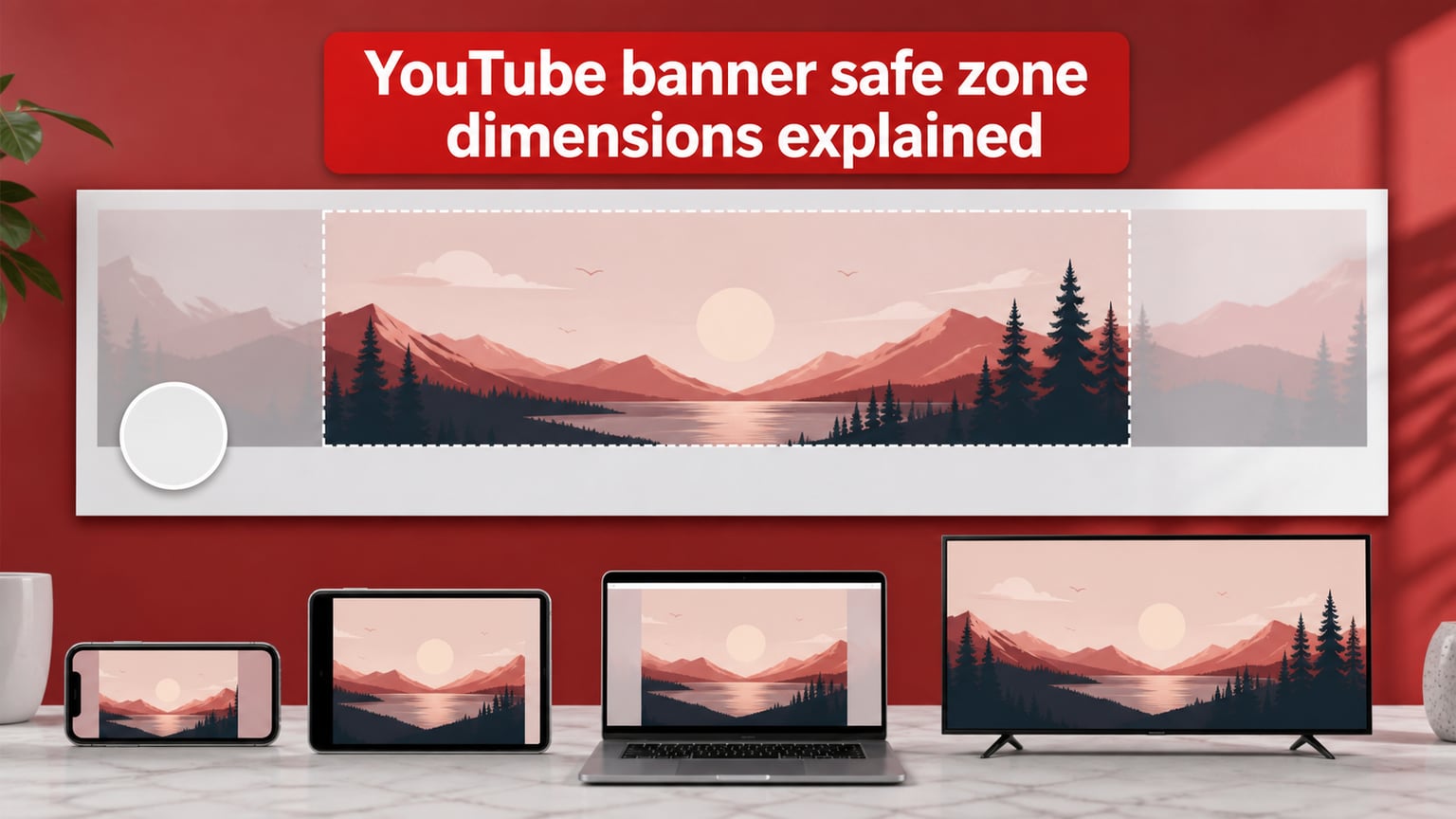
The YouTube banner safe zone is the 1546 by 423 pixel rectangle at the exact center of your 2560 by 1440 channel art image. It is the only area guaranteed to be visible on every device, from a phone in portrait mode to a 4K TV in full-screen mode. Every piece of text, logo, or focal element you place inside that rectangle will appear on the screen of every viewer who visits your channel. Anything outside it will be cropped on at least one device.
I learned this the hard way when I uploaded a banner that looked beautiful on my laptop, then opened my channel on my phone and saw half my logo sliced off. After years of designing channel art for creators, I now treat the safe zone as a hard rule, not a suggestion. In this guide I will walk you through every pixel, every coordinate, and every device crop so you can design a banner that looks right everywhere on the first try.
Table of Contents
- Quick Answer: YouTube Banner Safe Zone at a Glance
- Full YouTube Banner Specifications for 2026
- What Is the YouTube Banner Safe Zone?
- Device-by-Device Breakdown: What Viewers See
- How to Set Up Safe Zone Guides in Photoshop, Figma, Canva, and Illustrator
- Design Best Practices for the Safe Zone
- Common YouTube Banner Safe Zone Mistakes to Avoid
- Frequently Asked Questions
- What is the YouTube banner safe zone?
- What are the exact dimensions of a YouTube banner?
- Why does my YouTube banner look different on mobile vs desktop?
- What is the minimum YouTube banner size?
- Does the YouTube banner safe zone change in 2026?
- How do I set up the safe zone in Photoshop?
- Can I put important content outside the safe zone?
- What file format is best for YouTube banners?
- Final Thoughts on YouTube Banner Safe Zone Dimensions
Quick Answer: YouTube Banner Safe Zone at a Glance
Here is everything you need to remember in 30 seconds. Bookmark this block and reference it when you open your design tool.
- Full canvas size: 2560 x 1440 pixels (16:9 ratio).
- Safe zone size: 1546 x 423 pixels, centered horizontally and vertically.
- Left and right edges of the safe zone: 507 px in from each side.
- Top edge of the safe zone: 508 px down from the top of the canvas.
- Bottom edge of the safe zone: 1019 px down from the top (508 + 423 + 88 to the channel avatar circle).
- Minimum upload size: 2048 x 1152 pixels.
- Maximum file size: 6 MB.
- Accepted formats: JPG, PNG, GIF, BMP (non-animated GIFs only).
- Recommended DPI: 72 for screen, 150 for retina-quality displays.
That is the entire spec. If you design inside those numbers and never place critical content outside the 1546 by 423 rectangle, your banner will look correct on every device that opens YouTube in 2026.
Full YouTube Banner Specifications for 2026
YouTube accepts a wide range of banner sizes, but only one combination gives you the sharpest image on every device. Here is the complete specification table I use with every creator I work with.
| Specification | Recommended Value | Minimum / Maximum |
|---|---|---|
| Recommended dimensions | 2560 x 1440 px | 2048 x 1152 px minimum |
| Aspect ratio | 16:9 | 16:9 (locked) |
| Safe zone (visible on all devices) | 1546 x 423 px | Centered only |
| Tablet crop | 1855 x 423 px | Centered |
| Desktop strip | 2560 x 423 px | Centered horizontally |
| TV full canvas | 2560 x 1440 px | Edge to edge |
| File size limit | Under 6 MB | 6 MB maximum |
| File formats | JPG or PNG | JPG, PNG, non-animated GIF, BMP |
| Color space | sRGB | sRGB recommended |
| Resolution | 72 DPI (screen) or 150 DPI (retina) | 72 DPI minimum |
| Animation | Not supported for channel art | Static image only |
A few notes on this table. JPG is the smallest file format for photographic banners and almost always stays under 6 MB at full resolution. PNG is better when you need transparency or sharp edges on logos and text. GIF and BMP are accepted but rarely used because they bloat the file size without any benefit at this resolution.
The minimum upload size of 2048 x 1152 exists so that your banner does not pixelate on TVs. If you upload anything smaller, YouTube will still accept it, but the image will look soft on the biggest screens. Stick with 2560 x 1440 and you skip that problem entirely.
What Is the YouTube Banner Safe Zone?
The safe zone is the smallest rectangle inside your banner that stays visible on every screen. Think of your 2560 by 1440 banner as a giant canvas, and the safe zone as a smaller rectangle floating in the middle. The space outside that rectangle gets cropped differently depending on whether the viewer is on a phone, tablet, laptop, or TV.
YouTube does this because every device has a different aspect ratio. Your single uploaded image has to work on a tall phone, a square-ish tablet, a wide desktop browser, and a 16:9 television all at the same time. The company solved that problem by defining one rectangle that fits inside all four crops. That rectangle is the 1546 by 423 safe zone.
The Math Behind the Coordinates
I have seen a lot of guides hand you the numbers without explaining where they come from. Here is the simple math so you can sanity-check any future YouTube spec update.
- Total canvas width: 2560 px.
- Safe zone width: 1546 px.
- Horizontal margin on each side: (2560 – 1546) divided by 2 = 507 px.
- Total canvas height: 1440 px.
- Safe zone height: 423 px.
- Vertical margin above the safe zone: (1440 – 423) divided by 2 = 508.5 px (YouTube rounds to 508 px).
- Vertical margin below the safe zone: 508 px plus an 88 px buffer for the circular channel avatar.
The 88 px buffer is the part most guides skip. Your channel profile picture (a circle) sits in the bottom-left of the banner area on desktop, and it covers roughly 88 px of the bottom-left corner of the safe zone. I keep all my important content away from that lower-left square when I design.
Visualizing the Safe Zone as Nested Rectangles
The cleanest mental model is to think of four nested rectangles stacked inside each other.
- Outermost rectangle: the full 2560 by 1440 canvas (visible only on TV).
- Next rectangle: the 2560 by 423 desktop strip (visible on TV and desktop).
- Next rectangle: the 1855 by 423 tablet crop (visible on TV, desktop, and tablet).
- Innermost rectangle: the 1546 by 423 safe zone (visible on every device, including mobile).
When you place something inside the innermost rectangle, you are guaranteed it will be visible everywhere. When you place something in the desktop strip but outside the tablet crop, only TVs and desktops will see it. The safe zone is the only layer that crosses all four device crops.
Device-by-Device Breakdown: What Viewers See
This is the section I wish had existed when I started designing channel art. YouTube crops the same banner image differently for every device, and each crop has a name. Knowing the names and dimensions makes troubleshooting easy.
Mobile (Phone in Portrait Mode)
Mobile shows only the 1546 by 423 safe zone, centered. This is the smallest crop and the one that matters most because the majority of YouTube watch time happens on phones. If you are a creator with a younger audience, that share is even higher.
Everything outside the safe zone disappears on mobile. Tall illustrations, side decorations, and corner logos will all be cut off. Treat mobile as your primary canvas and design everything important to fit inside 1546 by 423.
Tablet
Tablets show a slightly wider crop of 1855 by 423. The extra 309 px (about 154.5 px on each side) is a small visual buffer, but you cannot rely on it because most viewers will not see it. Use the tablet crop only for secondary decorations, not critical information.
Desktop Browser
Desktop shows a wide 2560 by 423 horizontal strip across the top of the channel page. This is the crop most creators design for first, because it is what you see when you open YouTube on a laptop. The desktop strip is wider than the safe zone by 1014 px (507 px on each side).
The desktop strip is great for background gradients, repeating patterns, and decorative graphics that extend toward the edges. None of that will ever show on mobile, so treat it like wallpaper.
TV (Smart TV and Consoles)
TV shows the entire 2560 by 1440 canvas edge to edge, including the area above and below the desktop strip. This is the only device that uses the full height of your banner. TV viewers see a much taller image, which means your design will have visible top and bottom regions that mobile viewers will never see.
That extra TV-only real estate is a gift. I like to put a subtle photo, texture, or large watermark in the top and bottom regions so the banner does not look empty when someone browses the channel from their living room. Just make sure that decoration is not critical to your brand.
Quick Reference Table
| Device | Crop Size | Margin from Full Canvas | Critical Content? |
|---|---|---|---|
| TV | 2560 x 1440 | None (edge to edge) | Optional decoration only |
| Desktop | 2560 x 423 | 508 px top, 509 px bottom | Background and patterns |
| Tablet | 1855 x 423 | 352 px left/right | Secondary graphics |
| Mobile | 1546 x 423 | 507 px left/right | All critical content here |
The right column is the rule I follow on every project. Critical content (logos, slogans, upload schedule, faces) goes inside the safe zone. Background and decoration go in the wider strips. Anything in between is optional polish.
How to Set Up Safe Zone Guides in Photoshop, Figma, Canva, and Illustrator
Once you know the dimensions, you need to translate them into guides in your design tool of choice. Below are the exact steps for the four tools I use most often with creators.
Photoshop
- Create a new document at 2560 x 1440 pixels, 72 DPI, RGB color.
- Go to View > New Guide Layout and choose Custom.
- Add a vertical guide at 507 px and another at 2053 px (2560 – 507 = 2053).
- Add horizontal guides at 423 px and 1019 px from the top.
- Optional: add horizontal guides at 508 px and 93 px to mark the safe zone edges precisely.
- Lock your guides via View > Lock Guides so they do not move while you work.
I prefer Photoshop when the banner has photography, complex composites, or heavy retouching. The guide setup takes about 60 seconds once you have done it a few times.
Figma
- Create a new frame at 2560 x 1440.
- Press Shift plus R to bring up the rectangle tool, or right-click the canvas and choose Add Guide.
- Add vertical guides at X = 507 and X = 2053.
- Add horizontal guides at Y = 508 and Y = 931 (931 = 508 + 423).
- Use a frame sized 1546 x 423 with the corner radius set to 0 and position it at 507, 508 to visualize the safe zone.
- Group the guides into a component so you can reuse them on every banner.
Figma is my favorite tool for this kind of work because the components let me reuse the safe zone frame across projects. If you design banners for multiple channels, save the safe zone overlay as a shared library asset.
Canva
- Open Canva and choose Custom Size. Enter 2560 x 1440 px.
- Click on the page and add a rectangle at position 507, 508 with width 1546 and height 423.
- Send the rectangle to the back (right-click > Send to Back) so it sits behind your design layers.
- Set the rectangle’s transparency to around 15 percent so you can see your design through it.
- Add four thin guide lines at the rectangle’s edges using Canva’s line tool if you want clearer visual boundaries.
Canva does not have true ruler guides, so the rectangle trick is the closest workaround. Once your design is finished, delete the rectangle before exporting.
Illustrator
- Open a new document at 2560 x 1440 px (or use Artboard Options to change the size of an existing file).
- Press Ctrl/Cmd plus semicolon to show rulers if they are hidden.
- Click and drag from the left ruler to drop a vertical guide at 507 px and another at 2053 px.
- Click and drag from the top ruler to drop horizontal guides at 423 px, 508 px, and 931 px.
- Lock guides via View > Guides > Lock Guides.
Illustrator is the right choice for vector-heavy banners with logos that need to scale crisply on retina displays. The guide workflow is identical to Photoshop, just with different menu labels.
Design Best Practices for the Safe Zone
The dimensions tell you where to draw. Design best practices tell you what to draw inside those boundaries. After dozens of channel art projects, here are the rules I follow on every banner.
Design Mobile First, Desktop Second
Most YouTube watch time happens on phones, so design with the 1546 by 423 safe zone as your primary canvas. Get the layout looking right there first, then extend backgrounds and decorations outward toward the desktop strip.
This is the reverse of how most creators design. They start with the wide desktop view and end up cramming text and logos into the safe zone as an afterthought. Flip the order and your mobile crop will always look intentional.
Keep Text Big and Centered
Inside the safe zone, your text should be readable on a phone screen at arm’s length. I aim for a minimum height of about 60 px on the source file, which scales down to roughly 24 px on a phone. Anything smaller turns into a smudge.
Center your headline horizontally inside the safe zone and avoid the corners. The avatar circle in the lower-left of the desktop strip covers about 88 px of your canvas, so do not place text in the lower-left of the safe zone either.
Use High Contrast
Channel banners compete with thumbnails, page chrome, and ambient light. Pick a color combination with at least a 4.5:1 contrast ratio for text. White on dark blue, black on yellow, and white on black are all safe choices.
If you are not sure about your colors, run them through a free contrast checker before exporting. A surprising number of banners look great on a designer monitor but disappear against YouTube’s white background.
Treat the Edges as Wallpaper
Outside the safe zone, your design should look like an extension of the inside, not a separate composition. Use repeating patterns, gradients, soft photos, or solid colors. Anything that breaks the visual flow of the central content will look awkward on desktop and empty on mobile.
Avoid These Things Outside the Safe Zone
- Logos that need to be read at a glance.
- Taglines or slogans.
- Critical text like upload schedules or social handles.
- Small details under 30 px in the source file.
These belong inside the safe zone. Everything outside is decoration.
Common YouTube Banner Safe Zone Mistakes to Avoid
I have made every mistake on this list at least once. If you are new to channel art design, treat this section as a pre-flight checklist before you upload.
- Designing only for desktop. If your banner looks great at 2560 wide but you cannot read the text on your phone, the design failed. Always preview on a phone before uploading.
- Putting a logo in the corners. Corners are the first place to disappear on smaller crops. Keep logos centered and well inside the safe zone.
- Ignoring the avatar overlap. The channel profile picture sits in the lower-left of the banner area on desktop and covers about 88 px. Do not place important content in that square.
- Using the wrong canvas size. Designing at 1920 x 1080 or 1280 x 720 is a common mistake in older tutorials. Stick to 2560 x 1440 for the sharpest result.
- Going over 6 MB. PNG files with lots of detail often exceed the limit. Export as JPG at 80 to 85 percent quality to stay under the cap while keeping the image sharp.
- Forgetting to check on TV. If your banner looks fine on mobile and desktop but empty in the upper and lower thirds, TV viewers will notice the blank space. Fill those areas with subtle decoration.
- Skipping the upload preview. YouTube shows a preview tool during upload. Use it every single time. It is the fastest way to see how your banner looks on each device.
- Animating the banner. YouTube does not support animated channel art. If you submit a GIF, only the first frame will display.
Frequently Asked Questions
What is the YouTube banner safe zone?
The YouTube banner safe zone is the 1546 x 423 pixel rectangle at the exact center of your 2560 x 1440 channel art image. It is the only area guaranteed to be visible on every device, including mobile, tablet, desktop, and TV. Place all critical text, logos, and focal elements inside this rectangle to keep your channel looking consistent across screens.
What are the exact dimensions of a YouTube banner?
The recommended YouTube banner dimensions are 2560 x 1440 pixels with a 16:9 aspect ratio. The safe zone inside that canvas is 1546 x 423 pixels, positioned 507 pixels in from the left and right edges and 508 pixels down from the top. The minimum upload size is 2048 x 1152 pixels.
Why does my YouTube banner look different on mobile vs desktop?
YouTube crops the same uploaded image differently for each device. Mobile shows only the central 1546 x 423 safe zone, desktop shows a 2560 x 423 horizontal strip, tablet shows 1855 x 423, and TV shows the full 2560 x 1440 canvas. Anything outside the safe zone disappears on smaller screens, which is why mobile viewers see less of your banner than desktop viewers.
What is the minimum YouTube banner size?
The minimum upload size for a YouTube banner is 2048 x 1152 pixels. Smaller images will be accepted but may look soft on TVs and high-resolution screens. For the sharpest result on every device, design at the full 2560 x 1440 size.
Does the YouTube banner safe zone change in 2026?
As of 2026, the YouTube banner safe zone is still 1546 x 423 pixels centered inside a 2560 x 1440 canvas. YouTube has used these dimensions for years and they remain the official recommendation in the channel customization help center. Always double-check the latest help docs before a major redesign, but the safe zone numbers have not changed.
How do I set up the safe zone in Photoshop?
Create a 2560 x 1440 document, then open View u0026gt; New Guide Layout. Add vertical guides at 507 px and 2053 px, and horizontal guides at 423 px, 508 px, and 1019 px. Lock the guides with View u0026gt; Lock Guides so they do not move while you design. Anything you place inside the rectangle formed by those guides will stay visible on every device.
Can I put important content outside the safe zone?
You can, but it will not appear on every device. Content outside the 1546 x 423 safe zone disappears on mobile, and content outside the 2560 x 423 desktop strip disappears on tablet. Reserve the outer regions for decoration, backgrounds, and patterns. Keep logos, slogans, and critical text inside the safe zone so every viewer sees them.
What file format is best for YouTube banners?
JPG is the best format for photographic banners because it keeps file sizes small while staying sharp at 2560 x 1440. PNG is better for banners with logos, text, or transparency. Both stay well under the 6 MB limit at full resolution. Avoid GIF and BMP unless you have a specific reason to use them, and remember that animated GIFs are not supported for channel art.
Final Thoughts on YouTube Banner Safe Zone Dimensions
The YouTube banner safe zone is small but mighty. A 1546 x 423 pixel rectangle in the center of a 2560 x 1440 canvas is the entire area you can count on showing up on every screen, from a phone in a pocket to a TV on the far wall of a living room. Design for that rectangle first, fill the desktop strip with decoration second, and use the TV-only top and bottom regions as bonus canvas.
If you remember nothing else from this guide, remember the three numbers: 2560, 1440, and 1546 by 423. Those are the dimensions that matter, and they have not changed in years. Open your design tool, drop in the guides at 507, 2053, 508, and 931 pixels, and build your banner around the safe zone. Your channel will look consistent on every device, your logo will stay visible to every viewer, and you will never have to re-upload because of a cropped tagline again.
For more free banner templates and channel art tools, browse the rest of Free Web Headers and grab one of our starter templates designed around the exact safe zone covered in this guide.