
Getting the Twitter post image size right is the difference between a crisp, professional-looking tweet and one where your text gets cut off, your face is half-visible, or your graphic turns into a blurry mess after upload. I have spent years managing social media accounts across desktop and mobile, and the same sizing mistakes keep showing up because the specifications are scattered across outdated guides.
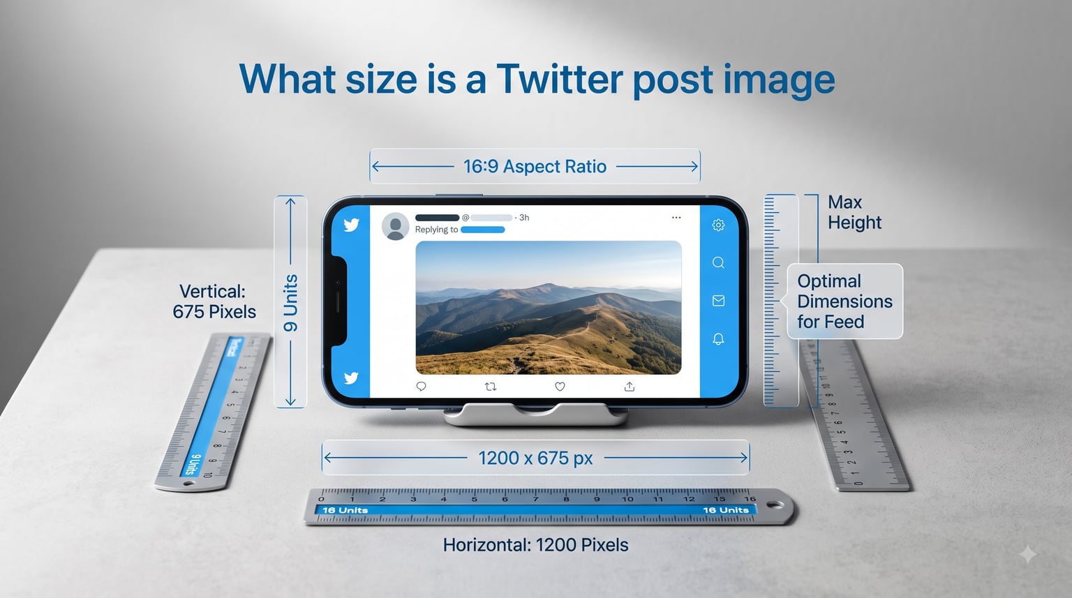
The recommended Twitter post image size is 1200 x 675 pixels with a 16:9 aspect ratio for single-image posts. This is the dimension that X (formerly Twitter) displays at full quality in the feed without cropping on most devices. If you take one thing away from this guide, that is it.
In this guide, I will walk you through every Twitter image size you need for 2026 — from standard in-feed posts to profile pictures, headers, Twitter Cards, and multi-image tweets. I will also explain why Twitter compresses your images, how to prevent blurry uploads, and the exact aspect ratios that avoid the platform’s automatic cropping. Everything here is based on hands-on testing across desktop, iOS, and Android.
Table of Contents
- Quick Answer: What Size Is a Twitter Post Image?
- Quick Reference: All Twitter Image Sizes
- Twitter Post Image Size: Single Image Posts
- Multi-Image Tweet Sizes (2, 3, and 4 Images)
- Twitter Profile Picture Size
- Twitter Header and Banner Size
- Twitter Card Image Sizes
- Twitter Ad Image Sizes
- Video Thumbnail Size on Twitter
- How to Avoid Cropping on Twitter Posts
- File Formats: PNG vs JPG vs GIF
- Why Twitter Images Look Blurry (and How to Fix It)
- Best Practices for Optimizing Twitter Images
- FAQs
- What is the best image size for Twitter posts?
- What is the Twitter header image size for 2026?
- What is the ideal Twitter profile image size?
- What size should Twitter images be to avoid cropping?
- What is the best vertical image size for Twitter?
- What is the Twitter Card image size?
- Why do Twitter images look blurry?
- Does Twitter compress uploaded images?
- What image format works best on X/Twitter?
- What is the maximum image file size on Twitter?
- Conclusion
Quick Answer: What Size Is a Twitter Post Image?
The ideal Twitter post image size is 1200 x 675 pixels at a 16:9 aspect ratio, saved as a PNG or high-quality JPG under 5 MB. This gives you the sharpest possible display in the feed on both mobile and desktop without any automatic cropping. X displays single in-feed images at a 16:9 ratio by default, so matching that ratio means every pixel you upload appears exactly where you intended.
If you want a square or vertical look instead, use 1080 x 1080 pixels (1:1) for square posts or 1080 x 1350 pixels (4:5) for vertical posts. Both display without cropping when you use those exact ratios.
The minimum recommended width for any Twitter post image is 600 pixels. The maximum supported resolution is 4096 x 4096 pixels, though anything above 1200 pixels wide provides no visible quality improvement because X downscales images to fit the feed. Staying at the recommended dimensions is always the best strategy.
Quick Reference: All Twitter Image Sizes
Here is the full cheat sheet for every Twitter (X) image type in 2026. I keep this table bookmarked because it covers everything from post images to ads in one place.
| Image Type | Dimensions (px) | Aspect Ratio | Max File Size |
|---|---|---|---|
| Single in-feed post (landscape) | 1200 x 675 | 16:9 | 5 MB |
| Single in-feed post (square) | 1080 x 1080 | 1:1 | 5 MB |
| Single in-feed post (vertical) | 1080 x 1350 | 4:5 | 5 MB |
| Profile picture | 400 x 400 | 1:1 | 2 MB |
| Header / banner | 1500 x 500 | 3:1 | 5 MB |
| Twitter Card (Summary) | 1200 x 628 | 1.91:1 | 5 MB |
| Twitter Card (Summary Large Image) | 1200 x 628 | 1.91:1 | 5 MB |
| Ad image (single) | 1200 x 628 | 1.91:1 | 5 MB |
| Video thumbnail | 1280 x 720 | 16:9 | 5 MB |
Bookmark this table and reference it before every upload. Every dimension listed has been tested for 2026 and reflects the current X platform behavior.
Twitter Post Image Size: Single Image Posts
Single-image posts are the most common tweet format, and they are also where I see the most sizing errors. X supports three primary aspect ratios for single in-feed images: landscape (16:9), square (1:1), and vertical (4:5). Each one has a specific use case and a specific pixel dimension that produces the cleanest result.
Landscape Post Image: 1200 x 675 Pixels (16:9)
The landscape format is the default display ratio for Twitter in-feed images. When you upload a 16:9 image at 1200 x 675 pixels, X shows the entire image in the timeline without cropping it. That is why this is the recommended Twitter post image size for most content — blog headers, infographic banners, screenshots, and wide promotional graphics.
I use 1200 x 675 for anything with text overlays because the full image is visible in the feed preview. There is no guessing about what gets cut off. The 16:9 ratio also matches most monitor and video thumbnails, so your content looks consistent across formats.
One important detail: uploading at a resolution higher than 1200 pixels wide does not improve quality. X downscales anything larger, and the downscaling process can introduce softness. Stick with 1200 x 675 for the sharpest result.
If you are cross-posting from Facebook or LinkedIn, their recommended landscape dimensions (1200 x 628 at 1.91:1) are close but not identical to X’s 1200 x 675. The slight difference means you should create a dedicated 16:9 version for X rather than reusing the 1.91:1 asset and accepting minor edge crops.
Square Post Image: 1080 x 1080 Pixels (1:1)
Square images at 1080 x 1080 pixels display fully in the feed without cropping. They occupy a slightly smaller footprint than landscape images but work well for product shots, portrait-style graphics with centered content, and cross-posting from Instagram (which uses 1080 x 1080 as its native square format).
The square format is especially useful when your content needs to look identical on Twitter and Instagram. I recommend it for quote graphics, branded templates, and any image where the subject is centered and symmetrical.
X displays square images at 1:1 in the feed, meaning no pixels are hidden. The minimum recommended width is 600 pixels, but always upload at 1080 to keep things sharp after compression.
Square posts also perform well when you plan to boost them as ads later. X’s ad system accepts 1:1 images natively, so you will not need to reformat your creative if you decide to promote a tweet.
Vertical Post Image: 1080 x 1350 Pixels (4:5)
Vertical images at 1080 x 1350 pixels use a 4:5 aspect ratio, which is the tallest format X supports in the feed without cropping. This ratio gives your content more vertical real estate, which is ideal for portraits, fashion photography, step-by-step infographics, and any image that benefits from height.
I have found that vertical posts stand out in the timeline because they take up more screen space on mobile devices. When most of your audience scrolls on phones, that extra height translates to more attention. The 4:5 ratio is also shared with Instagram, so you can cross-post without resizing.
Avoid going taller than 4:5. If you upload a 2:3 or full 9:16 image, X will crop the top and bottom to fit the 4:5 display window. That crop is automatic and often removes the most important part of your image.
For vertical graphics with multiple sections — like numbered tips or stacked quotes — position each section at least 150 pixels apart vertically. This gives the crop buffer room so individual sections stay intact even if the display crops slightly.
Multi-Image Tweet Sizes (2, 3, and 4 Images)
When you attach multiple images to a single tweet, X applies a specific grid layout that crops each image to fit a predetermined tile arrangement. Understanding how these grids work prevents awkward cuts and ensures your multi-image tweets look intentional.
Here is how X arranges multi-image tweets in the feed for 2026:
Two images: X displays them side by side, each cropped to a 7:8 vertical ratio within a combined 16:9 frame. Each image fills half the width with a 50/50 split. Upload at 700 x 800 pixels per image for the cleanest result.
Three images: X creates a layout with one large image on the left taking up the full height, and two smaller images stacked on the right. The large image is cropped to roughly 220 x 275 pixels of visible area at display size, and the two right-side images are each about 115 x 135 pixels. Upload at 800 x 1000 pixels and let X handle the grid crop.
Four images: X arranges them in a 2 x 2 grid. Each tile is cropped to a square ratio. Upload at 1200 x 1200 pixels per image for the sharpest grid display. The four-image grid is the most predictable layout because every tile is square, which means centered content always survives the crop.
The key rule for multi-image tweets: keep important content centered and avoid putting text or faces near the edges. X’s grid crop is aggressive, and elements placed at the borders of your original image will likely be cut. I always preview multi-image tweets on mobile before publishing because the grid crop behaves slightly differently across devices.
When a user taps a multi-image tweet, X opens a lightbox that shows each image individually at a larger size. The lightbox respects each image’s original aspect ratio within limits, so the full composition of each photo is visible when expanded. Design your images so they work both as small grid tiles and as full-size lightbox views.
For consistent multi-image layouts, I recommend pre-cropping your images to the tile dimensions before uploading. Pre-cropping gives you full control over what appears in each grid position, rather than relying on X’s automatic crop decisions. This is especially important for three-image tweets, where the left image gets significantly more display area than the two right images.
Twitter Profile Picture Size
Your Twitter profile picture is the circular avatar that appears next to every tweet you post. The recommended size is 400 x 400 pixels with a 1:1 aspect ratio and a maximum file size of 2 MB.
X displays profile pictures as circles, which means the four corners of your square image are hidden. This is the number one mistake I see — people upload a logo or face that fills the entire square, and the circular crop chops off the edges. Keep all important elements within the center 80% of the image.
For the sharpest result on high-resolution displays, upload at exactly 400 x 400 pixels. Going larger does not help because X downscales the image, and the downscaling can blur fine details like small text in a logo.
The file format for profile pictures should be PNG if your avatar has text, sharp edges, or a logo. Use JPG if it is a photograph. PNG preserves line art and text clarity better through X’s compression pipeline.
The profile picture also appears in several sizes across the platform. In the timeline, it shows at roughly 49 x 49 pixels. On your profile page, it displays at about 200 x 200 pixels. In notifications, it shrinks to around 32 x 32 pixels. Design your avatar so it remains recognizable at all three sizes — bold, simple shapes with high contrast work best. Intricate details that look great at 400 pixels can become invisible mush at 32 pixels.
Twitter Header and Banner Size
The Twitter header (also called the banner) is the wide image that spans the top of your profile page. The recommended size is 1500 x 500 pixels with a 3:1 aspect ratio and a maximum file size of 5 MB.
The header is the trickiest image to get right on the entire platform. It displays differently on desktop, mobile, and tablets, and the profile picture overlaps the bottom-left corner of the header on every device. On mobile, additional bio text can cover the bottom portion of the banner.
I recommend designing your header with a safe zone in mind. Keep all text, logos, and important visual elements in the horizontal center band of the image — roughly between 200 and 400 pixels from the top in a 1500 x 500 canvas. Avoid placing anything critical in the bottom-left corner (where the profile picture sits) or the bottom-right corner (where bio text appears on mobile).
Here is the layout breakdown I use for header design on a 1500 x 500 canvas. The top 100 pixels are a danger zone on desktop — browsers can crop up to 30 pixels from the top edge. The center band from y=100 to y=400 is the safe zone where content reliably survives across all devices. The bottom 100 pixels are the most vulnerable area, especially on mobile where the profile picture circle and bio text overlay consume significant space.
The profile picture overlaps the header starting at roughly x=20 and extends to about x=230 on a standard desktop view. On mobile, this overlap is proportionally larger because the profile picture is scaled relative to the screen width. Never place text, logos, or important imagery in this bottom-left region.
For headers with text, use PNG format to keep letters crisp. For photographic headers, JPG is fine. Always preview your header on both desktop and a mobile device before finalizing — the difference in cropping between the two is significant.
If you need text in your header, use a font size of at least 48 pixels at 1500 width. Smaller text becomes unreadable on mobile devices where the header is displayed at roughly 375 pixels wide. Test legibility by scaling your 1500 x 500 canvas down to 375 x 125 in your image editor — if the text is still readable at that size, it will work on mobile.
Twitter Card Image Sizes
Twitter Cards are the expanded link previews that appear when you tweet a URL. The website you link to controls which card type appears, but you can configure the card image through your website’s meta tags. There are three main card types, each with its own image size requirements.
Summary Card: Displays a small square image (120 x 120 pixels at display size) next to a title and description. The recommended upload size is 1200 x 1200 pixels at a 1:1 ratio. This card appears as a compact link preview with the image on the left side.
Summary Card with Large Image: Displays a wide image above the title and description. The recommended size is 1200 x 628 pixels at a 1.91:1 ratio. This is the card type most brands want because the large image takes up significant feed space and drives higher click-through rates.
Player Card: Used for video and audio content. The recommended image size is 1200 x 628 pixels at a 1.91:1 ratio, matching the Summary Card with Large Image. The player card includes a playable media widget in the tweet.
To control your card images, add Open Graph tags (og:image) or Twitter-specific tags (twitter:image) to your website’s HTML head section. The image URL must point to an absolute path, and the image should be at least 1200 x 628 pixels for the large image format.
I always recommend testing your card with the X Card Validator tool before publishing a link. This shows you exactly how the card will appear in the feed and flags any image sizing issues before they go live.
One common issue: if your card image does not appear, it is usually because the image URL is not absolute (it needs to start with https://), the image is too large (over 5 MB), or the server is blocking X’s crawler. Check your robots.txt file and server headers to confirm X can access the image file.
Twitter Ad Image Sizes
If you run promoted tweets or X ad campaigns, the ad image dimensions follow slightly different specifications than organic posts. The standard single ad image size is 1200 x 628 pixels at a 1.91:1 ratio, matching the Twitter Card format.
For carousel ads, each card image should be 1200 x 628 pixels at 1.91:1. You can include up to six cards in a single carousel, and each card can have its own image, headline, and destination URL. Keep the same safe zone principles in mind — text near the top and bottom edges may be cropped on certain devices.
Website card ads display a smaller image (800 x 418 pixels minimum) alongside a headline and website URL. The image appears as a thumbnail rather than a full-width banner, so prioritize bold, simple visuals over detailed graphics.
For all ad formats, I recommend designing at exactly 1200 x 628 pixels and testing the creative in X’s Ads Composer before launching. The preview tool shows how the ad will appear across desktop, mobile, and tablet placements, which helps catch cropping issues before you spend budget.
Video Thumbnail Size on Twitter
When you post a video on X, the platform generates a thumbnail image from the video file. You can also upload a custom thumbnail. The recommended video thumbnail size is 1280 x 720 pixels at a 16:9 aspect ratio, with a maximum file size of 5 MB.
Custom thumbnails are worth the extra effort. The auto-generated frame X selects is often an unflattering mid-motion shot. Uploading a designed thumbnail with a text overlay, branded frame, or compelling visual consistently improves click-through rates on video tweets.
Use the same design principles as landscape post images: keep text large enough to read on mobile, use high contrast, and avoid placing critical elements at the edges. The thumbnail is the first thing users see before deciding whether to watch, so treat it like a book cover for your video content.
How to Avoid Cropping on Twitter Posts
Cropping is the most common frustration I hear about from social media managers and creators. The good news is that X’s cropping behavior follows predictable rules once you understand them. Here is how to prevent unwanted cropping on your Twitter post images.
Rule 1: Match the aspect ratio. X displays single in-feed images within a 16:9 frame by default. If your image is wider than 16:9, the sides get cropped. If it is taller than roughly 4:5, the top and bottom get cropped. Upload at 16:9, 1:1, or 4:5 and your image will display fully.
Rule 2: Keep content centered. When X does apply a center crop — which happens for images that fall outside the supported ratios — it crops from the center outward. Faces, text, and logos placed in the center 60% of the image survive most crops. Elements at the edges do not.
Rule 3: Design for the feed preview, not the full image. When someone sees your tweet in the timeline, they see the cropped preview. Clicking expands the full image, but most people never click. Design assuming only the preview matters.
The 2021 cropping algorithm change is relevant here. X removed the machine-learning-based saliency crop that previously decided which part of an image to show. Now, the platform uses a straightforward center crop for images outside the supported ratios. This means cropping behavior is more consistent than it was before, but it also means you cannot rely on smart face detection to protect your content. Manual centering is the only reliable approach.
Reddit users on r/Twitter have noted that Android devices sometimes apply slightly different cropping than iOS. This inconsistency is minor but worth checking if you have an Android device available for testing. I always preview tweets on both platforms before scheduling important posts.
The old saliency algorithm had a well-documented issue where it preferred lighter-skinned faces over darker-skinned faces when choosing which part of an image to crop. X addressed this by moving to the simpler center crop model. While this fixed the bias problem, it shifted responsibility for smart cropping entirely to the user. Your images will be center-cropped, period — so plan accordingly.
File Formats: PNG vs JPG vs GIF
Choosing the right file format is just as important as getting the pixel dimensions right. Each format interacts differently with X’s compression pipeline, and using the wrong one can turn a sharp image into a blurry mess.
PNG is the best format for images with text, sharp lines, logos, and flat color areas. PNG uses lossless compression, which means no quality is lost when you save the file. When you upload a PNG to X, the platform applies lighter compression to PNGs that are under 900 pixels wide or under 300 KB in file size. This is a key insight from community testing — smaller PNGs survive the compression pipeline with minimal quality loss.
JPG is the best format for photographs and images with gradients, shadows, or complex color blends. JPG uses lossy compression, which means some quality is lost every time the file is saved. Upload JPGs at the highest quality setting your editor allows (90-100% quality) to give X the best source material before its own compression kicks in.
GIF is the format for animated images on X. The platform supports GIF animations natively, and they loop automatically in the feed. Keep GIFs under 5 MB and ideally under 3 MB for smooth playback. Static GIFs (single frame) should be converted to PNG instead — PNG produces a smaller file with better quality for non-animated content.
Here is my format decision flow for every Twitter post image. If the image has text or sharp graphics, use PNG. If it is a photo, use JPG at maximum quality. If it needs animation, use GIF under 5 MB. If it needs transparency, use PNG. This simple flow eliminates 90% of quality issues before they start.
One format to avoid: WEBP. While X can display WEBP files, the compression behavior is less predictable than PNG or JPG. Stick with the established formats for the most consistent results across devices.
For file size optimization before upload, run your images through a compression tool. TinyPNG reduces PNG file sizes by 50-80% with minimal visible quality loss. Squoosh gives you fine-grained control over compression level and output format. ImageOptim strips unnecessary metadata that bloats file size without adding visible quality. Pre-compressing your images means X applies less additional compression, preserving more of your original quality.
Why Twitter Images Look Blurry (and How to Fix It)
Blurry images on X are almost always caused by compression. When you upload an image, X runs it through a compression pipeline that reduces the file size for faster loading. This pipeline applies to every image, regardless of format or original quality. The compression is aggressive — it can reduce a 2 MB PNG to under 200 KB — and it is the primary reason your images look softer after upload than they do in your image editor.
Here is how to minimize quality loss from X’s compression:
Upload at the exact recommended dimensions. If the recommended size is 1200 x 675, upload at exactly 1200 x 675. Going larger forces X to downscale, which compounds compression artifacts. Going smaller means X has less source data to work with, producing a softer result.
Pre-compress your images before upload. This sounds counterintuitive, but it works. If you compress the image yourself using a high-quality setting before uploading, X’s pipeline applies less additional compression. The platform’s algorithm detects that the file is already optimized and applies a lighter touch. Tools like Squoosh, TinyPNG, and ImageOptim handle pre-compression well.
Use PNG for images under 900 pixels wide. Community testing on Reddit confirms that X applies lighter compression to PNG files that are under 900 pixels in width. For smaller graphics like icons, badges, or small banners, PNG is the safer choice.
Avoid uploading screenshots as JPG. Screenshots contain sharp text and edges that JPG’s lossy compression blurs. Always use PNG for screenshots. The difference is immediately visible — text in a PNG screenshot stays readable, while text in a JPG screenshot gets fuzzy halos around every letter.
The forum community has also flagged that Android users sometimes see more compression artifacts than iOS users for the same image. This appears to be related to how the X app handles image rendering on different platforms. If you have access to both, compare your uploads across devices to identify any platform-specific issues.
Here is a step-by-step checklist I run through before publishing any image-heavy tweet. First, confirm the image is at the recommended pixel dimensions for its type. Second, verify the file is in the correct format (PNG for graphics, JPG for photos). Third, run the file through a compression tool to reduce its size to under 1 MB if possible. Fourth, preview the tweet on both desktop and mobile. Fifth, check the feed preview specifically — not the expanded view — to confirm text and faces are not cropped. This five-step process takes about two minutes and eliminates nearly every common quality issue.
Best Practices for Optimizing Twitter Images
Beyond getting the dimensions right, a few optimization practices will keep your images looking sharp and professional across every device. These are the tips I apply to every image before it goes live on X.
Use the sRGB color space. X’s rendering pipeline expects sRGB. If your image uses Adobe RGB or ProPhoto RGB, the platform converts it to sRGB, which can shift colors and reduce vibrancy. Export in sRGB from your image editor to maintain consistent colors across all devices.
Set DPI to 72. DPI (dots per inch) does not affect how images display on screens — it only matters for print. However, setting DPI to 72 ensures your image editor does not add unnecessary metadata or apply unexpected scaling. It is a harmless setting that keeps files clean.
Add alt text to every image. Alt text improves accessibility for users with screen readers and provides SEO value for your tweets. X allows up to 1,000 characters for alt text, but I recommend keeping it under 125 characters for conciseness. Describe the image’s content and context, not just what it literally shows. For example, instead of “photo of a person,” write “marketing team reviewing campaign analytics on a laptop.” Context-rich alt text helps all users, including those who have images disabled on slow connections.
Design for mobile first. Over 80% of X users access the platform on mobile devices. Images that look great on a 27-inch monitor might look cramped on a 6-inch phone screen. Use larger fonts (minimum 24 pixels at 1200 width), high contrast, and simple layouts that read clearly at small sizes.
Use the right tools for resizing. Canva offers pre-built Twitter templates with correct dimensions for every image type. Squoosh is a free web tool that handles compression and format conversion. Photopea is a free browser-based Photoshop alternative for more complex editing. For batch resizing, I use ImageMagick or FastStone Photo Resizer to process multiple files at once.
Test before you publish. Always preview your images on both desktop and mobile before scheduling or posting. The display differences between devices can be significant, especially for headers and multi-image tweets. A quick preview catches cropping and compression issues that would otherwise go live.
Maintain visual consistency across platforms. If you post on both X and Instagram, design templates that work across both. The 1:1 square at 1080 x 1080 pixels displays well on both platforms. The 4:5 vertical at 1080 x 1350 also cross-posts cleanly. Avoid X-only 16:9 images if you plan to reuse the same creative on Instagram, where the 16:9 ratio is not supported in the feed.
Keep an organized asset library. Save your final images with descriptive filenames that include the dimensions and intended platform. For example, “summer-sale-banner-1500×500-x-header.png” tells you exactly what the file is without opening it. This saves time when you need to update seasonal content or replicate a previous campaign’s format.
FAQs
What is the best image size for Twitter posts?
The best image size for Twitter posts is 1200 x 675 pixels with a 16:9 aspect ratio. This size displays fully in the feed without cropping on both mobile and desktop. For square posts, use 1080 x 1080 pixels (1:1). For vertical posts, use 1080 x 1350 pixels (4:5).
What is the Twitter header image size for 2026?
The Twitter header image size for 2026 is 1500 x 500 pixels with a 3:1 aspect ratio. The maximum file size is 5 MB. Keep important text and logos in the center band of the image, as the profile picture overlaps the bottom-left corner and mobile bio text can cover the bottom portion.
What is the ideal Twitter profile image size?
The ideal Twitter profile image size is 400 x 400 pixels with a 1:1 aspect ratio and a maximum file size of 2 MB. X displays profile pictures as circles, so keep all important content within the center 80% of the square to avoid the circular crop cutting off edges.
What size should Twitter images be to avoid cropping?
To avoid cropping on Twitter, use one of three supported aspect ratios: 16:9 (1200 x 675 pixels) for landscape, 1:1 (1080 x 1080 pixels) for square, or 4:5 (1080 x 1350 pixels) for vertical. Images outside these ratios are center-cropped automatically.
What is the best vertical image size for Twitter?
The best vertical image size for Twitter is 1080 x 1350 pixels with a 4:5 aspect ratio. This is the tallest format X displays in the feed without cropping. Going taller than 4:5 causes X to crop the top and bottom of the image.
What is the Twitter Card image size?
Twitter Summary Cards use a 1200 x 1200 pixel image (1:1 ratio). Summary Cards with Large Image and Player Cards use a 1200 x 628 pixel image (1.91:1 ratio). Configure card images using og:image or twitter:image meta tags on your website.
Why do Twitter images look blurry?
Twitter images look blurry because X compresses every uploaded image to reduce file size for faster loading. To minimize blurriness, upload at the exact recommended dimensions, pre-compress images before uploading, use PNG for graphics with text, and avoid uploading at resolutions higher than recommended.
Does Twitter compress uploaded images?
Yes, Twitter compresses all uploaded images. The compression pipeline reduces file sizes significantly, which can introduce artifacts and softness. PNG files under 900 pixels wide receive lighter compression. Pre-compressing your images before upload reduces the additional compression X applies.
What image format works best on X/Twitter?
PNG works best for images with text, logos, and sharp graphics. JPG works best for photographs and images with gradients. GIF is best for animations under 5 MB. Avoid WEBP as its compression behavior on X is less predictable than PNG or JPG.
What is the maximum image file size on Twitter?
The maximum image file size on Twitter is 5 MB for post images, header images, and Twitter Cards. Profile pictures have a lower limit of 2 MB. For GIFs, keep the file under 5 MB for smooth playback in the feed.
Conclusion
Getting the Twitter post image size right comes down to one core recommendation: 1200 x 675 pixels at 16:9 for landscape, 1080 x 1080 at 1:1 for square, and 1080 x 1350 at 4:5 for vertical. Match these dimensions, choose the right file format, and pre-compress before uploading. Your images will display fully in the feed, stay sharp after compression, and look consistent across every device. Bookmark the quick reference table, preview on mobile before you post, and keep your content centered to avoid surprise crops.