
If you have ever exported an image for a website and wondered whether you should pick 72 DPI, 96 DPI, or 300 DPI, you are not alone. This is one of the most common sources of confusion in web design, photography, and digital marketing. The question “what DPI should an image be for web” comes up constantly on forums like Reddit’s r/webdev and r/photography, and the answers people find are often contradictory.
I have spent years working with web images across dozens of client projects, and the confusion almost always comes down to one thing: people mix up DPI (dots per inch) with PPI (pixels per inch), and they do not realize that web browsers ignore DPI metadata entirely.
In this guide, I will clear up what DPI should an image be for web once and for all. I will explain the 72 PPI standard, why it exists, whether it still matters for retina displays, and give you practical export settings you can use right away in Photoshop, GIMP, or any design tool.
Table of Contents
- Quick Answer: What DPI Should an Image Be for Web?
- DPI vs PPI: Understanding the Difference
- The 72 PPI Standard for Web Images
- Does DPI Actually Matter for Web Display?
- Retina and High-DPI Displays: Do You Need 144 PPI?
- Web vs Print: 72 PPI vs 300 DPI Explained
- Recommended Pixel Dimensions for Common Web Images
- How to Set the Right DPI in Photoshop and Other Tools
- Best Image Formats for Web in 2026
- Web Image Optimization Checklist
- FAQs
- Conclusion
Quick Answer: What DPI Should an Image Be for Web?
The standard DPI for web images is 72 PPI. This has been the convention since the early days of desktop computing, and it remains the default recommendation across Adobe Community, Stack Exchange, and major web design resources in 2026.
Here is the part most guides skip: the DPI setting in your image file does not actually change how the image looks on a screen. Web browsers only read pixel dimensions (width times height). A 1920×1080 image set to 72 DPI displays identically to a 1920×1080 image set to 300 DPI on any website.
The DPI value is just metadata. Think of it as a sticky note attached to the file that tells printing software how large to print it. Screens do not read that note. So while 72 PPI is the correct number to set for web images, what actually matters is that your pixel dimensions are large enough for your intended display size.
DPI vs PPI: Understanding the Difference
Before going further, we need to separate two terms that get used interchangeably but mean different things. This distinction is the root cause of most confusion I see in forum discussions.
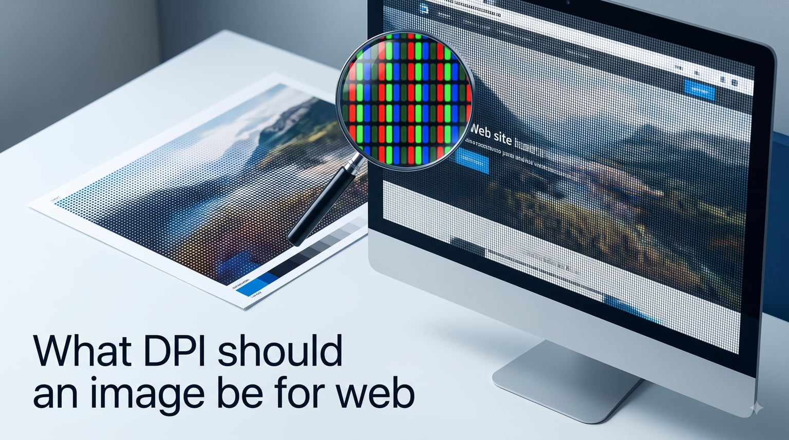
DPI (dots per inch) refers to physical ink dots laid down by a printer. A 300 DPI print means the printer places 300 tiny ink dots in every linear inch of paper. This is a print-only concept.
PPI (pixels per inch) refers to the pixel density of a digital image on a screen. A monitor with 96 PPI displays 96 pixels in every linear inch. This is the relevant metric for anything digital.
The reason people mix them up is simple: software like Photoshop labels its resolution field as “Resolution” measured in “Pixels/Inch” but most users call it DPI anyway. The terms became blurred over decades of casual usage. When someone asks “what DPI should an image be for web,” they almost always mean PPI.
I use DPI and PPI interchangeably throughout this guide because that is how the conversation happens in the real world. But if you want to be technically accurate, PPI is the correct term for digital screens, and DPI belongs to print.
The 72 PPI Standard for Web Images
The number 72 comes from early Apple Macintosh computers. The original Mac screens in 1984 had a display density of exactly 72 PPI, chosen so that on-screen text would match physical print sizes at 1:1 scale. A 12-point font on screen measured the same as 12-point text printed on paper.
That became the default resolution setting in image editing software, and it stuck. Even though modern monitors range from roughly 90 to over 500 PPI, the 72 PPI convention persisted as the standard metadata value for web images.
Is 72 PPI good for web? Yes. Adobe Community, Stack Exchange, and the consensus across r/webdev and r/photography all agree: 72 PPI works perfectly for web images. The community has tested this repeatedly, and the result is always the same. Screen display depends on pixel dimensions, not the PPI metadata field.
Some resources mention 96 PPI as an alternative standard. That number comes from Microsoft Windows, which assumed a slightly higher default display density. In practice, the difference between 72 and 96 PPI in the metadata field has zero visible effect on web display. Either number works fine.
Does DPI Actually Matter for Web Display?
This is where I need to be very direct: DPI metadata in an image file does not affect how that image renders on any screen. Not on a laptop. Not on a phone. Not on a 4K monitor. Web browsers read the pixel dimensions and display the image at whatever size CSS and HTML dictate.
I see this question constantly on forums: “Will my images look better if I save them at 300 DPI instead of 72 DPI for web?” The answer is no. The image will look identical because the browser never checks the DPI field.
Here is a simple test I have done myself. Take a 1200×800 pixel image. Save one copy at 72 PPI and another at 300 PPI. Load both on a webpage at the same display size. They will look exactly the same. The only difference is that the 300 PPI file’s metadata suggests a smaller physical print size, which is irrelevant for screen viewing.
What does matter is having enough pixels for your display area. If you want an image to fill a 1200-pixel-wide content area, you need at least 1200 pixels of width in the source file. Whether that file is tagged 72, 96, or 300 PPI makes no difference to the browser.
Community consensus on Reddit and Stack Exchange confirms this repeatedly. Experienced web developers note that they never worry about DPI settings for web images. They focus on pixel dimensions and file size optimization instead.
Retina and High-DPI Displays: Do You Need 144 PPI?
This is the most common follow-up question I get from designers. Retina displays, high-DPI phones, and 4K monitors pack many more pixels into each inch of screen. Does that mean you need higher DPI images?
The answer is nuanced. You do not need to change the PPI metadata field. But you do need more source pixels if you want your images to look sharp on high-DPI screens.
Here is how it works in practice. A standard display shows one image pixel per screen pixel. A retina display at 2x density shows two screen pixels for each image pixel. If your source image only has enough pixels for a standard display, the retina screen has to stretch those pixels, which can look soft or blurry.
The solution is not to change DPI. The solution is to provide more pixels. If your image displays at 400 pixels wide on a standard screen, export it at 800 pixels wide so retina screens have enough detail. Then use CSS or the HTML srcset attribute to serve the right version to each device.
Some guides suggest saving images at 144 PPI for retina. This is misleading. The 144 PPI number does nothing special in the browser. What helps is the doubled pixel dimensions that typically accompany a 144 PPI export. Focus on pixel count, not the PPI label.
Web vs Print: 72 PPI vs 300 DPI Explained
The 300 DPI standard belongs entirely to print. Professional printers need 300 dots of ink per inch to produce sharp, detailed output on paper. At 300 DPI, a 4×6 inch photo requires 1200×1800 pixels. Drop below 300 DPI for print, and you start seeing visible pixelation on the physical page.
For web, those rules do not apply. A 1200×1800 pixel image on a website looks the same whether the metadata says 72 PPI or 300 PPI. The browser does not print it; it displays it pixel for pixel.
Can you use 300 DPI images on the web? Absolutely. They will display fine. But there is a downside: file size. A 300 PPI image exported at full print dimensions tends to be much larger than necessary for web, which slows down your page load times. I always recommend resizing web images to the actual pixel dimensions needed and saving at 72 PPI to keep file sizes reasonable.
Should I use 72 or 300 DPI? For web, use 72 PPI. For print, use 300 DPI. That simple rule covers 99 percent of situations.
Recommended Pixel Dimensions for Common Web Images
Since pixel dimensions matter far more than DPI for web display, here are the dimensions I recommend for common use cases based on current web design standards in 2026.
Full-width hero images: 1920 pixels wide by 1080 pixels tall. This covers most desktop screens at full width. For retina, consider exporting at 2x (3840 pixels wide) and serving via srcset.
Blog featured images: 1200 pixels wide by 630 pixels tall. This matches the Open Graph dimensions used by Facebook, LinkedIn, and other social platforms when links are shared.
Content area images: 800 to 1200 pixels wide. Match the image width to your content column. A typical blog content area is 800 pixels, so an 800-pixel-wide image fills it perfectly.
Product thumbnails: 400 to 600 pixels wide. Keep these small for fast loading on category pages and galleries.
Social media square posts: 1080 by 1080 pixels. This is the standard for Instagram, Facebook, and LinkedIn square feeds.
Website headers and banners: 1920 pixels wide by 400 to 600 pixels tall. Match the aspect ratio your layout calls for.
Email images: 600 pixels wide for full-width email images, since most email clients cap content width at 600 to 700 pixels.
At all of these dimensions, set the PPI to 72 in your export settings. The combination of correct pixel dimensions and 72 PPI gives you sharp images that load fast.
How to Set the Right DPI in Photoshop and Other Tools
Setting the correct DPI for web images is straightforward once you know where the settings live. Here are step-by-step instructions for the most common tools.
Step 1: Resize for your display area. Before adjusting DPI, make sure your image has the right pixel dimensions. In Photoshop, go to Image, then Image Size. Make sure the Resample box is checked. Set Width and Height to the pixel values you need for your web layout.
Step 2: Set resolution to 72. In the same Image Size dialog, find the Resolution field. Type 72 and make sure the unit is Pixels/Inch. This sets the PPI metadata to the web standard.
Step 3: Export for web. Go to File, then Export, then Save for Web (Legacy) or Export As. In the export dialog, choose your format (JPEG for photos, PNG for graphics with transparency, WebP for modern browsers). Set quality to 70 to 80 percent for JPEG to balance quality and file size.
Step 4: Check the file size. Aim for under 200 KB for most web images. Hero images can go up to 500 KB. If your file is larger, reduce quality or dimensions slightly and re-export.
For GIMP users, the process is similar. Go to Image, then Scale Image. Set the new pixel dimensions and change X and Y resolution to 72 pixels per inch. Export using File, then Export As, and choose your format.
For Canva users, the platform handles pixel dimensions automatically when you choose web-optimized export. Just select PNG or JPG and download. Canva defaults to screen-appropriate resolution.
For Figma and Sketch users, both tools export at screen resolution by default. Set your frame to the pixel dimensions you need and export at 1x for standard screens or 2x for retina.
Best Image Formats for Web in 2026
Choosing the right format goes hand in hand with getting DPI right. Here is a quick breakdown of which format to use for different types of web images.
JPEG is the best choice for photographs and complex images with many colors. It offers excellent compression, keeping file sizes small. Use JPEG for hero images, blog photos, and product shots without transparency.
PNG is ideal for graphics with sharp edges, text, or transparency. Logos, icons, and illustrations with flat colors look best as PNG. The downside is larger file sizes for photographic content.
WebP is the modern standard I recommend for 2026. It produces files 25 to 35 percent smaller than JPEG at equivalent quality. WebP supports both lossy and lossless compression plus transparency. All major browsers now support it, including Chrome, Firefox, Safari, and Edge.
AVIF is the newest format, offering even better compression than WebP. Browser support has improved significantly, but some older browsers still struggle with it. I recommend AVIF for cutting-edge projects with a fallback to WebP or JPEG for compatibility.
Is PNG or JPEG higher quality for web? PNG is lossless, meaning no quality loss, but it produces much larger files for photos. JPEG is lossy but produces smaller files that look fine at 70 to 80 percent quality. For most web photographs, JPEG at high quality settings looks great and loads fast.
Web Image Optimization Checklist
Before you publish any image to a website, run through this quick checklist to make sure it is properly optimized.
Pixel dimensions match or slightly exceed the display size
Resolution set to 72 PPI in the metadata
File format chosen appropriately (JPEG for photos, PNG for graphics, WebP when possible)
File size under 200 KB for standard images, under 500 KB for hero images
Retina version exported at 2x for high-DPI screens (served via srcset)
Alt text written describing the image for accessibility and SEO
Descriptive filename using hyphens (example: sunset-hero-banner.jpg)
Lazy loading enabled for images below the fold
This checklist addresses what actually impacts web image quality and performance: pixel dimensions, file format, compression, and delivery. DPI is just one small piece of the puzzle, and as I have explained, it affects print more than screen.
FAQs
Is 72 PPI good for web?
Yes, 72 PPI is the standard resolution for web images. It works well because web browsers ignore the PPI metadata field and only display images based on their pixel dimensions. As long as your image has enough pixels for the display area, 72 PPI is perfectly fine.
Should I use 72 or 300 DPI?
Use 72 PPI for web images and 300 DPI for print images. The 300 DPI standard exists because printers need dense ink coverage for sharp output. Screens do not use ink, so 300 DPI provides no benefit for web display and only increases file size unnecessarily.
Can you use 300 DPI images on the web?
Yes, you can use 300 DPI images on the web. They will display normally because browsers only read pixel dimensions. However, 300 DPI images exported at print dimensions tend to have much larger file sizes, which slows down page loading. For best performance, resize to the needed pixel dimensions and save at 72 PPI.
Is PNG or JPEG higher quality for web?
PNG is technically higher quality because it uses lossless compression, but it produces larger files for photographic content. JPEG uses lossy compression but creates smaller files that look excellent at 70 to 80 percent quality. For web photographs, JPEG is usually the better choice. For logos, icons, and graphics with transparency, use PNG.
Is 72 DPI good for social media?
Yes, 72 DPI is fine for social media. Platforms like Instagram, Facebook, and Twitter display images based on pixel dimensions, not DPI metadata. Focus on uploading images at the recommended pixel dimensions for each platform. For example, 1080×1080 pixels for Instagram square posts.
What DPI should images be for retina displays?
You do not need to change the DPI setting for retina displays. Instead, export images at double the pixel dimensions (2x) so high-DPI screens have enough detail. Keep the PPI at 72 in the metadata and use the srcset attribute or CSS to serve the larger version to retina devices.
Conclusion
The answer to what DPI should an image be for web is 72 PPI, but the deeper truth is that DPI metadata barely matters for screen display at all. What drives image quality on the web is pixel dimensions, file format, and compression. Get those right and your images will look sharp on every device.
Set your resolution to 72 PPI, choose pixel dimensions that match your display area, export at retina-friendly 2x sizes when needed, and pick the right format for the job. Follow the optimization checklist above and your web images will load fast and look great on everything from budget phones to 5K monitors.