
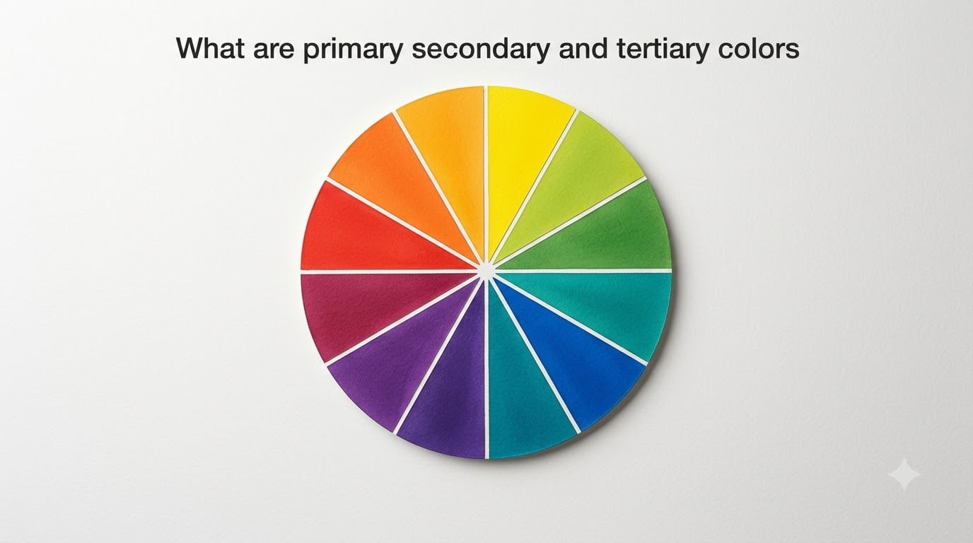
Primary, secondary, and tertiary colors are the three categories that organize every hue on the color wheel. Primary colors cannot be mixed from other colors, secondary colors come from mixing two primaries, and tertiary colors result from combining a primary with an adjacent secondary. Together, these twelve hues form the foundation of color theory used by artists, designers, and photographers worldwide.
When I first started learning color theory, I remember staring at a color wheel and wondering why red, yellow, and blue got the VIP treatment. The answer comes down to a simple principle: every other color on the wheel can be traced back to those three. Once you understand how these categories work together, mixing colors becomes far more predictable and a lot less frustrating.
In this guide, we will break down each color category with specific examples, mixing formulas, and practical tips. We will also clear up the common confusion between traditional art color models (RYB) and digital screen models (RGB), since many people run into conflicting information online.
Table of Contents
What Is the Color Wheel?
The color wheel is a circular diagram that arranges colors by their relationships to one another. It is the tool artists and designers use to visualize how colors mix, contrast, and harmonize. The standard wheel contains twelve positions divided into three groups of four: three primary colors, three secondary colors, and six tertiary colors.
Sir Isaac Newton created the first color wheel in 1704 after passing sunlight through a prism and observing the visible light spectrum. Newton arranged the spectral colors into a circle to show that red and violet connected at each end, forming a continuous loop. His original diagram mapped seven colors to match the seven notes of a musical scale, but modern versions use twelve positions for practical mixing.
The wheel reads clockwise or counterclockwise, and each color’s position tells you something about its relationships. Colors directly across from each other are complementary pairs, colors next to each other are analogous neighbors, and the three primaries sit equally spaced at 120-degree intervals. This spatial arrangement is what makes the wheel so useful for building color schemes.
Think of the color wheel as a map. Once you know where each color lives, you can predict what happens when you combine any two points on that map. That predictability is what separates a planned palette from guesswork.
What Are Primary, Secondary, and Tertiary Colors?
Primary, secondary, and tertiary colors form a three-level hierarchy on the color wheel. Each level builds on the one before it, creating an organized system for understanding how every hue relates to every other hue.
Here is a quick reference list:
Primary colors: Red, Yellow, Blue (cannot be created by mixing other colors)
Secondary colors: Orange, Green, Purple (each made by mixing two primaries)
Tertiary colors: Red-Orange, Yellow-Orange, Yellow-Green, Blue-Green, Blue-Violet, Red-Violet (each made by mixing a primary with an adjacent secondary)
That gives you twelve total colors on the traditional wheel. Each category plays a specific role in color mixing, and understanding those roles is the key to working confidently with any palette.
Primary Colors Explained
Primary colors are the three hues that cannot be produced by mixing other colors together. In the traditional RYB color model used in painting and art education, the primary colors are red, yellow, and blue. These three pigments serve as the building blocks for every other color on the wheel.
Why these three? The answer has to do with how pigments absorb and reflect light. Red, yellow, and blue pigments each reflect a distinctive range of wavelengths that cannot be replicated by blending other pigments. When you try to mix your way to a true primary red or primary blue from secondary or tertiary colors, you always end up with something slightly muddy or dull. That is because primaries represent the purest form of each hue family.
Red sits at the warm end of the spectrum and is associated with energy and intensity. Yellow is the lightest primary, sitting between warm and cool, and it brings brightness and visibility to any mix. Blue anchors the cool side of the wheel and provides depth and calm. When you combine any two of these three, you unlock the secondary colors.
One thing that trips up beginners is discovering that different fields use different primary sets. Painters learn red, yellow, and blue (RYB), but digital screens use red, green, and blue (RGB), and printers use cyan, magenta, and yellow (CMYK). We will cover all three models in detail later. For now, know that when people talk about primary colors in art, they almost always mean RYB.
Here is something I learned the hard way: not every tube of “primary red” paint is the same. Pigment quality matters. A cadmium red and an alizarin crimson behave very differently when you mix them with blue to make purple. The closer your primaries are to true color wheel positions, the cleaner your secondary and tertiary mixes will be.
Secondary Colors Explained
Secondary colors are created by mixing two primary colors in roughly equal proportions. The three secondary colors in the RYB model are orange, green, and purple. Each one sits directly between its two parent primaries on the color wheel, occupying the midpoint of that mixing relationship.
Here are the exact mixing formulas:
Orange: Red + Yellow
Green: Yellow + Blue
Purple (Violet): Red + Blue
The position of each secondary color on the wheel is no accident. Orange sits between red and yellow, green sits between yellow and blue, and purple sits between red and blue. This spatial logic is what makes the wheel work as a mixing tool. If you want to know what two colors produce, find them on the wheel and look at the midpoint.
When it comes to mixing ratios, equal parts is the starting point but not always the end result. Red and blue mixed in equal amounts produce a balanced purple, but many painters prefer adding slightly more blue to create a deeper, richer violet. Similarly, yellow and blue in equal parts make a medium green, but adjusting the ratio toward yellow gives you a brighter, spring-like chartreuse, while leaning toward blue produces a deeper forest green.
A common mistake I see beginners make is using too much of one primary and not enough of the other. If your orange looks too red, you probably did not add enough yellow. If your green looks muddy, you might be using a red-leaning blue instead of a green-leaning blue like ultramarine or phthalo blue. Pigment bias plays a huge role in how clean your secondary colors turn out.
Secondary colors are generally less intense than primaries but more complex. They carry visual information from two hue families, which makes them useful for creating depth and variety in a composition. Orange carries the warmth of red and the brightness of yellow. Green carries the cheer of yellow and the calm of blue. Purple carries the energy of red and the depth of blue.
Tertiary Colors Explained
Tertiary colors are created by mixing a primary color with the secondary color directly adjacent to it on the color wheel. This produces six intermediate hues that bridge the gap between each primary and its neighboring secondary. The six tertiary colors are red-orange, yellow-orange, yellow-green, blue-green, blue-violet, and red-violet.
Here are the six tertiary colors with their mixing formulas:
Red-Orange: Red + Orange
Yellow-Orange: Yellow + Orange
Yellow-Green: Yellow + Green
Blue-Green: Blue + Green
Blue-Violet: Blue + Purple
Red-Violet: Red + Purple
Notice the naming convention. Tertiary colors are always named with the primary color first and the secondary color second. You say red-orange, not orange-red. This convention helps you immediately identify which primary anchors the mix. Red-orange leans more toward red, while yellow-orange leans more toward yellow, even though both are shades of orange.
Some sources list a seventh or even mention 24 tertiary colors. This confusion comes from different color theories and naming systems. In the traditional twelve-color wheel used in art education, there are exactly six tertiary colors. However, some extended systems split each tertiary into lighter and darker versions, doubling the count. We address this in the FAQ section below.
Tertiary colors are the most nuanced and varied hues on the wheel. They sit between clearly defined categories, which makes them incredibly versatile for design work. Teal (a blue-green) can read as calming or energetic depending on context. Magenta-leaning red-violet can feel luxurious or playful. These intermediate colors give artists and designers the widest range of expressive options.
When mixing tertiaries, I recommend starting with a small amount of the secondary color and gradually adding the primary until you reach the desired balance. This approach gives you more control than dumping equal amounts and hoping for the best. Tertiary mixing rewards patience and observation.
RYB vs RGB vs CMYK Color Models
This is where a lot of people get confused, and it is one of the most common questions in art and design forums. You might read that primary colors are red, yellow, and blue on one website, then see another source calling red, green, and blue the primaries. Both are correct, but they belong to different color models designed for different purposes.
Let me break down all three models in a comparison table so you can see exactly how they differ.
| Feature | RYB | RGB | CMYK |
|---|---|---|---|
| Primary Colors | Red, Yellow, Blue | Red, Green, Blue | Cyan, Magenta, Yellow, Key (Black) |
| Type | Subtractive (pigment) | Additive (light) | Subtractive (ink) |
| Used For | Painting, art education | Digital screens, monitors, cameras | Printing presses, inkjet printers |
| How Colors Mix | Mixing pigments darkens the result | Mixing light brightens the result | Layering inks absorbs more light |
| All Colors Combined | Brown / dark gray | White | Dark brown (black ink added for true black) |
| Secondary Colors | Orange, Green, Purple | Cyan, Magenta, Yellow | Red, Green, Blue |
Notice something fascinating: the secondary colors in the RGB model are the primary colors of CMYK, and vice versa. This is not a coincidence. RGB and CMYK are essentially mirror systems, which is why color conversion between screens and printers always involves some compromise.
The RYB model is the oldest of the three and is what most people learn in school. It dates back centuries and works well for paint, pastels, and other physical media where pigments absorb light. The model is not scientifically perfect, which is why CMYK was developed for professional printing, but it remains the standard for art education because it is intuitive and easy to teach.
RGB works with light instead of pigment. When you combine red, green, and blue light at full intensity, you get white. This is how every screen you look at produces color. Your phone, computer monitor, and television all use RGB subpixels in varying intensities to create the full spectrum of visible colors.
CMYK is the printing industry standard. Professional printers layer cyan, magenta, yellow, and black ink to reproduce colors on paper. The addition of black (the K) compensates for the fact that cyan, magenta, and yellow inks combine to produce a muddy brown rather than a true black.
So which model should you use? If you are painting with traditional media, RYB is your framework. If you are designing for screens, work in RGB. If your work is headed to a printing press, convert to CMYK. Understanding which model applies to your medium prevents a lot of headaches down the line.
Warm Colors vs Cool Colors
The color wheel splits into two temperature zones: warm colors and cool colors. Warm colors include red, orange, and yellow, along with their tertiary variations like red-orange and yellow-orange. Cool colors include blue, green, and purple, along with tertiaries like blue-green and blue-violet.
Warm colors tend to advance visually, meaning they appear to come toward the viewer. They are associated with energy, passion, warmth, and urgency. Think of a fiery sunset or a glowing campfire. Designers use warm colors to draw attention, create excitement, and make elements pop.
Cool colors tend to recede, appearing to move away from the viewer. They evoke calm, professionalism, serenity, and distance. Think of a deep ocean or a clear winter sky. Designers use cool colors for backgrounds, to create a sense of space, and to convey trust and stability.
Green and purple sit on the borderline between warm and cool, which makes them versatile chameleons. A yellow-green reads as warm, while a blue-green feels cool. A red-purple (like magenta) has warm energy, while a blue-purple feels distant and serene. Understanding this temperature shift helps you fine-tune the mood of any composition.
Color temperature also affects how viewers perceive size and distance. Warm objects appear larger and closer. Cool objects appear smaller and farther away. Landscape painters have used this principle for centuries, placing warm colors in the foreground and cool colors in the background to create the illusion of depth.
Color Schemes and Combinations
Now that you know the three color categories, you can use them to build intentional color schemes. The color wheel gives you a set of reliable formulas for combining colors that look good together. Here are the most common schemes.
Complementary: Two colors directly opposite each other on the wheel. Red and green, blue and orange, yellow and purple. Complementary pairs create maximum contrast and vibrancy, but they can clash if used in equal proportions. Designers typically use one as the dominant color and the other as an accent.
Analogous: Three to five colors that sit next to each other on the wheel. Yellow, yellow-orange, and orange form an analogous scheme. These combinations feel harmonious and natural because the colors share a common parent hue. Analogous schemes are great for creating a unified, calm mood.
Triadic: Three colors equally spaced around the wheel. Red, yellow, and blue form a triadic scheme, as do orange, green, and purple. Triadic schemes are vibrant and balanced, offering strong visual contrast while maintaining harmony. They work well when you want energy without chaos.
Split-Complementary: A base color plus the two colors adjacent to its complement. If your base is blue, its complement is orange, so you would pair blue with yellow-orange and red-orange. This scheme gives you the contrast of complementary colors with less tension.
Each of these schemes relies on the primary, secondary, and tertiary color relationships built into the wheel. Once you internalize those relationships, choosing a palette becomes a deliberate creative decision rather than a guessing game.
Practical Tips for Mixing Colors
Knowing the theory is one thing, but actually mixing colors that look good is another. Here are practical tips I have gathered from experience and from discussions with working artists.
Start light and build dark. It is much easier to darken a color by adding a dark pigment than to lighten one by adding white. Begin with your lightest color and gradually add the darker one until you reach the desired tone.
Mind your pigment bias. Every primary pigment leans slightly warm or cool. A warm blue (like ultramarine) mixed with a warm red (like cadmium red) produces a clean, vivid purple. Mix a cool blue (like phthalo blue) with a warm red and you might get a muddy result. Learn the bias of your specific paints.
Mix in small batches. When experimenting with secondary and tertiary colors, mix tiny amounts first. Once you find the right ratio, scale it up. This saves materials and prevents waste when a mix goes wrong.
Keep a mixing journal. Write down the ratios that produce colors you love. I use a simple notebook where I dab each color and note the approximate proportions. Months later, I can reproduce a specific teal or coral without starting from scratch.
Avoid using black to darken colors. Adding black can deaden a color and make it look flat. Instead, try adding the complementary color. To darken orange, add a touch of blue. The complement naturally darkens and enriches without killing the vibrancy.
FAQs
What are the 7 tertiary colors?
The traditional color wheel has six tertiary colors: red-orange, yellow-orange, yellow-green, blue-green, blue-violet, and red-violet. Some systems include a seventh by counting the midway point between red and violet separately or by adding a brown-neutral. However, the standard twelve-color wheel used in art education recognizes exactly six tertiary colors.
What are the 4 main types of color?
The four main types of color categories are primary, secondary, tertiary, and neutral colors. Primary colors (red, yellow, blue) cannot be mixed from other colors. Secondary colors (orange, green, purple) come from mixing two primaries. Tertiary colors come from mixing a primary with a secondary. Neutral colors (black, white, gray, brown) are not part of the color wheel but are essential for tonal range.
What are the main 3 secondary colors?
The three secondary colors are orange, green, and purple. Orange is made by mixing red and yellow, green is made by mixing yellow and blue, and purple is made by mixing red and blue. Each secondary color sits directly between its two parent primary colors on the color wheel.
What are the 24 tertiary colors?
Some extended color systems divide each of the six standard tertiary colors into four variations (light, medium-light, medium-dark, and dark), producing 24 named tertiary colors. This expanded system is sometimes used in advanced color theory and paint manufacturing. However, the standard color wheel used in most art education recognizes only six tertiary colors.
Conclusion
Understanding primary, secondary, and tertiary colors gives you a reliable framework for working with any palette. Primary colors (red, yellow, blue) are the foundation. Secondary colors (orange, green, purple) expand the wheel. Tertiary colors fill in the gaps with six nuanced intermediate hues. The color wheel organizes all twelve into a visual system that makes mixing predictable and scheme-building intentional.
Whether you are painting with traditional media, designing for screens, or preparing files for print, knowing which color model applies to your work makes all the difference. Grab a color wheel, start mixing, and see how these relationships come alive in practice.