
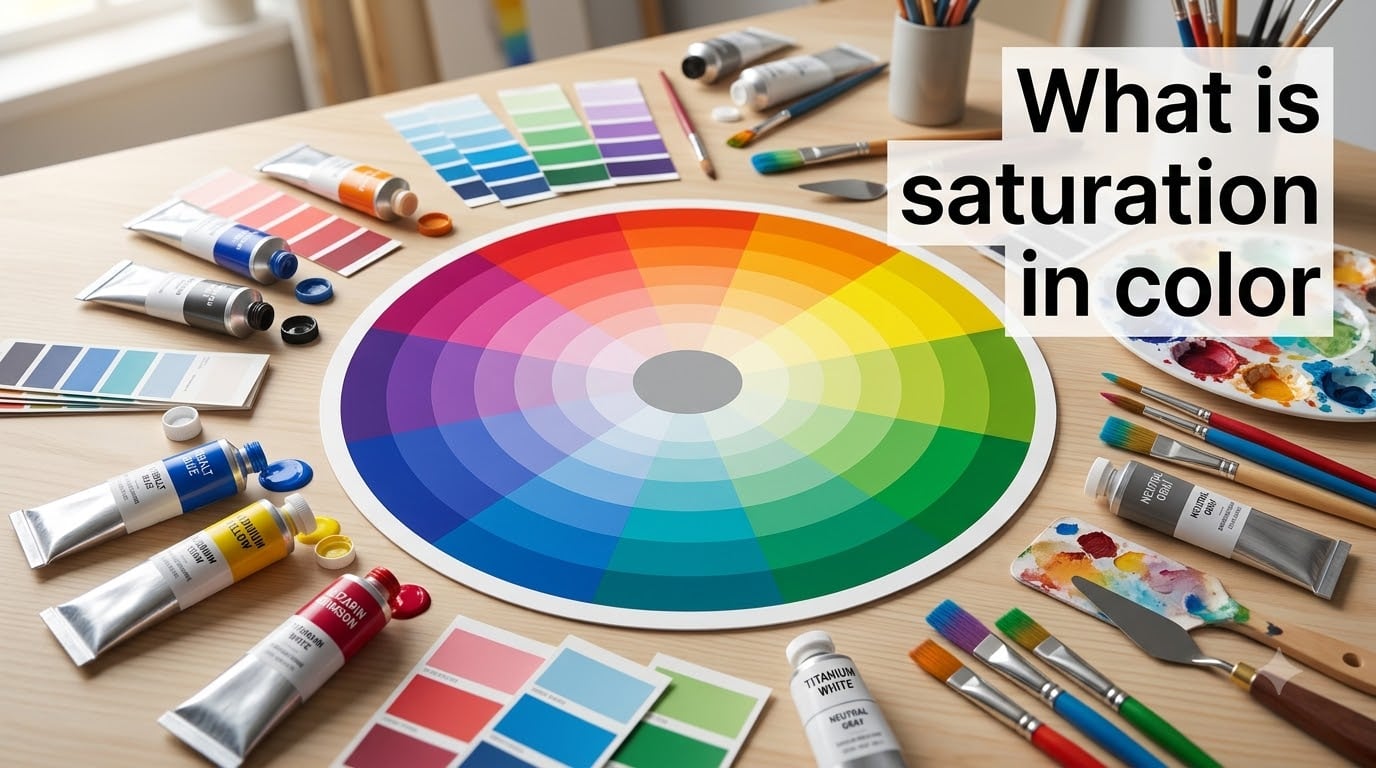
Saturation in color refers to how pure or intense a hue is. It describes the strength of a color, from vivid and bold at full saturation to washed-out and grayish at low saturation. If you have ever adjusted the vibrance slider on a photo or mixed gray into a bright paint, you have already worked with saturation.
Together with hue and value, saturation is one of the three core properties that define any color. Understanding how it works changes the way you paint, design websites, edit photos, and choose color palettes. This guide breaks down what saturation means, how it differs from brightness, and how to use it in practical creative work.
Our team has spent years working with color across digital design, traditional art, and photography. We are distilling what we have learned into clear examples and actionable tips so you can apply these concepts right away.
Table of Contents
- What Is Saturation in Color?
- Saturation vs Hue vs Value: The Three Properties of Color
- High Saturation vs Low Saturation: What’s the Difference?
- Saturation in the HSL and HSB Color Models
- Saturation on the Color Wheel
- Saturation vs Brightness: A Common Confusion
- How to Use Saturation in Art and Design
- How Color Relativity Affects Saturation
- FAQs
- Conclusion
What Is Saturation in Color?
Saturation is the measure of how much pure color is present compared to gray. A fully saturated red contains zero gray, so it looks intense and pure. A low-saturation red contains a lot of gray mixed in, so it looks muted or dusty.
Think of saturation as a dial that controls colorfulness. Turn it up and colors become vivid. Turn it down and they fade toward neutral gray. The color wheel always has the purest, most saturated colors at its outer edge.
The term chroma is often used interchangeably with saturation. Both describe color intensity, though some color systems make subtle distinctions between the two. In most practical contexts, when someone says chroma, they mean the same thing as saturation.
Here is what happens across the saturation range:
100% saturation: pure, unmixed color with no gray. Fire-engine red, electric blue, sunshine yellow.
50% saturation: the color is still recognizable but noticeably softer. A brick red or sage green.
0% saturation: no color at all. Pure grayscale, from black through grays to white.
Colors at low saturation are sometimes called desaturated, muted, toned, or neutralized. These are the soft, understated colors that make designs feel calm and sophisticated.
Saturation vs Hue vs Value: The Three Properties of Color
Every color has three properties: hue, value, and saturation. Understanding the difference between them is the foundation of color theory. Many people confuse these terms, so let us separate them clearly.
Hue is the name of the color itself. Red, orange, yellow, green, blue, and purple are all hues. Hue answers the question “what color is it?” Think of it as the position on the color wheel.
Value (also called lightness or brightness in some systems) describes how light or dark a color is. A dark navy blue and a pale sky blue can share the same hue but have very different values. Value answers the question “how light or dark is this color?”
Saturation describes how intense or pure that hue is. A vivid red and a dusty rose can share the same hue and similar value but differ enormously in saturation. Saturation answers the question “how strong is the color?”
Here is a quick way to remember the distinction:
Hue = which color (red, blue, green)
Value = how light or dark
Saturation = how intense or muted
All three properties work together. You can take a single hue like blue and create hundreds of variations by changing its value and saturation independently. A dark, muted blue feels entirely different from a bright, saturated blue even though the hue stays the same.
This is also why two colors can look completely different yet share the same hue. A desaturated, light orange (peach) and a saturated, dark orange (burnt sienna) are both orange at their core. Value and saturation are what separate them.
High Saturation vs Low Saturation: What’s the Difference?
The easiest way to understand saturation is to see it as a spectrum. At one end you have fully saturated colors that look vivid and bold. At the other end you have desaturated colors that look muted and neutral.
High saturation colors are eye-catching and energetic. They grab attention and create a sense of intensity. A stop sign red, a highlighter yellow, or a tropical ocean blue are all highly saturated.
Low saturation colors are calm and subtle. They recede visually and feel more natural or understated. Think of the muted tones in a foggy landscape, a faded pair of jeans, or the soft greens of sage.
Real-world examples make this concrete. Compare a fresh strawberry (high saturation red) to dried terracotta clay (low saturation red-orange). Compare the electric blue of a tropical sky to the dusty blue of a faded denim jacket.
In design and art, the contrast between high and low saturation is one of the most powerful tools you have. Placing a single highly saturated color among muted tones draws the eye instantly to that spot. Designers use this technique to create focal points and guide attention.
Saturation in the HSL and HSB Color Models
Digital tools represent color using mathematical models. The two most common models that use saturation are HSL (Hue, Saturation, Lightness) and HSB (Hue, Saturation, Brightness), also called HSV.
In both models, saturation is expressed as a percentage from 0 to 100%. At 100% the color is pure with no gray. At 0% the color is completely grayscale. Most design software, from Photoshop to Figma, uses one of these models in their color pickers.
The HSL model defines saturation as the distance from the midpoint between pure black and pure white at a given hue. The HSB model defines saturation slightly differently, measuring the distance from white. This creates a subtle difference in how colors behave when you adjust the controls.
Here is how the sliders work in practice:
Hue slider: moves around the color wheel (0-360 degrees)
Saturation slider: goes from 0% (gray) to 100% (pure color)
Lightness or Brightness slider: goes from dark to light
In the RGB model that screens use, saturation relates to how spread the red, green, and blue values are. Pure red (255, 0, 0) is fully saturated. A grayish red (180, 150, 150) has low saturation because the three channels are closer together.
The Munsell color system, developed by Albert Munsell in the early 1900s, was one of the first to treat saturation (which Munsell called chroma) as a distinct dimension. Munsell arranged colors in a three-dimensional shape where chroma extends outward from a central gray axis.
Saturation on the Color Wheel
The color wheel gives you a visual map of how saturation works. The purest, most saturated colors sit at the outer edge of the wheel. As you move toward the center, colors become more neutral and grayish.
At the dead center of the wheel, saturation reaches zero. This is the neutral zone where no hue is detectable at all. The outer ring and the center represent the two extremes of the saturation scale.
The HSV cone model visualizes this in three dimensions. Hue wraps around the outside, saturation extends from the central axis outward, and value runs from top to bottom. It looks like a cylinder or cone with pure colors on the surface and gray running through the core.
When you look at the color wheel in design software, you are often looking at a cross-section of this model. The color picker shows hue as a ring and saturation as a triangle or square inside it, letting you pick any combination of hue and saturation at a fixed value.
Saturation vs Brightness: A Common Confusion
One of the biggest sources of confusion is whether saturation and brightness mean the same thing. They do not. A color can be saturated without being bright, and it can be bright without being saturated.
Brightness (or value) is about how much light a color reflects. Saturation is about how pure that color is. These are independent properties that you can change separately.
A vivid dark blue can be highly saturated and quite dark at the same time. Navy blue packs intense color even though it reflects very little light. On the flip side, a pale washed-out pink can be very bright in value but have almost no saturation.
This is why simply making a color brighter does not make it more saturated. Adding white to a color creates a tint that is lighter but actually less saturated. Adding black creates a shade that is darker without changing saturation much.
Here is a simple test: does the color look vivid and pure, or does it look washed-out and grayish? That is saturation. Does it look light or dark? That is brightness. Asking both questions separately helps you describe any color accurately.
Forum discussions on Reddit repeatedly highlight this confusion. Artists in communities like r/learnart and r/ArtistLounge often ask whether saturation means brightness, and the answer is always the same: they are different properties that happen to influence how vivid a color appears.
How to Use Saturation in Art and Design
Saturation is one of the most powerful tools in any creative workflow. By controlling how vivid or muted colors are, you can direct attention, set mood, and create visual hierarchy. Here is how to put it to work.
In Painting
To increase saturation in paint, use pure pigments straight from the tube with minimal mixing. Mixing complementary colors (colors opposite each other on the color wheel) reduces saturation because they cancel each other out toward gray.
To decrease saturation, mix in the complementary color, a neutral gray, or white. This is how painters create the muted, naturalistic tones that make skin, foliage, and sky look realistic rather than cartoonish.
In Web Design
Use high saturation sparingly for calls to action, buttons, and important elements you want users to notice. Reserve most of your palette for lower saturation colors that are easier on the eyes during long reading sessions.
A common approach is the 60-30-10 rule applied to saturation: 60% low saturation for backgrounds, 30% medium saturation for content areas, and 10% high saturation for accents and focal points.
In Photography
Most photo editors have a saturation slider that adjusts all colors equally and a vibrance slider that targets only the less saturated colors. Vibrance is usually the safer choice because it avoids oversaturating skin tones, which quickly look unnatural.
Pushing saturation too far in post-processing creates unnatural colors with clipped detail. Skin tones turn orange, skies turn radioactive blue, and the image loses realism. Subtle adjustments almost always look better.
Creating Focal Points
The single most effective use of saturation is creating focal points. Surround a highly saturated element with desaturated colors and the eye locks onto it immediately. This works in paintings, web layouts, photography, and graphic design alike.
Conversely, lowering the saturation of everything except your main subject creates instant emphasis. This is the same principle behind desaturated backgrounds in product photography and selective color effects in film.
How Color Relativity Affects Saturation
Here is something that trips up many artists: a color’s perceived saturation changes depending on what surrounds it. The same red can look vivid against gray and dull against a brighter red. This is called color relativity or simultaneous contrast.
Your brain does not measure color in isolation. It compares colors to their surroundings and adjusts perception accordingly. A medium-saturation blue surrounded by neutral grays will appear more intense than the exact same blue surrounded by highly saturated colors.
This has practical consequences. If you want a color to feel saturated, place it among desaturated neighbors. If you want it to feel calmer, surround it with more saturated colors. You can shift the perceived intensity of a color without changing the actual color at all.
Color relativity is why testing colors in context matters so much. A paint chip that looks perfect in the store can feel entirely different on your wall. Always evaluate saturation decisions in the environment where the color will actually live.
FAQs
What is an example of a saturated color?
A saturated color is a pure, vivid hue with no gray mixed in. Fire-engine red, electric blue, highlighter yellow, and tropical ocean turquoise are all highly saturated colors. They appear bold and intense compared to muted, grayish versions of the same hues.
How do you add saturation to paint?
To increase saturation in paint, use pure pigments straight from the tube with minimal mixing. Avoid adding white, black, or complementary colors, all of which reduce intensity. To decrease saturation, mix in the complementary color (the hue opposite on the color wheel) or a neutral gray to mute the tone.
Should color saturation be high or low?
It depends on the effect you want. High saturation creates energy and draws attention, making it ideal for focal points and accents. Low saturation feels calm, natural, and sophisticated, making it better for backgrounds and large areas. Most strong designs use a mix of both.
Does saturated color mean brighter?
No. Saturation and brightness are different properties. A color can be highly saturated and dark, like navy blue, or bright and desaturated, like pale pink. Saturation measures color purity, while brightness measures how light or dark a color is.
Conclusion
Saturation in color is the property that controls how pure and intense a hue appears. It works alongside hue and value to define every color you see, from the vivid red of a stop sign to the muted tones of a foggy morning.
Understanding saturation gives you precise control over mood, attention, and visual hierarchy in any creative project. Start experimenting with the saturation slider in your favorite design tool, or try mixing complementary colors in paint to see the effects firsthand.
The best way to internalize these concepts is practice. Pick a single hue, create a grid of variations by changing only saturation, and observe how each version feels different. Once saturation clicks, your entire approach to color improves.